
A new logo, brand guidelines, strategy and website, for IBioIC looking to the future.
IBioIC, the Industrial Biotechnology Innovation Centre, has worked since 2013 to grow Scotland’s industrial biotechnology sector to £900 million by 2025. We worked with IBioIC to completely redevelop their logo, brand guidelines, and strategy, as they move into phase two of their plan towards 2025.
Introducing the new IBioIC corporate identity.
From the icon to the typeface, colour palette to mono version, we completely redesigned the original logo, yet still maintained the established look.

Redrawing the current marque.
Working with such an established marque, the decision was taken to retain the hexagon icon.
We still saw this as an opportunity to redraw the marque, from its original shape, ensuring it was absolutely geometrical, with a more slender form.

Updating the typeface.
From a larger selection of typefaces, we worked with the IBioIC marketing team, to narrow it down to the final three.

A bold new colour palette.
Working from the previous colour palette of darker tones, we completely refreshed the look of the logo with a modern, fresh colour scheme.

Recolouring the Icon.
We created a number of options to present to the IBioIC team for selection.

The final choice.
After combining the final icon and the chosen typeface, the new logo was complete.

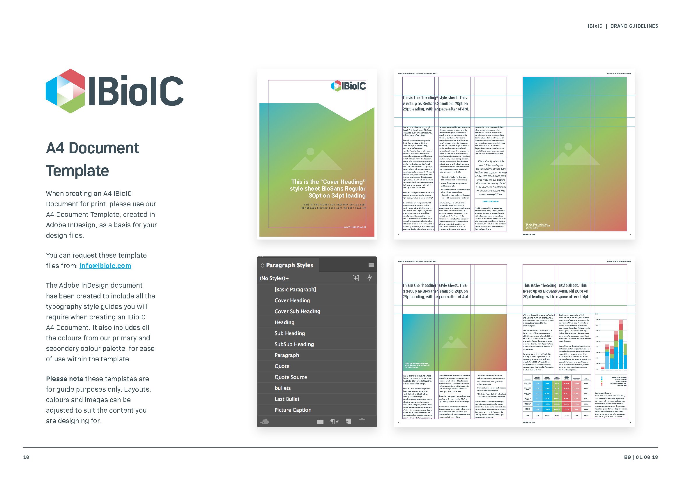
The new brand guidelines.
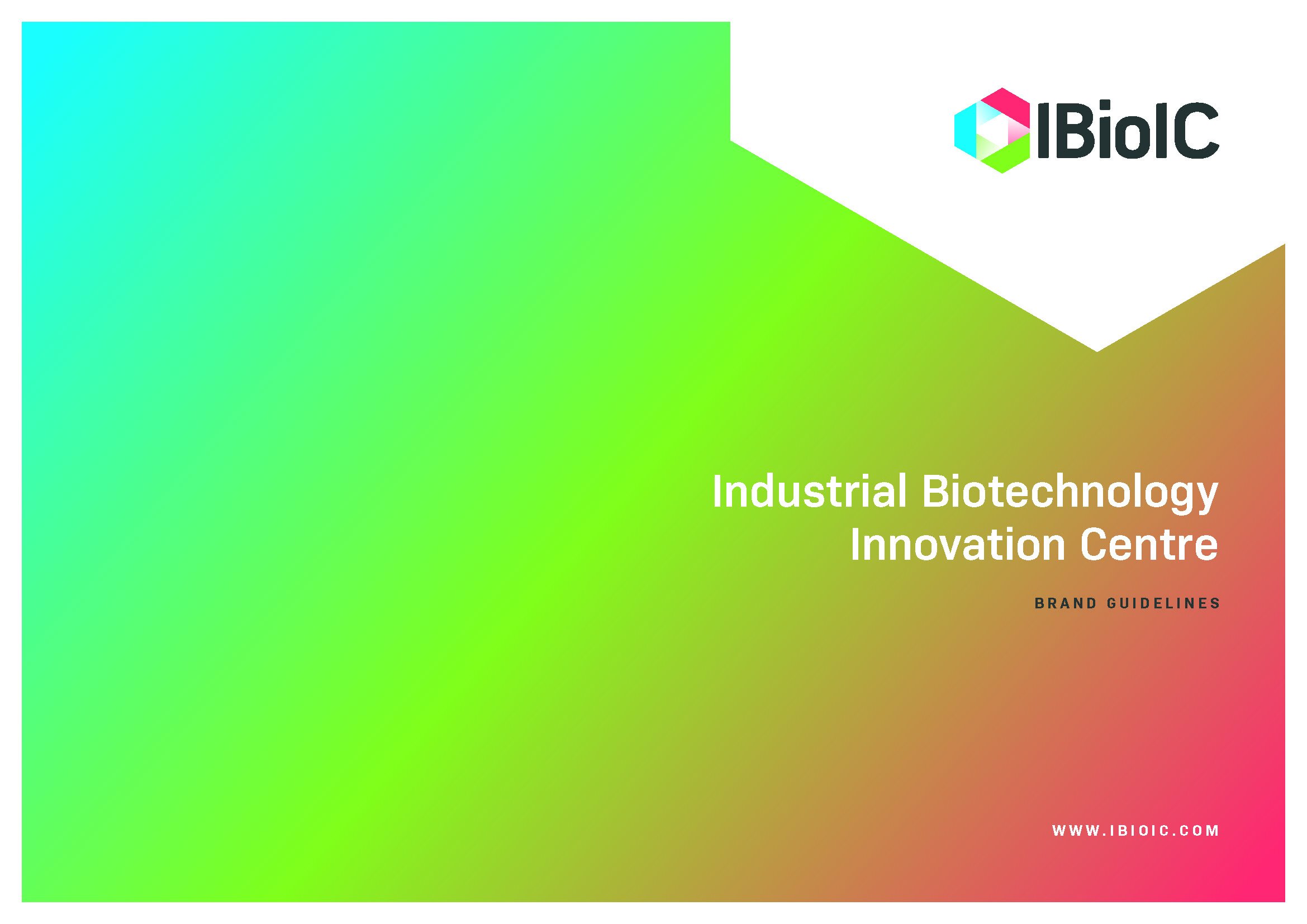
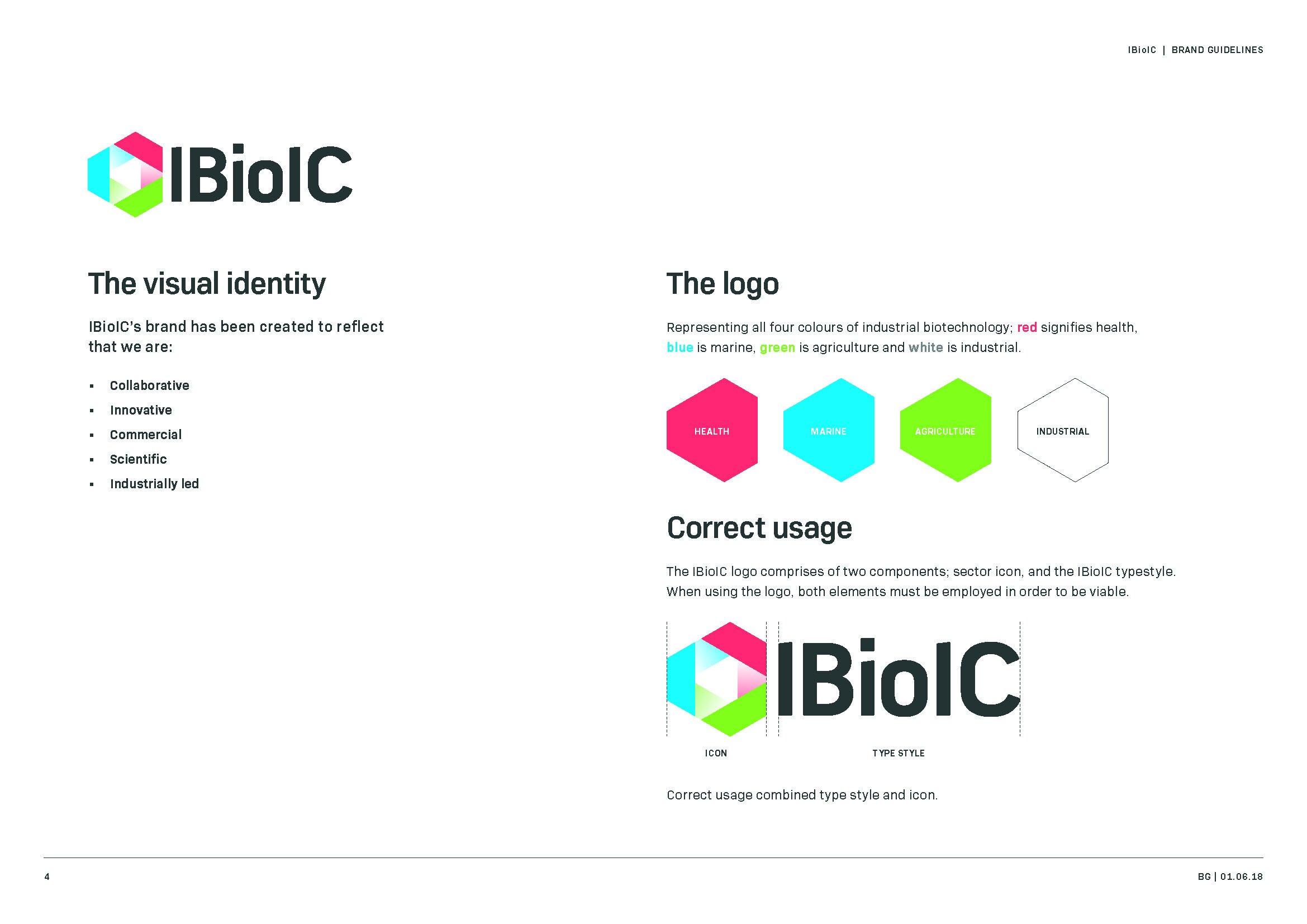
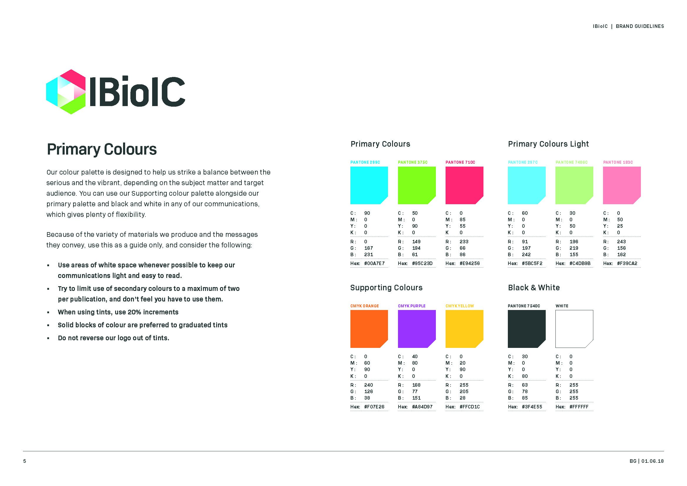
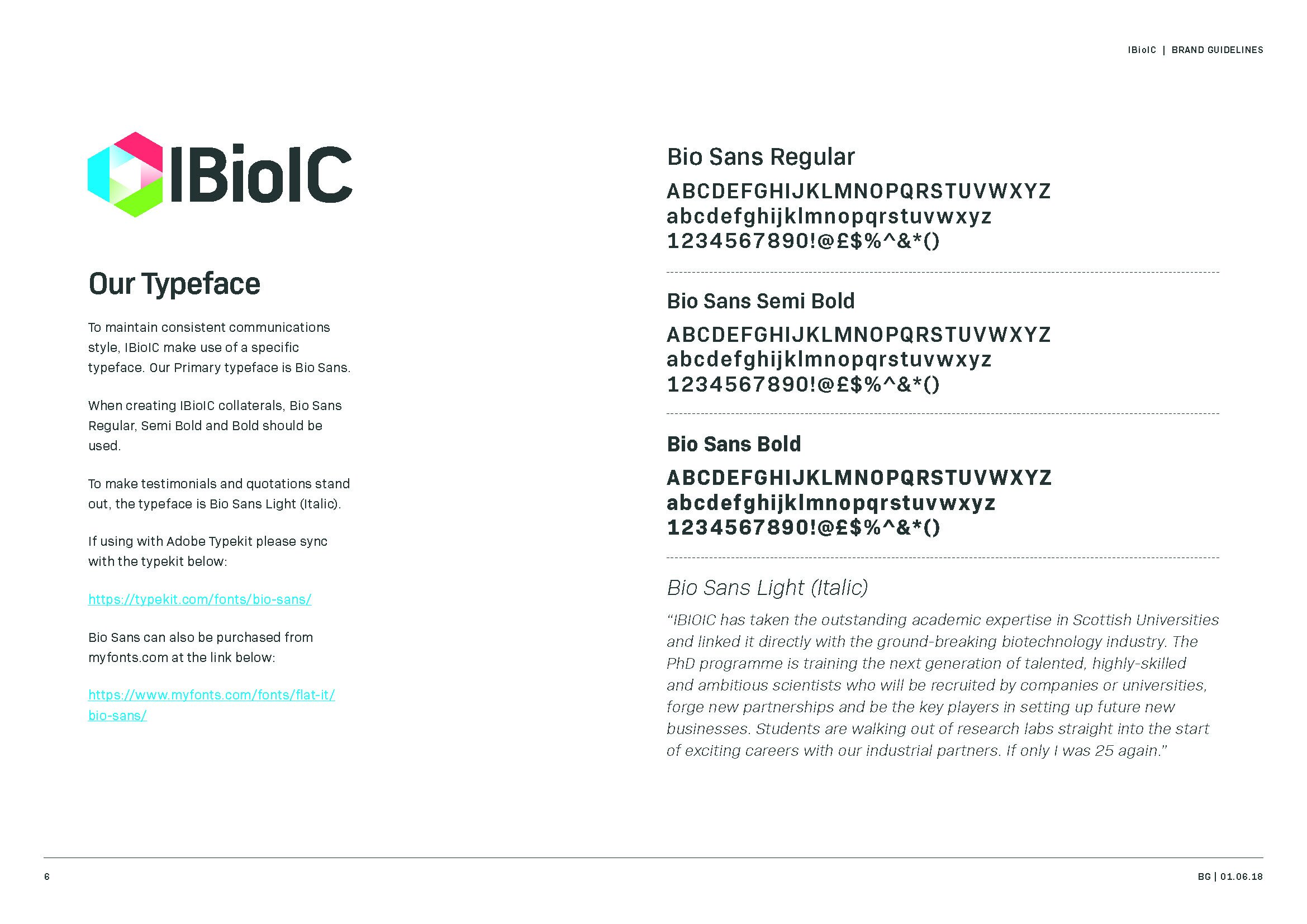
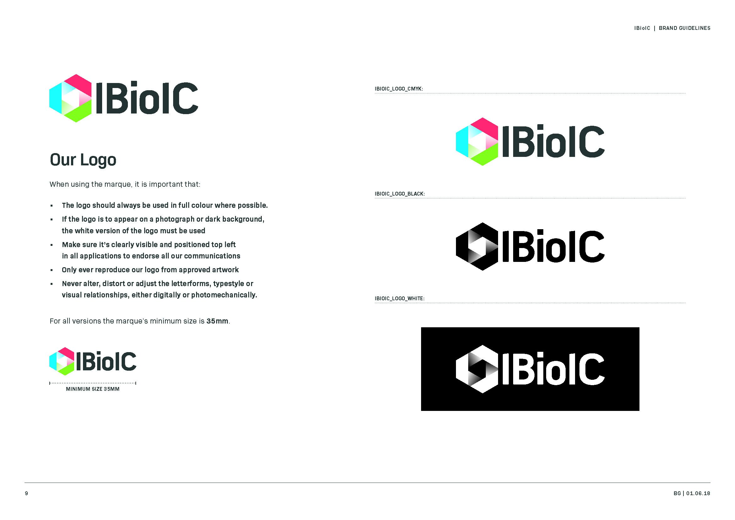
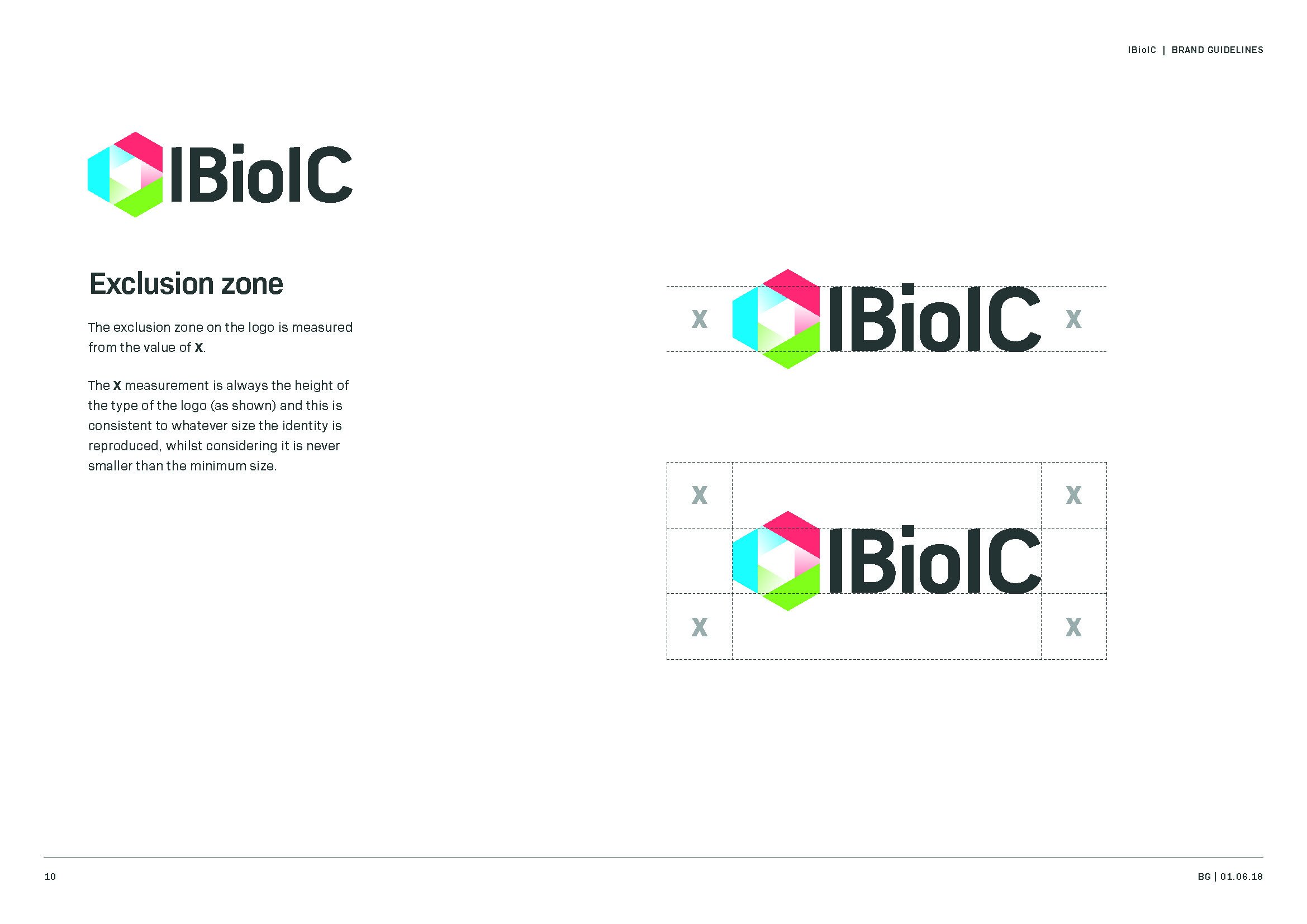
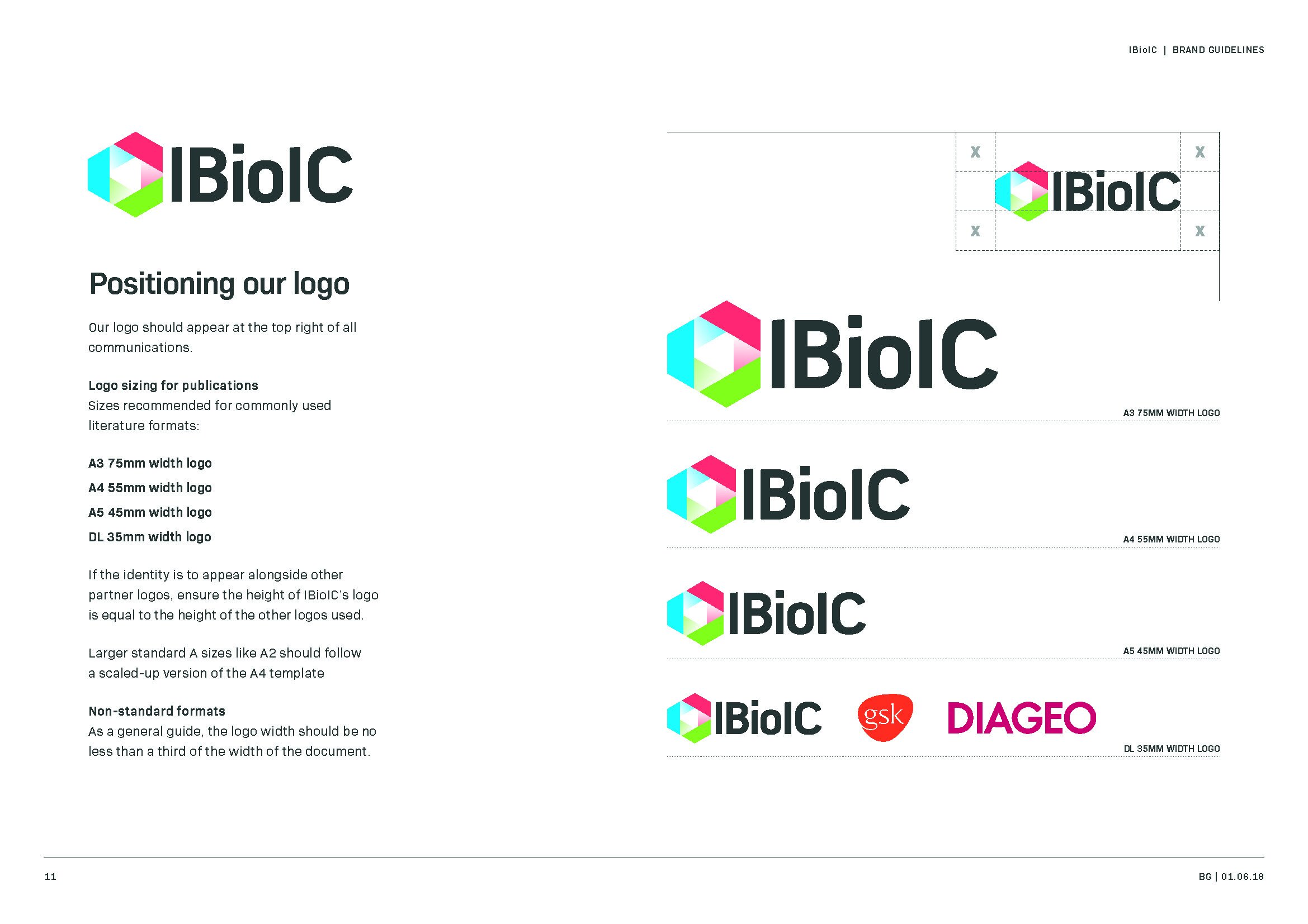
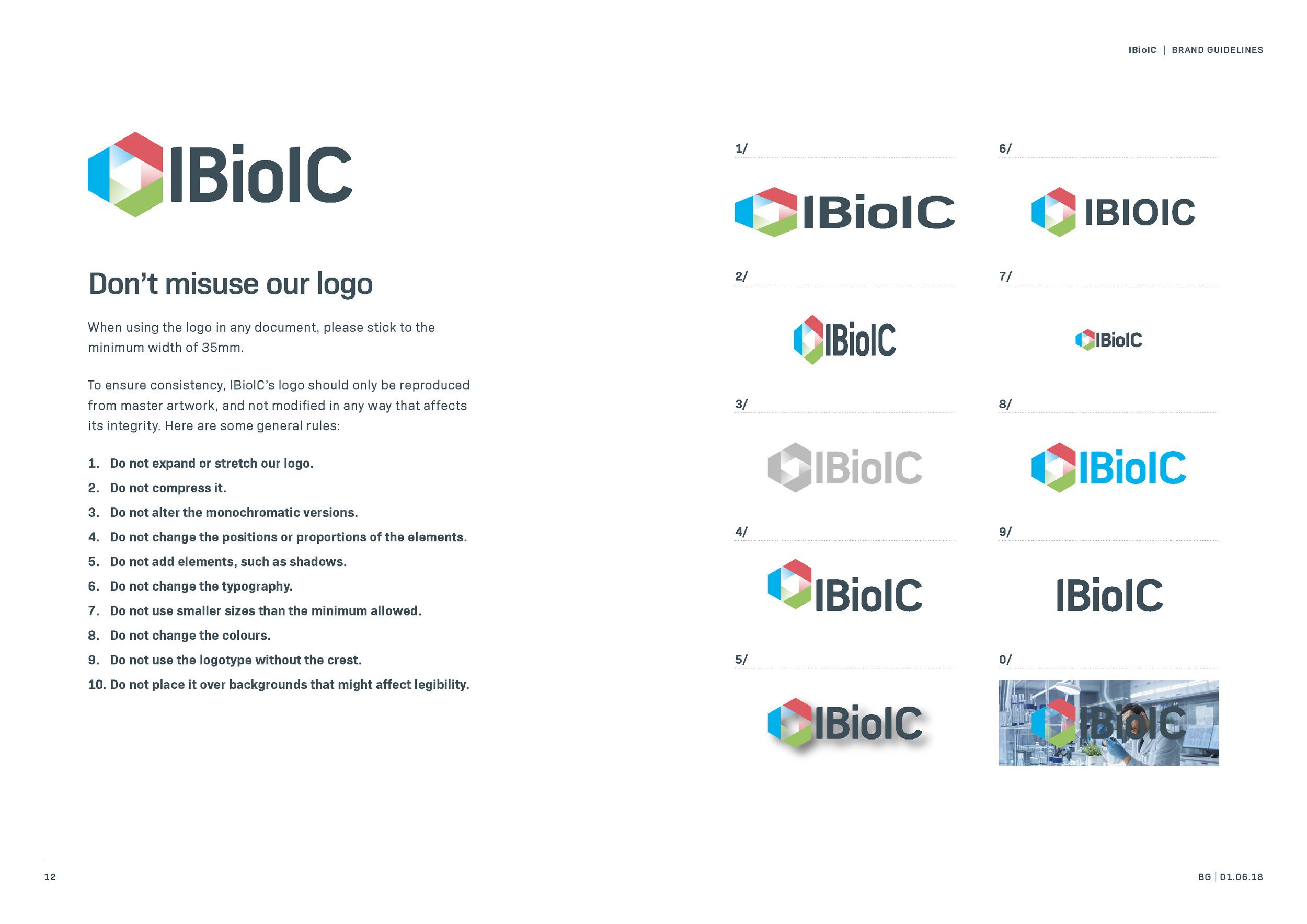
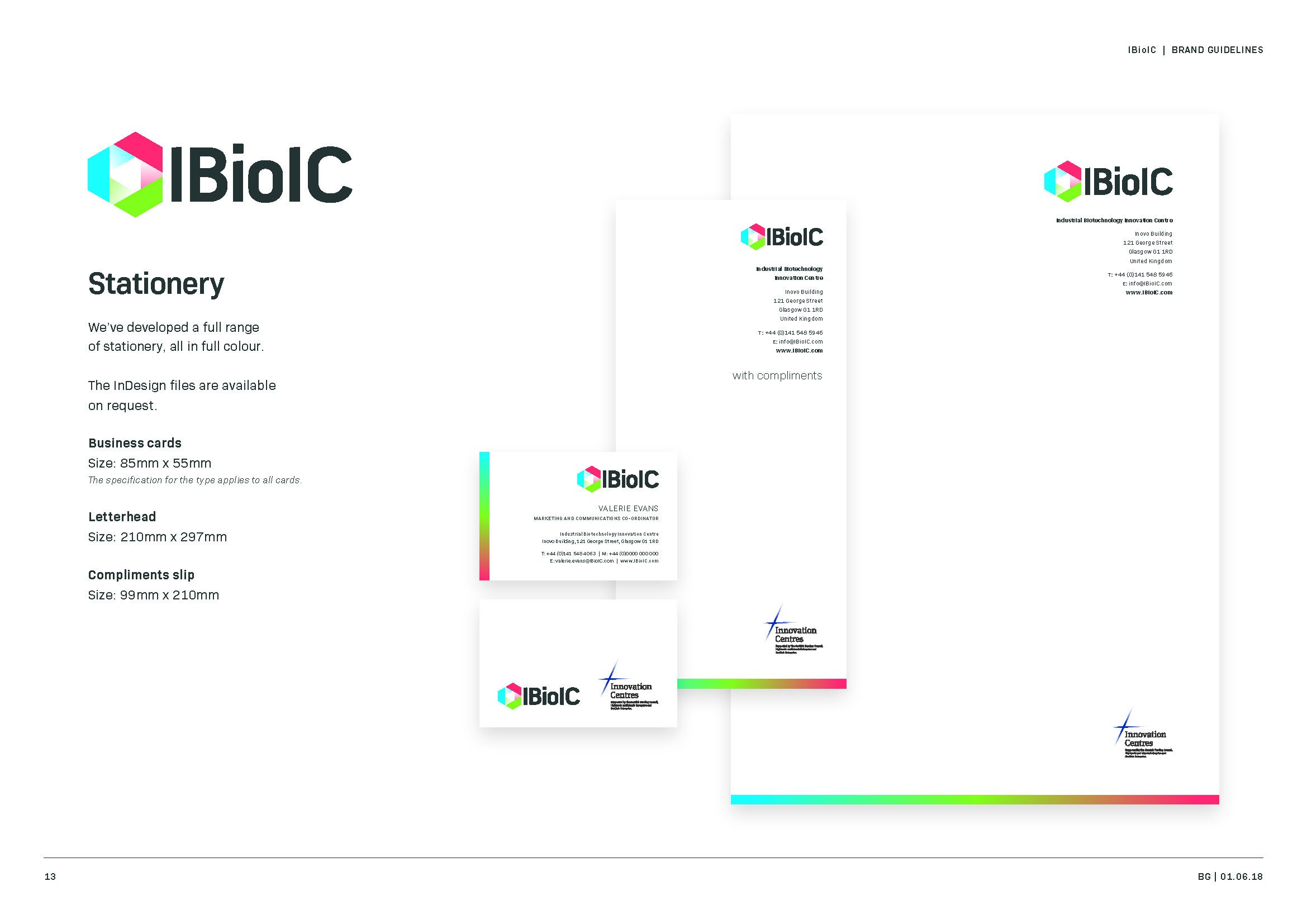
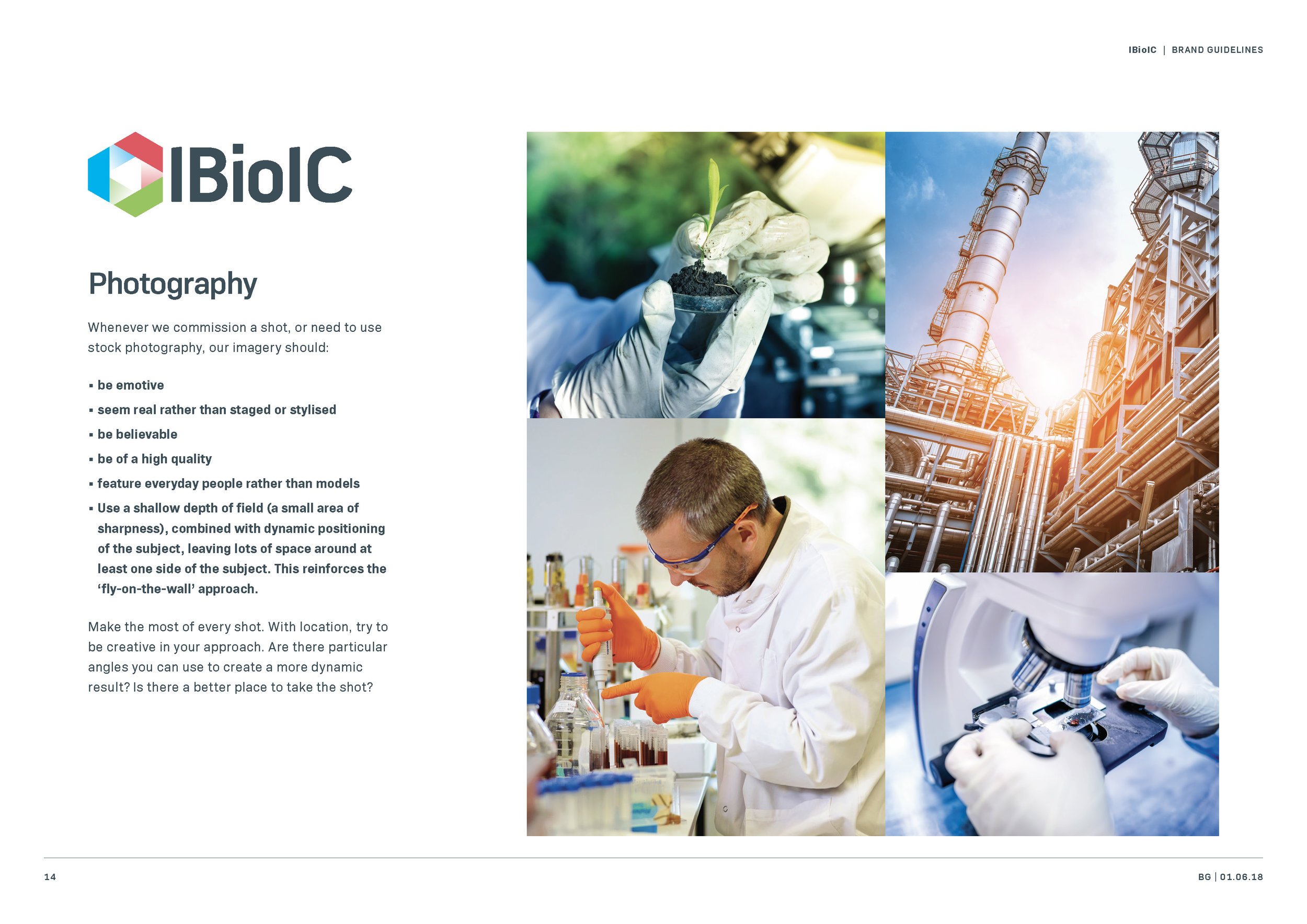
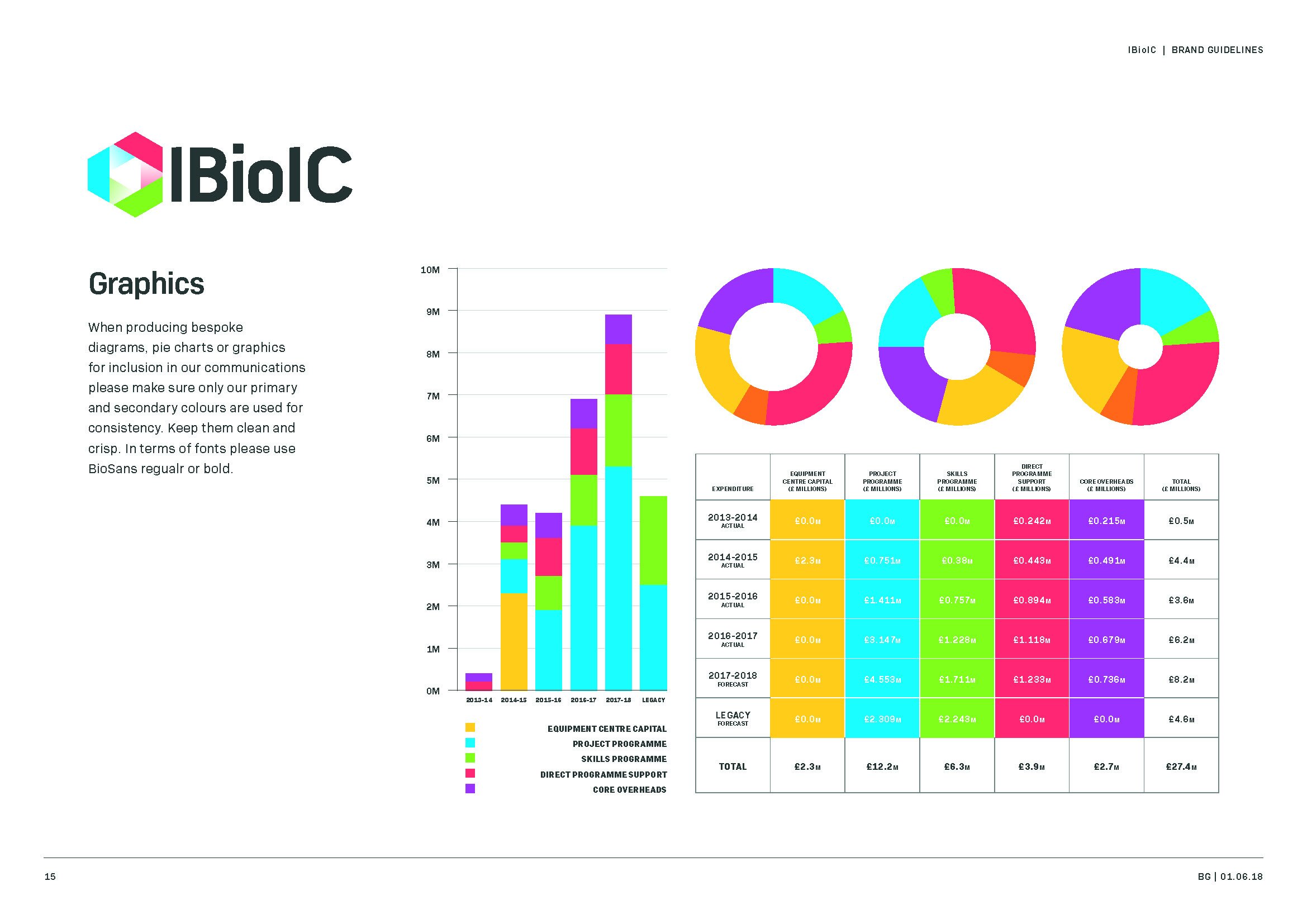
We created a new comprehensive set of brand guidelines for designers to follow.
Some example pages:
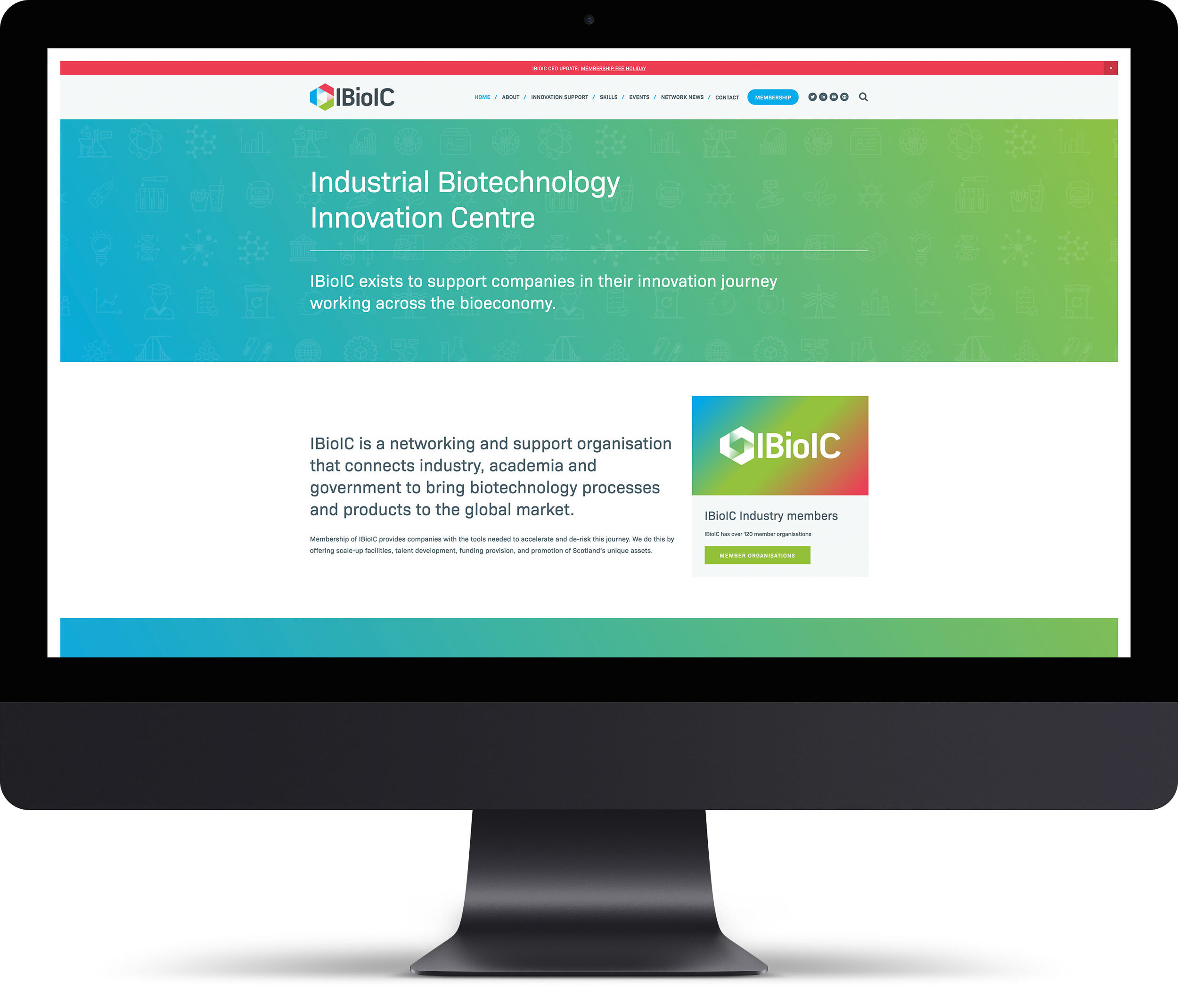
A website to complete the brand.
visit: www.IBioIC.com
A strategy for the future.
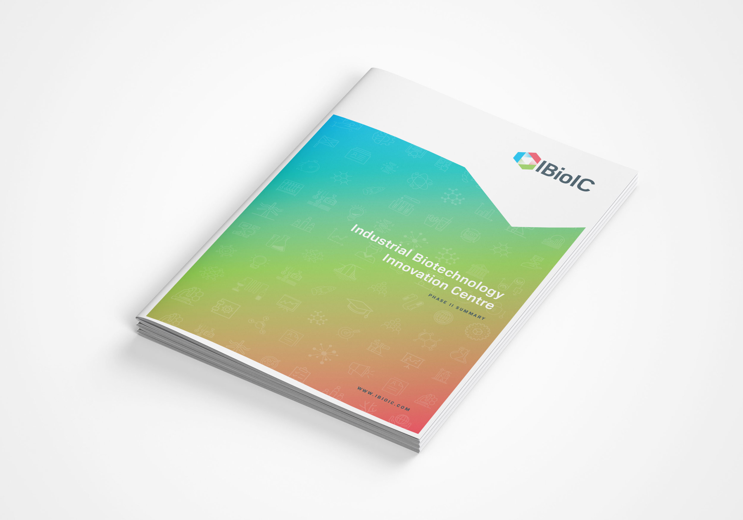
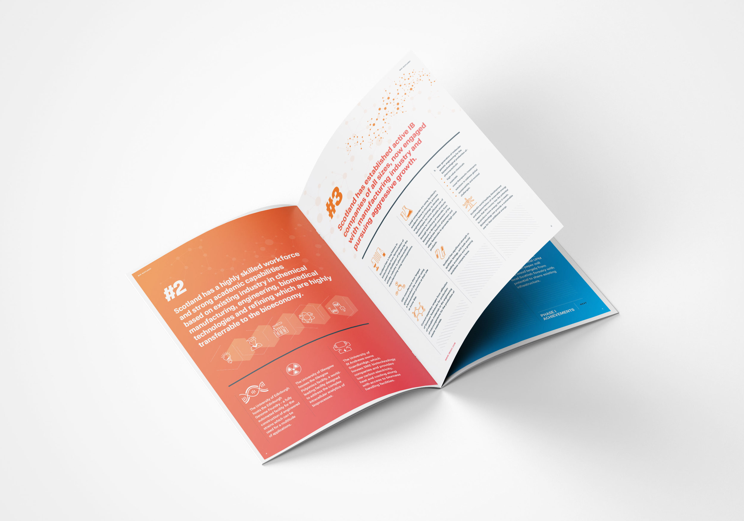
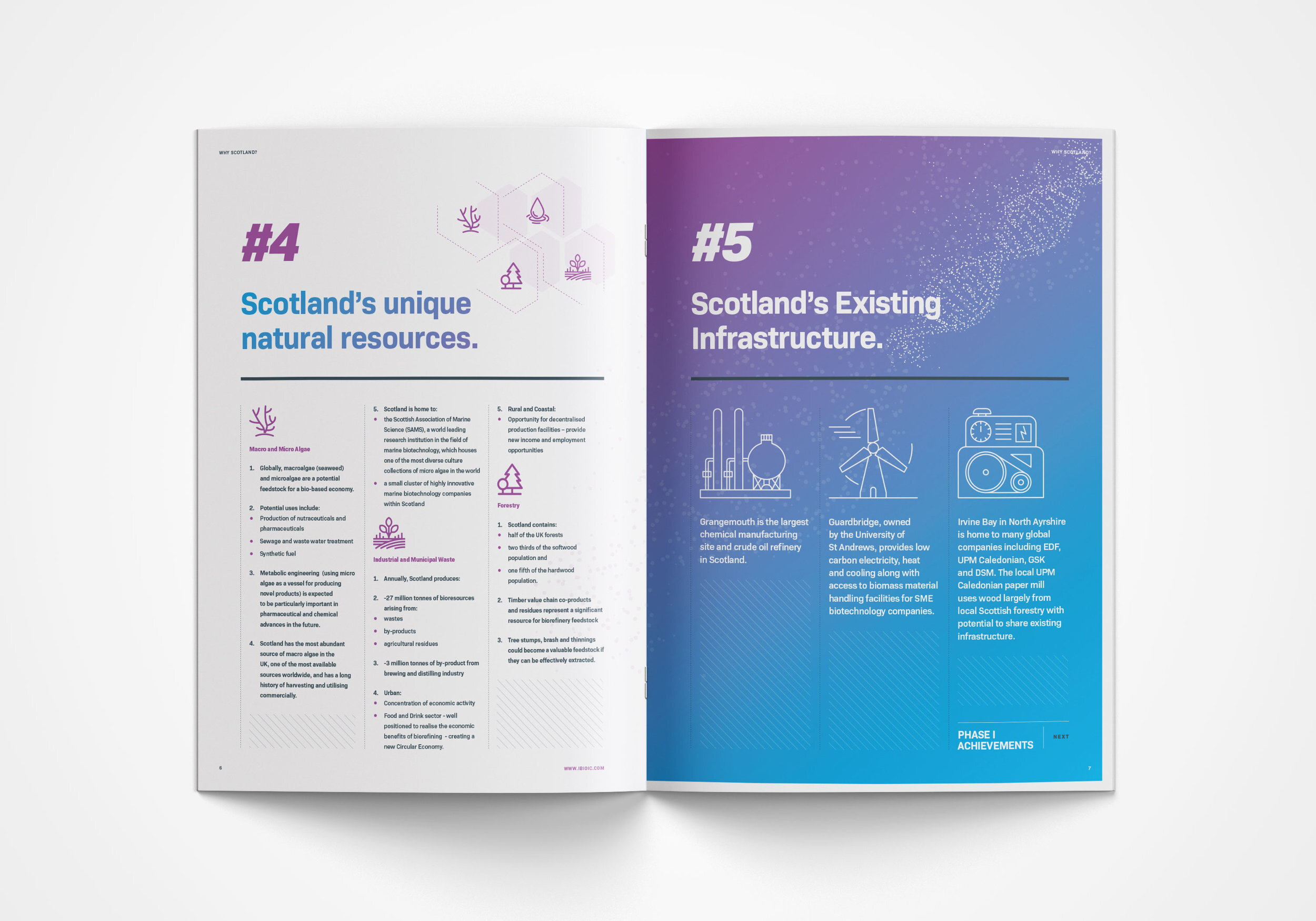
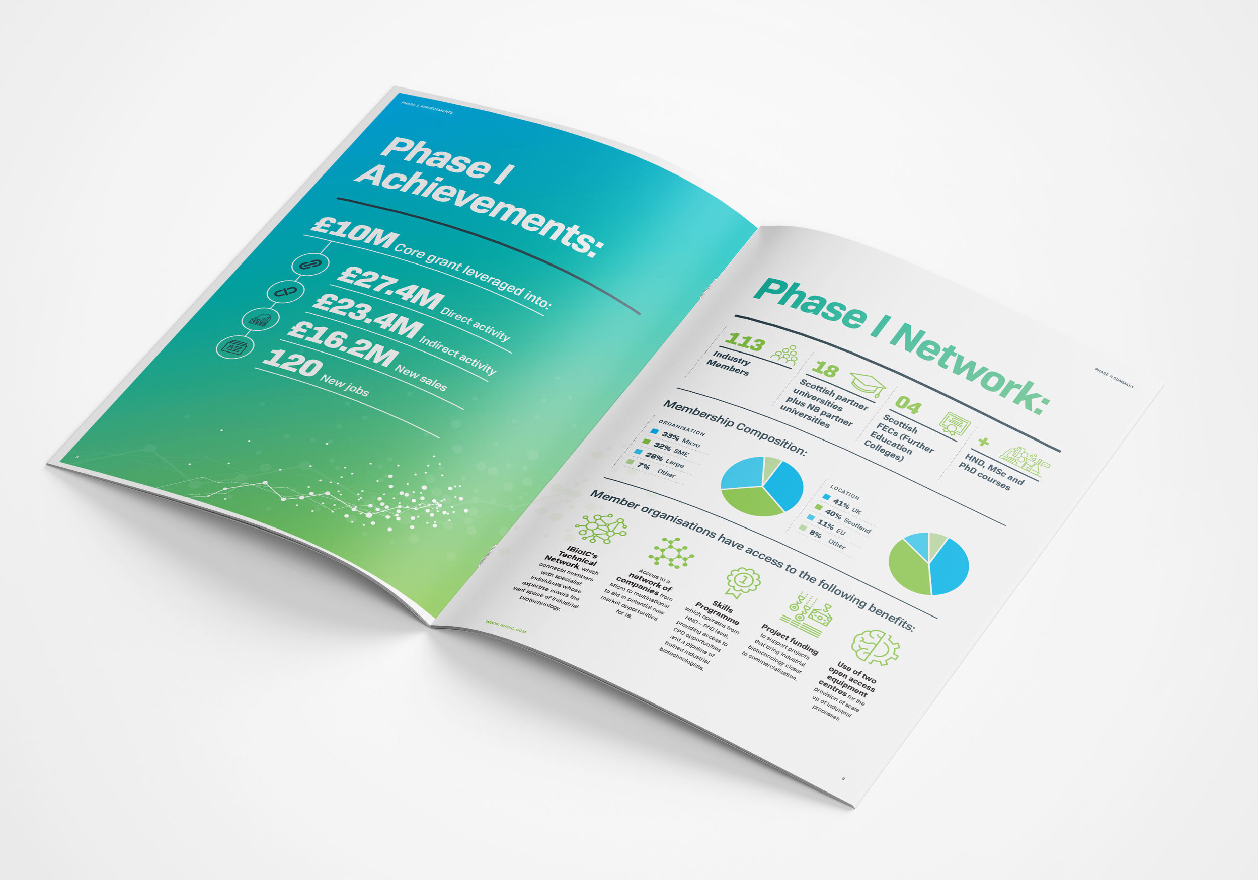
The brief was to develop a strategy & review document that was simple to read and easy to extract information from. We created an infographics document that reviewed the past, discussed the present, and set out the future.