


How we got involved?
Dr. Georgia Richards DPhil (Oxon), BSc (Hons I), an Epidemiologist, Health Research Scientist, and King's Prize Research Fellow at King's College London, launched the Preventable Deaths Tracker, a national vigilance platform that uses coroner data to extract lessons from inquests.
With immense dedication, Dr Richards meticulously gathered the necessary data, envisioning a stunning dashboard-style website that was simple, swift to navigate, and offered effortless access to reports and downloads. Recognising our previous successes in the data sector, Dr. Richards reached out to see if we could help bring her vision to life. Here’s how we got started.
We began by focusing on the brand.

Researching the Preventable Deaths Tracker.
The inaugural Preventable Deaths Tracker for England and Wales reveals a staggering statistic: one-fifth of all deaths - more than 125,000 annually - are avoidable, costing the economy over £328 billion.
The coroner service plays a vital role in investigating these sudden, unexplained, or violent deaths, seeking to uncover the who, when, where, and how behind each case.
With this crucial context, we aimed to craft an identity that encapsulates the purpose of the tracker while embodying the essential tasks it undertakes.
Breaking down the research.
From the extensive research carried out, we meticulously picked out six common themes that emerged across the findings:
Tracking
Scanning
Data
Patterns
Research
Education
From the core of the brief we developed, we crafted a captivating series of geometric shapes that reflect the patterns discovered within the data itself. These shapes would eventually become the foundations upon which the identity itself is built, and defined.


Developing a distinctive identity marque is a creative journey that involves a thoughtful blend of design elements and brand values.
Using a striking geometric style derived from the meticulous analysis of collected data, we expertly crafted a distinctive identity that thoughtfully utilises a range of geometric shapes to artfully form the letters of PDT.
Out of the three unique PDT letters created, we creatively combined them to produce a one-of-a-kind arrangement of shapes for the identity marque, ensuring it stands out.
The next exciting step in our process was to implement the vibrant new color palette and seamlessly integrate the carefully designed data patterns into the overall identity.
Striking the perfect balance with vibrant and harmonious colour is essential to creating visually appealing designs that resonate with audiences and capture attention.
Choosing the right color palette was crucial for the project. We aimed to find a harmonious balance between the positive, life-saving, and financial, potential of the tracker and the stark, negative implications of its content.
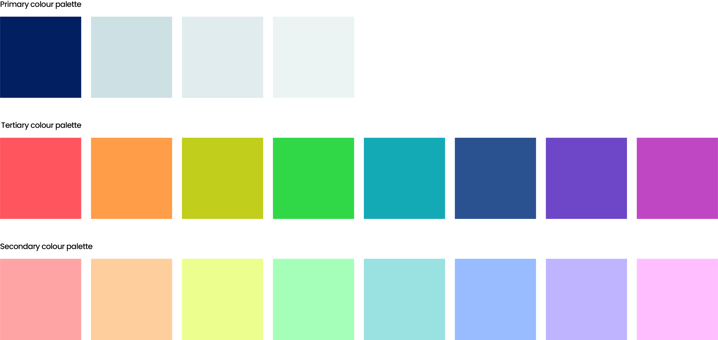
Additionally, we had to consider the accessibility of the tracker while developing the website platform. To accommodate this, we created secondary and tertiary colour palettes, allowing us the flexibility to distinguish various types of data effectively.
Primary Colour Palette

Choosing the typeface.
We explored a wide variety of elegantly crafted sans serif typefaces, as we were eager to find something that was not only timeless and stylish but also highly accessible and easy to read, making it suitable for use throughout the entire platform development process.
This meticulous attention to detail ensured that our design would genuinely resonate with users while creating an effortlessly seamless experience that they would enjoy and appreciate.


Bringing the Preventable Deaths Tracker brand together.


Using the meticulously crafted geometric graphics, which were stylised to vividly reflect the intricate underlying data, we seamlessly combined the striking PDT marque with the distinctive shapes to thoughtfully create the final identity.
To effectively represent the ongoing continuous tracking process, we skillfully animated the identity to elegantly illustrate the scanning and real-time tracking of the coroner's essential data that the website will diligently perform on a seamless basis, ensuring a truly dynamic and engaging user experience for all visitors.


Creating the world’s first Preventable Deaths Tracker website.
Dr. Richards had a clear vision for her website: a stunning dashboard design that prioritised simplicity and swift navigation, allowing for effortless access to reports and downloads.
We embraced this vision and set to work, crafting exactly what the Doctor had ordered. To tackle the technical challenges of such a project, we brought in the talented Nick Haworth, whose expertise was instrumental.
Together, with Dr Richards, we created, and crafted, a beautiful and functional dashboard-style website that met Dr. Richards' needs perfectly.
Don’t just take our word for it …

Telling stories
Telling the captivating story of the Preventable Deaths Tracker is an important journey that highlights the critical need for awareness and action in our communities.
By sharing compelling narratives and statistics, we shed light on the countless lives that could be saved through timely interventions and preventative measures. Each story not only informs but also inspires hope for a future where preventable deaths become a thing of the past.
Designing the report collateral.
Continuing with the vibrant theme of the brand we carefully rolled out the design for the comprehensive report and matching download collateral. This ensures a cohesive and engaging visual experience that truly reflects our brand’s personality.
