


Bringing the SkillSeeder Logo and brand to life.

SkillSeeder is an app that gives users the chance to learn or pass on their skills, set up to address gaps in support for Scotland’s rural communities. When we were selected to redesign the original SkillSeeder logo, we suggested giving it a softer, more friendly appeal.
Our first thoughts were to look at the colours and typography, then we simplified the iconography, losing the leaf detail, which was frequently too small to notice, on smaller collateral.

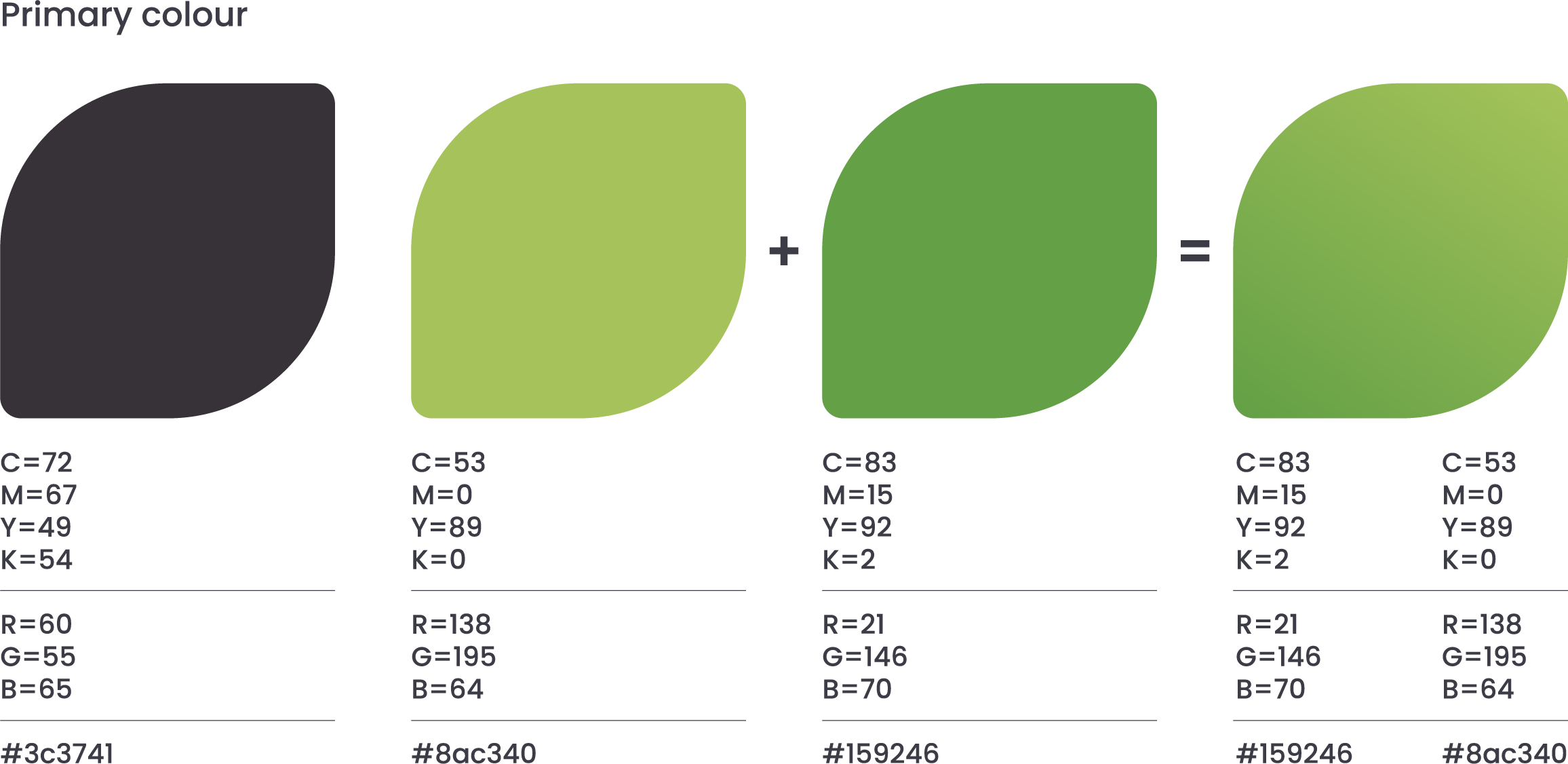
Developing the colour palette

To soften the colour palette we changed the solid black to an earthy dark grey, introducing a second lighter green to create a gradient across the iconography.
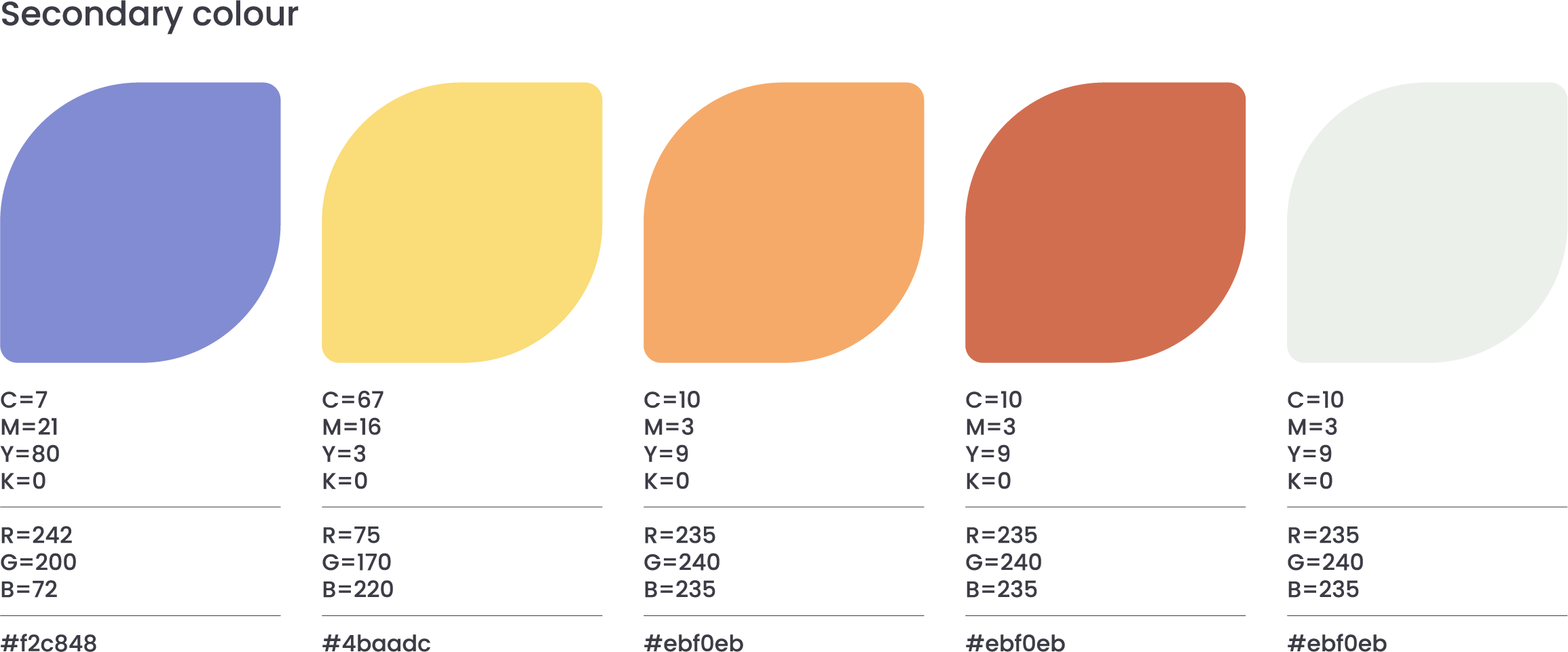
We introduced a secondary colour palette to open up the range across the new brand we were developing.
Selecting a friendly timeless font.
The final choice was Museo Sans 700 | friendly, modern, contemporary, timeless.



The final logo.
The finished marque brings the three changes together: the simplified icon with the leaf detail removed, the earthy dark grey paired with a two-green gradient, and Museo Sans 700 for the wordmark.
The result is softer and friendlier than the original, and it holds its detail at small sizes, across the app, the website and printed collateral.

Growing the SkillSeeder brand style.
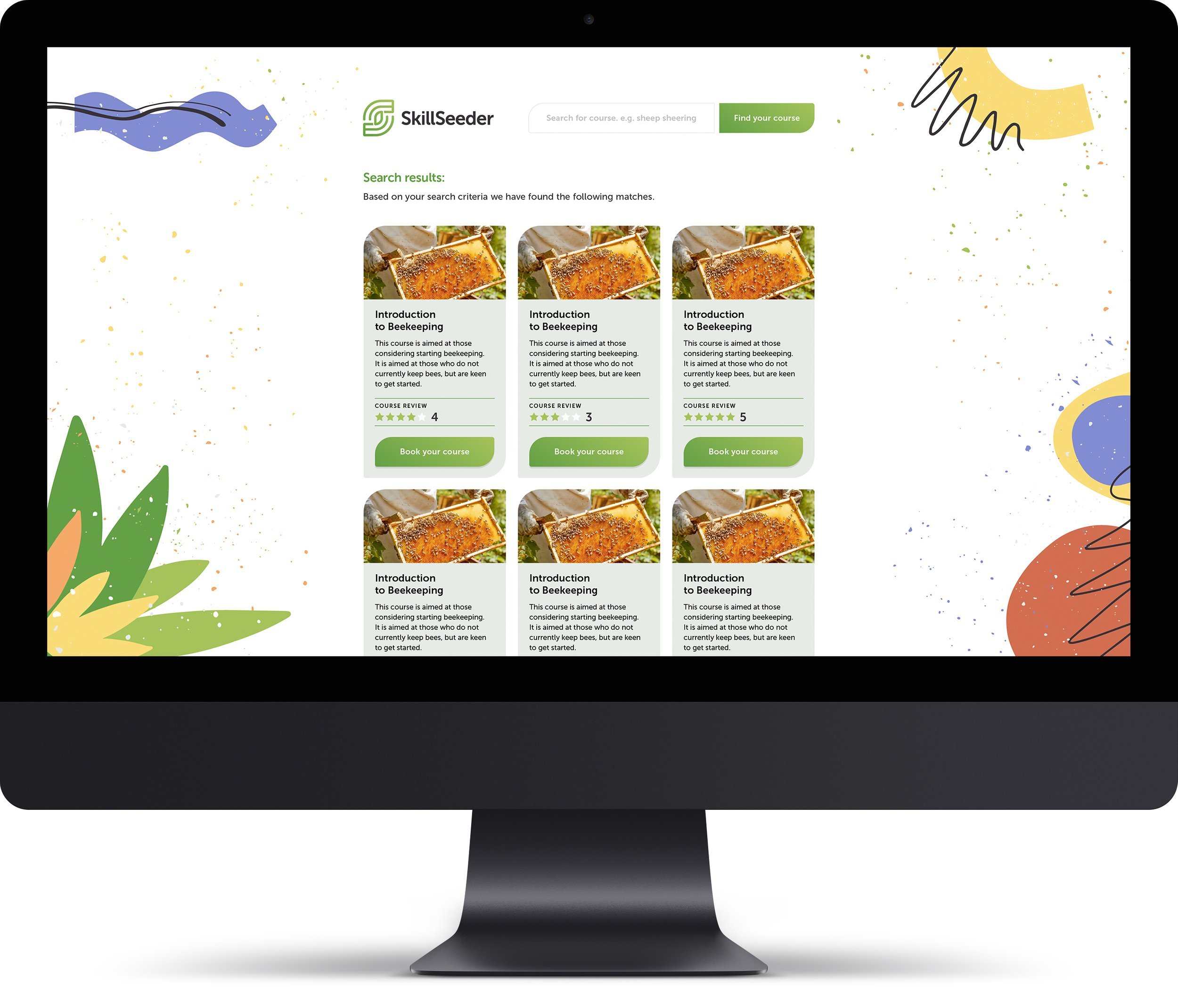
We took things right back to basics when creating the brand style, using organic shapes, to mirror the rural usage, to create and represent anything, and everything, from pottery making to painting, gardening to sheep shearing.


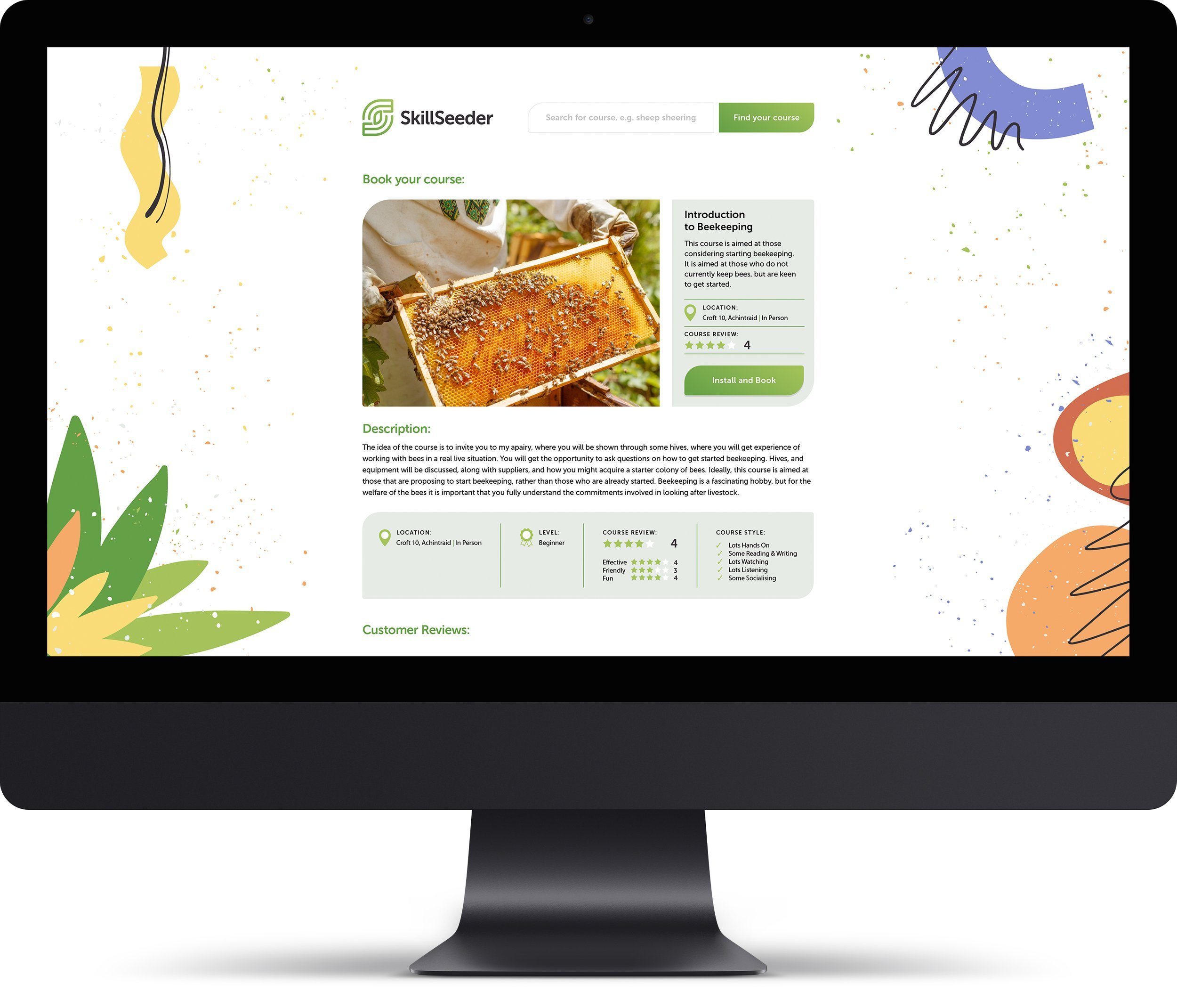
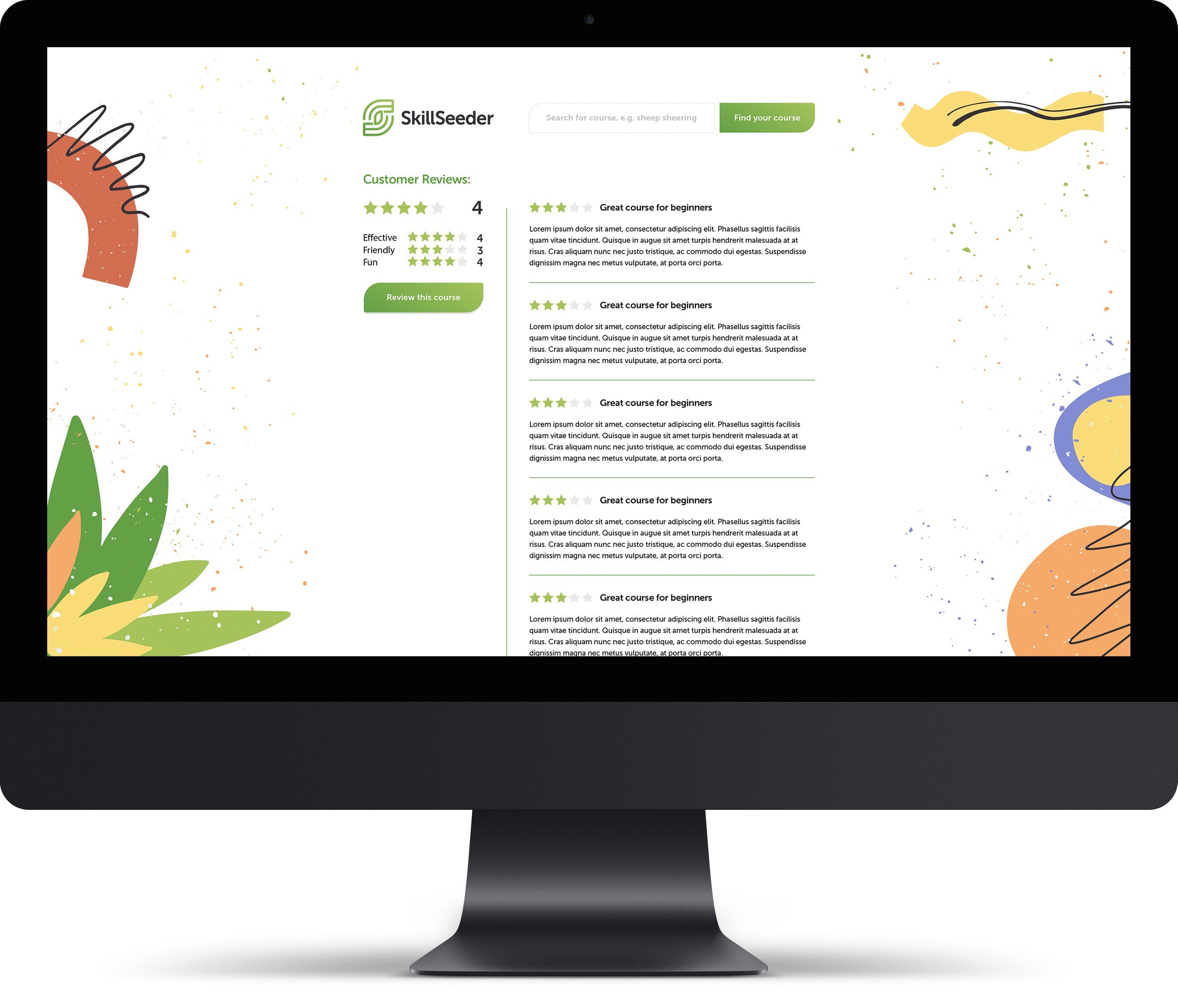
Developing the application design.



Promoting the brand at networking events.
