
A new identity for Alvine Capital Management.
TwoFifths Design, a brand identity studio in Edinburgh, redesigned the brand for Alvine Capital Management, the independent placement agency that connects European institutional investors with boutique fund managers. Founded in 2005 and working from London and Stockholm, Alvine had grown well beyond the identity it started with. Ahead of its twentieth anniversary the firm wanted a mark that matched the business it had become, and that could sit comfortably alongside the largest names in the sector.

Looking at how luxury brands use monograms.
Alvine named Chanel, Mercedes and Mulberry as brands they admired, so the first exploration looked at how the luxury sector builds a monogram. We collected classic, modern and contemporary examples to work out what gives a two letter mark authority, and where the line sits between confident and overworked. The brief was clear that the result had to be simple, memorable and free of anything that would date it.
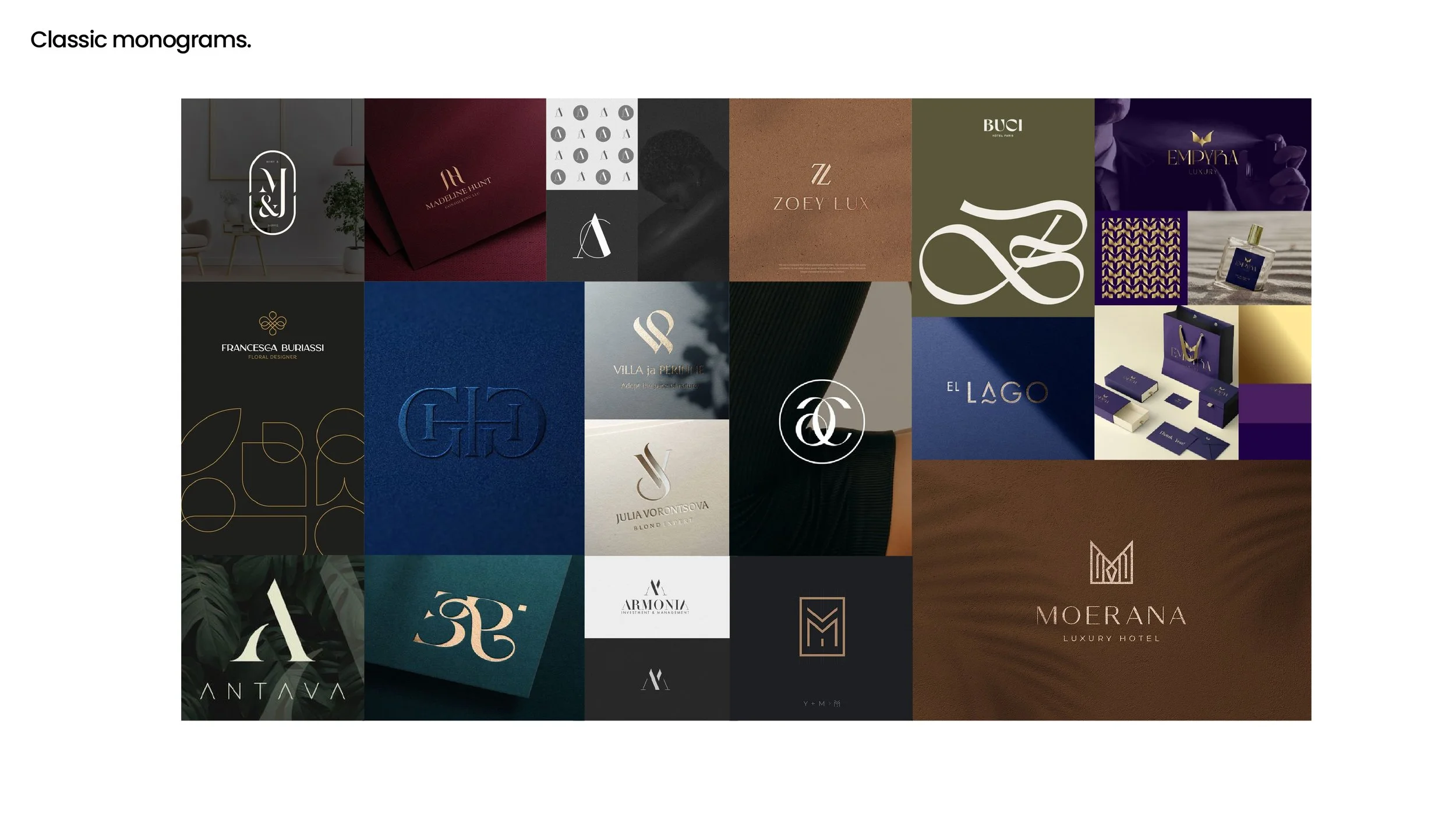
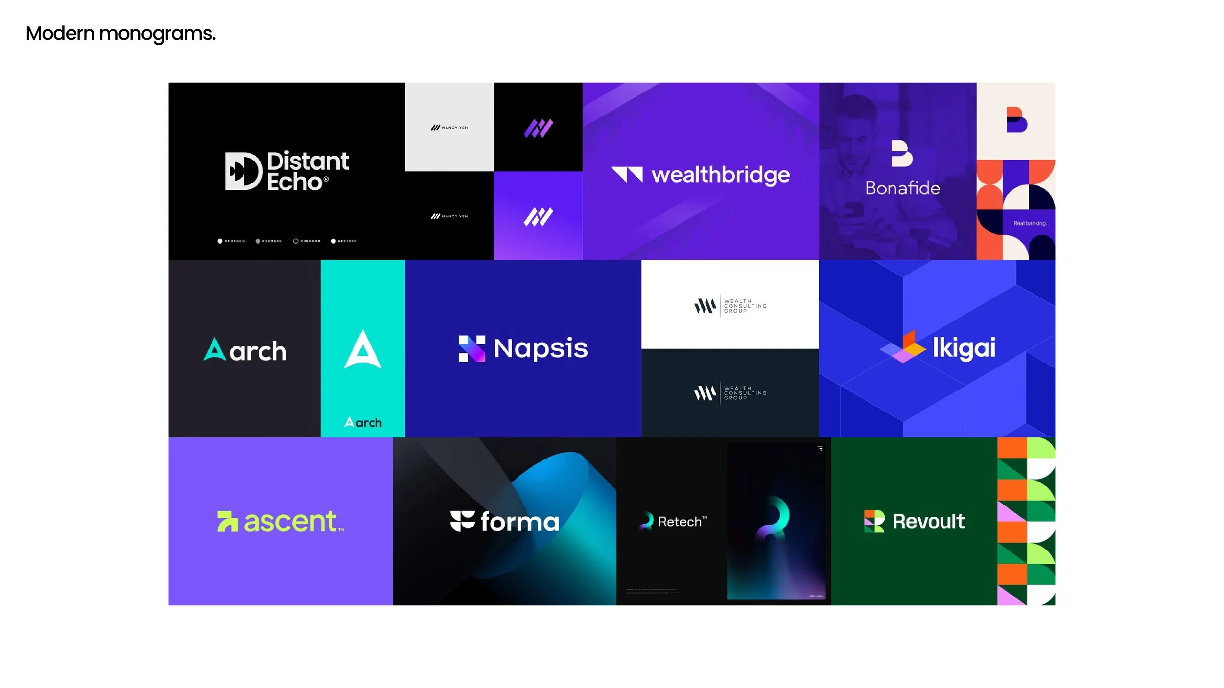
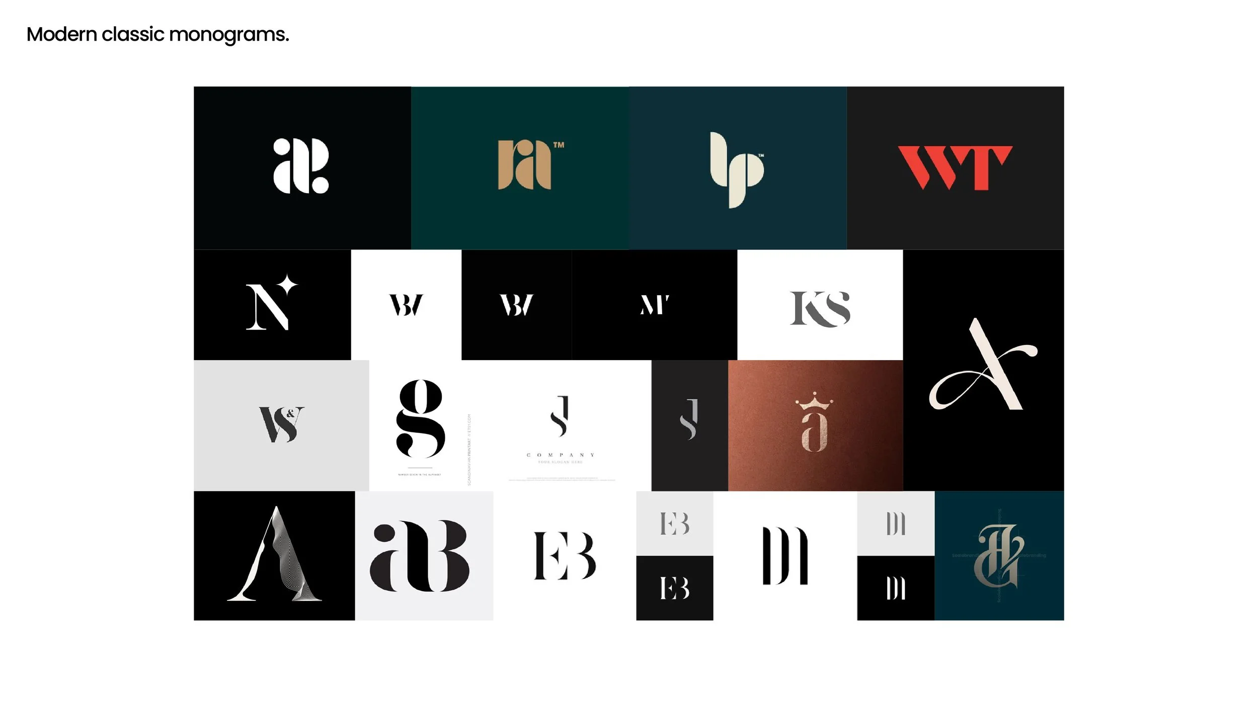
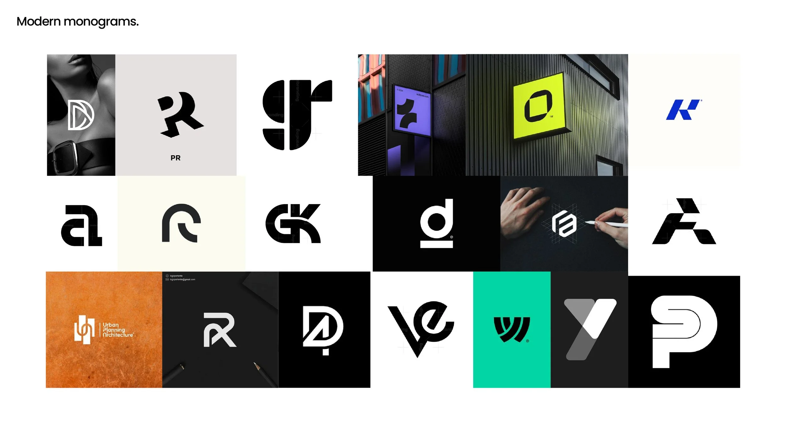

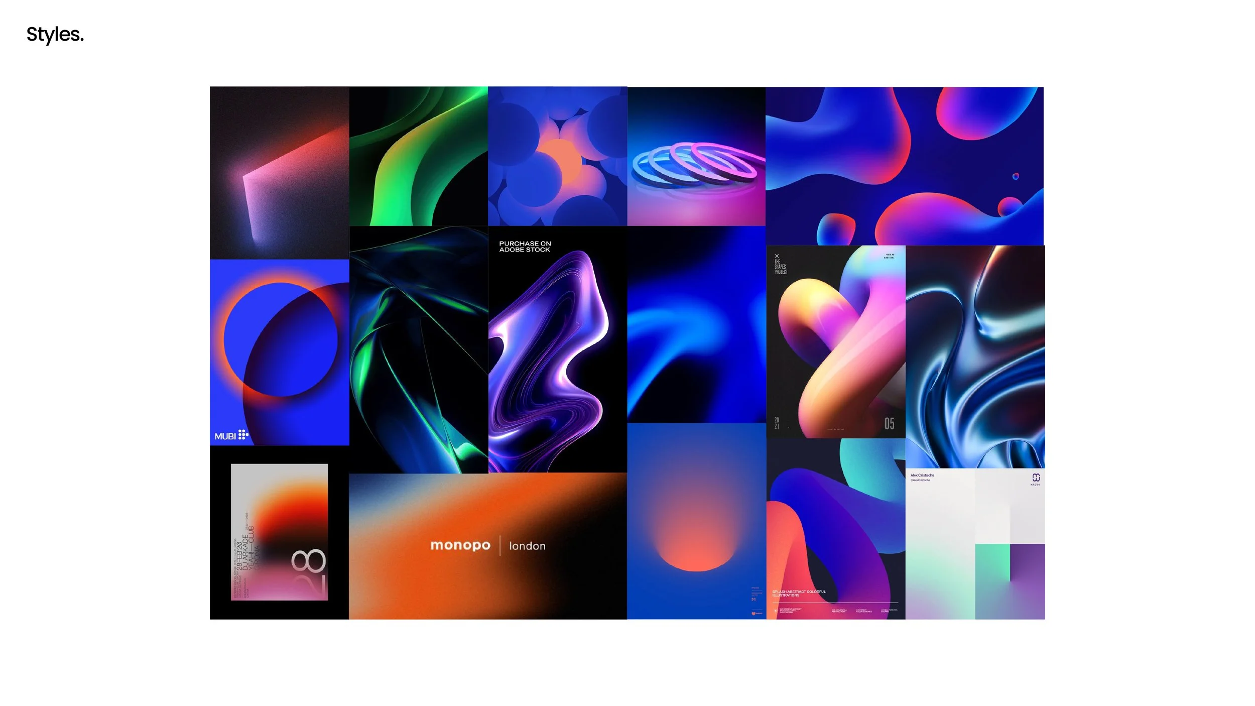
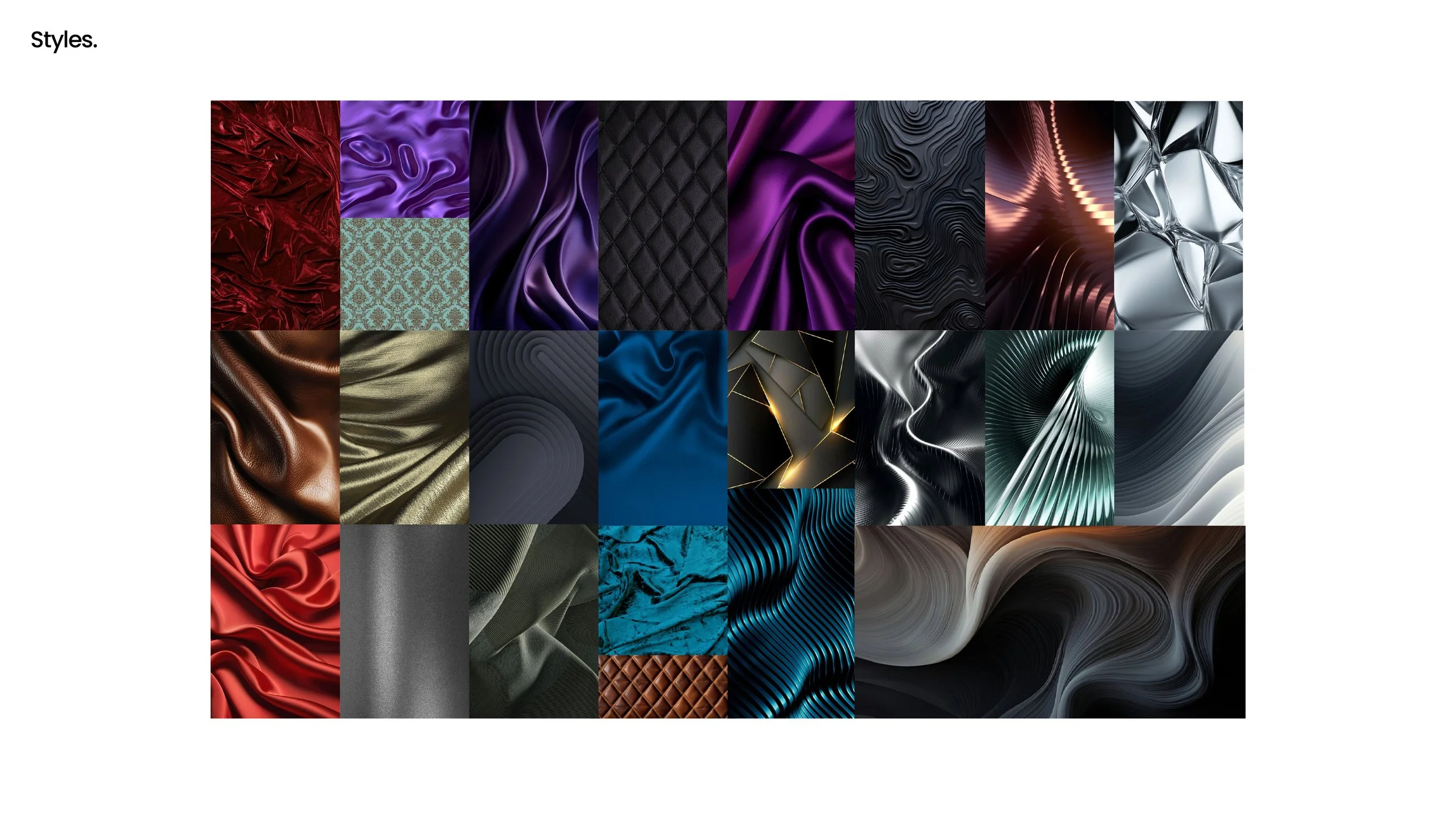
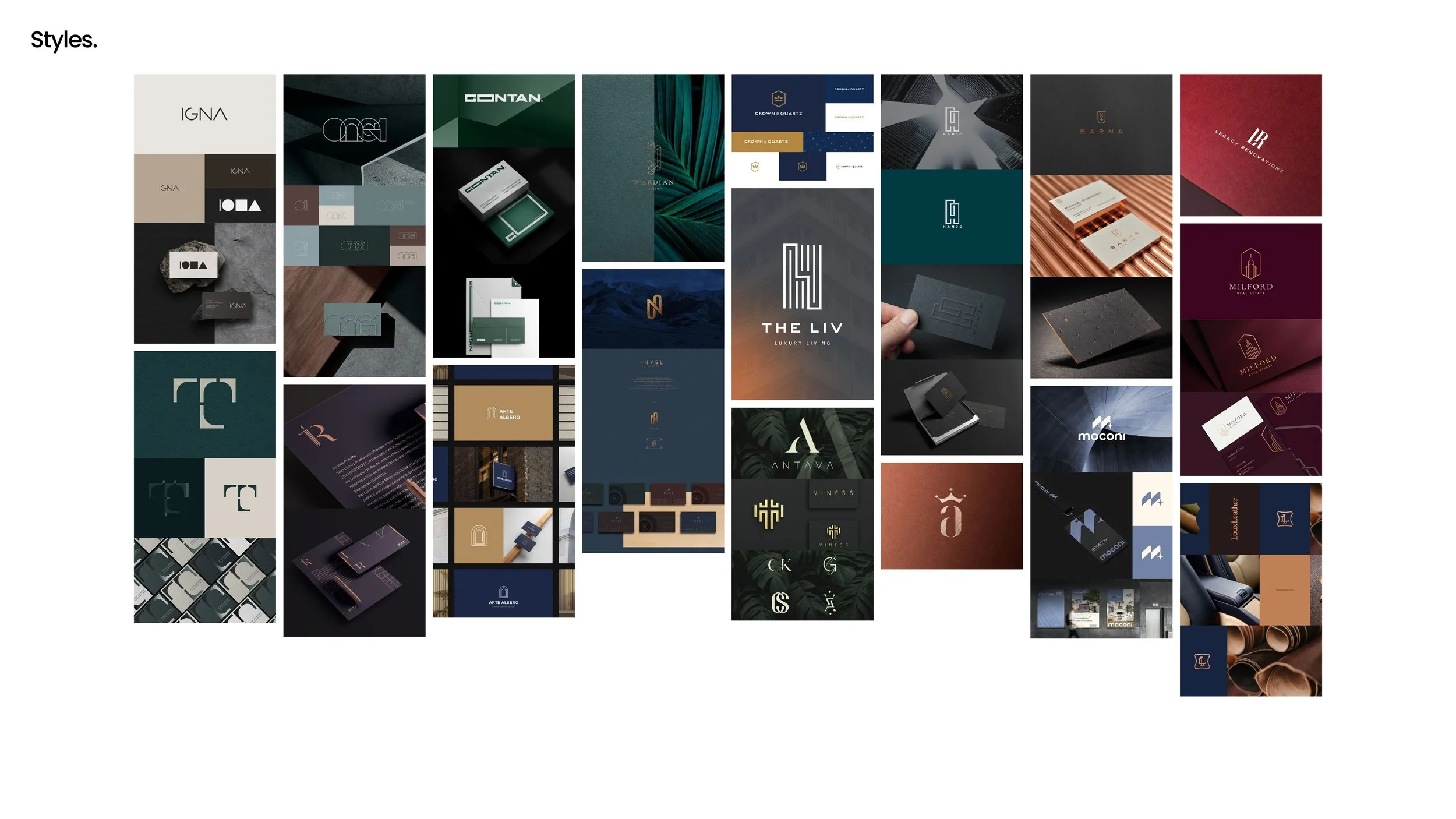
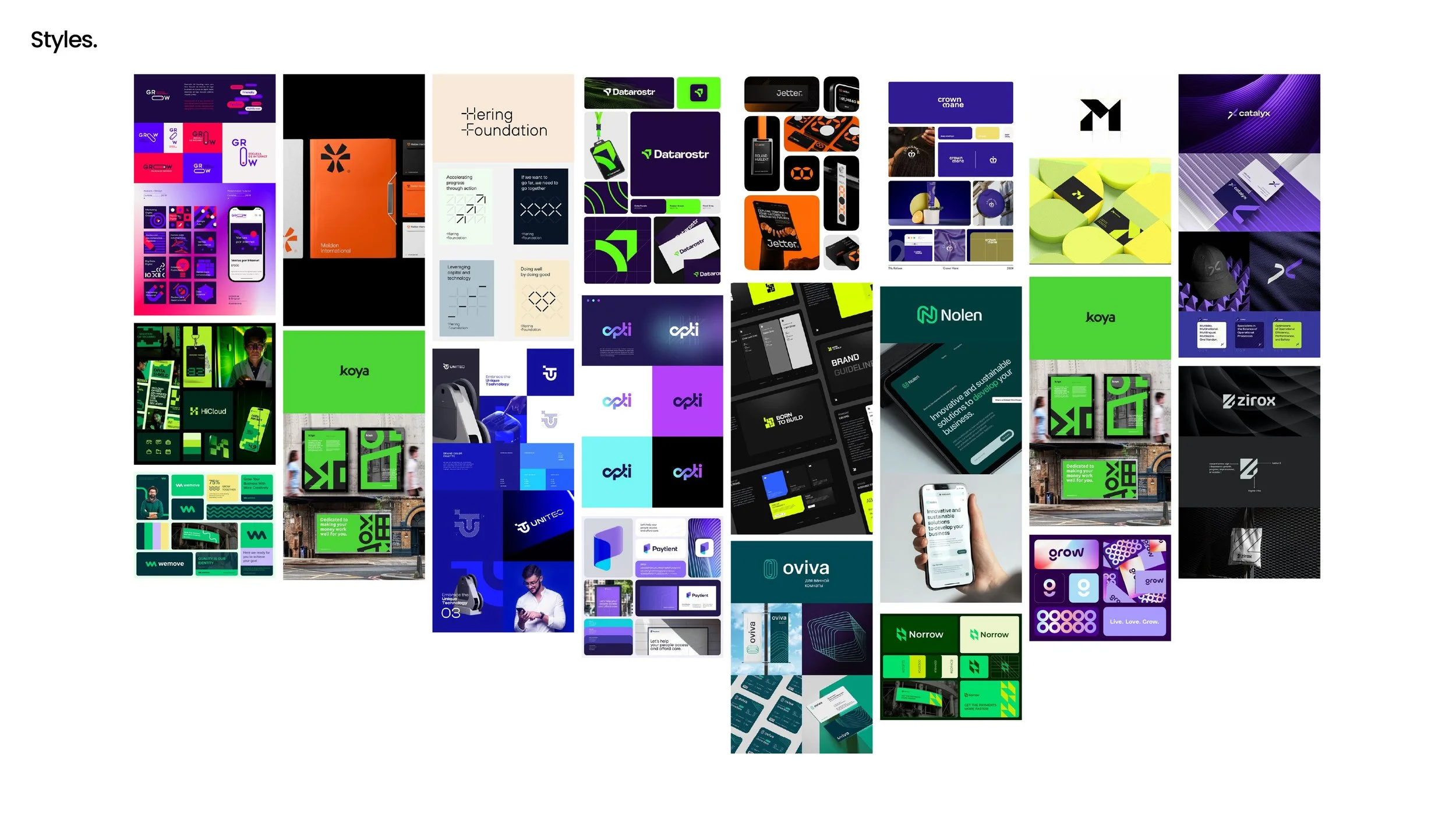
Setting the range of styles on the table.
Before drawing anything we put the full range of options in front of the client, from restrained and traditional through to bold and graphic. Showing the extremes early is the quickest way to find the edges of what a board will accept, and it gave Alvine a vocabulary for describing what they wanted rather than only what they disliked about the old mark.
Finding a typeface with the right manners.
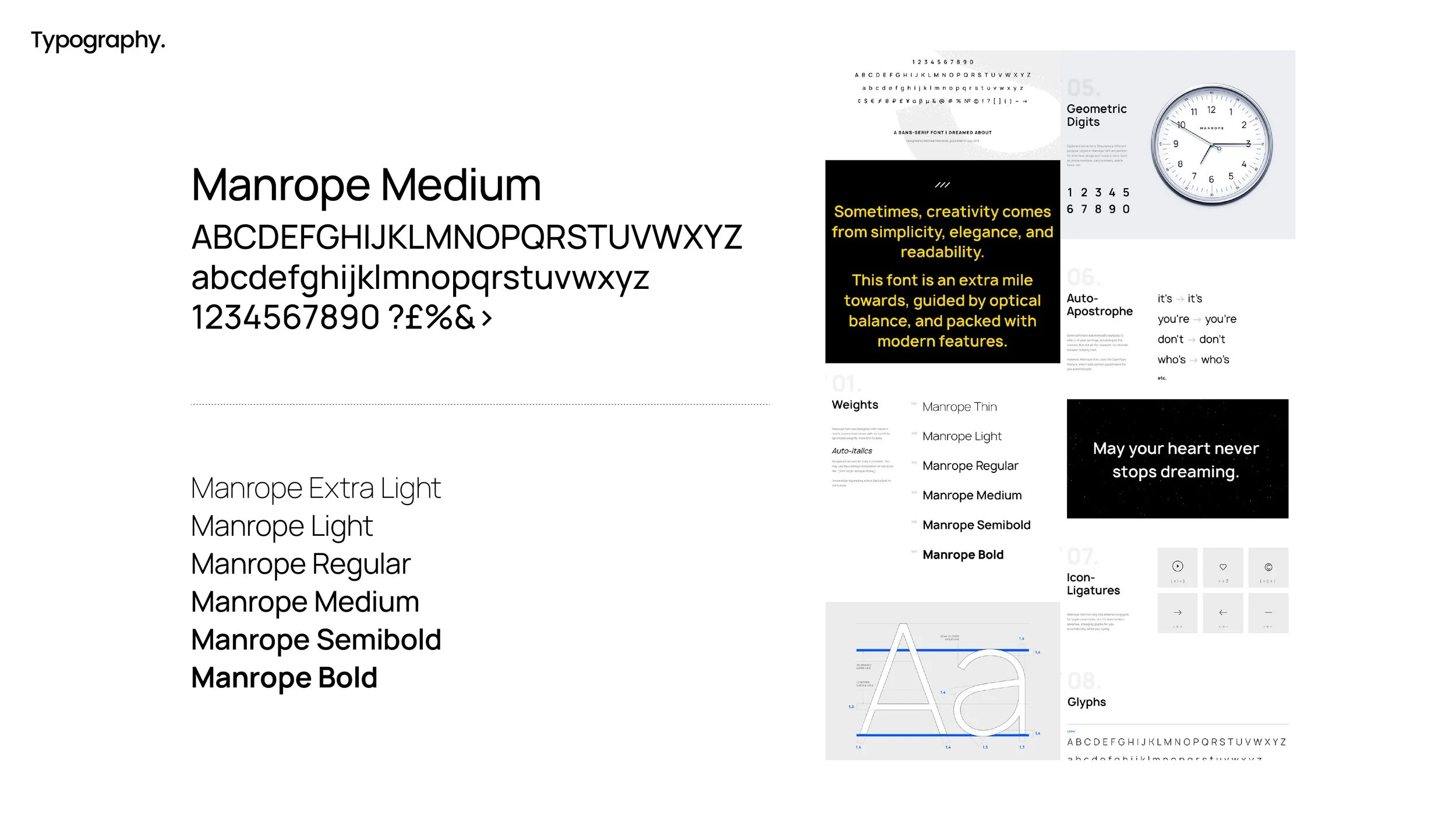
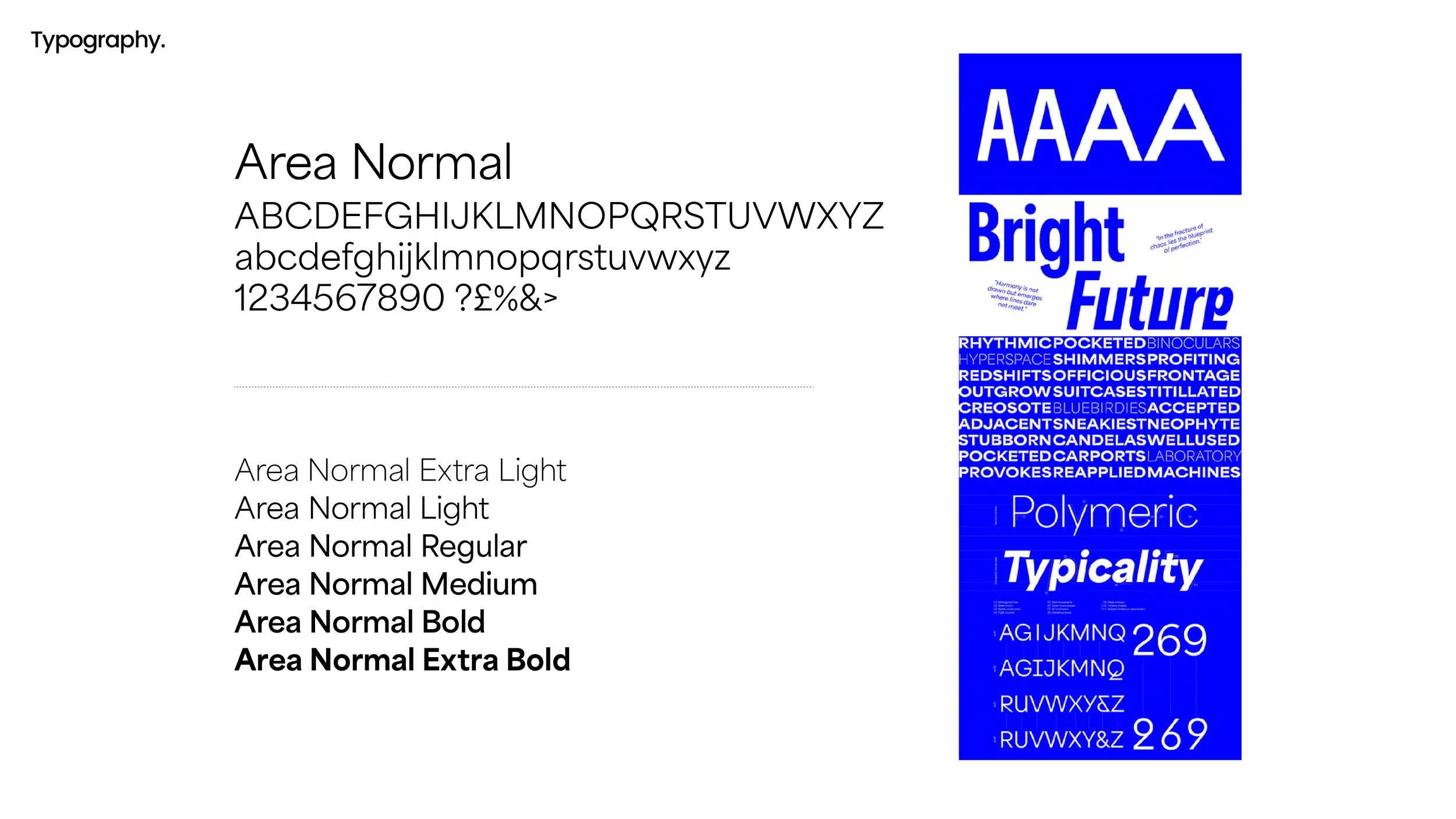
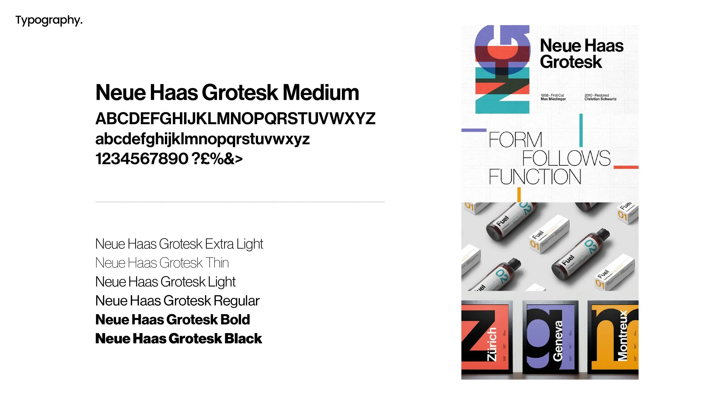
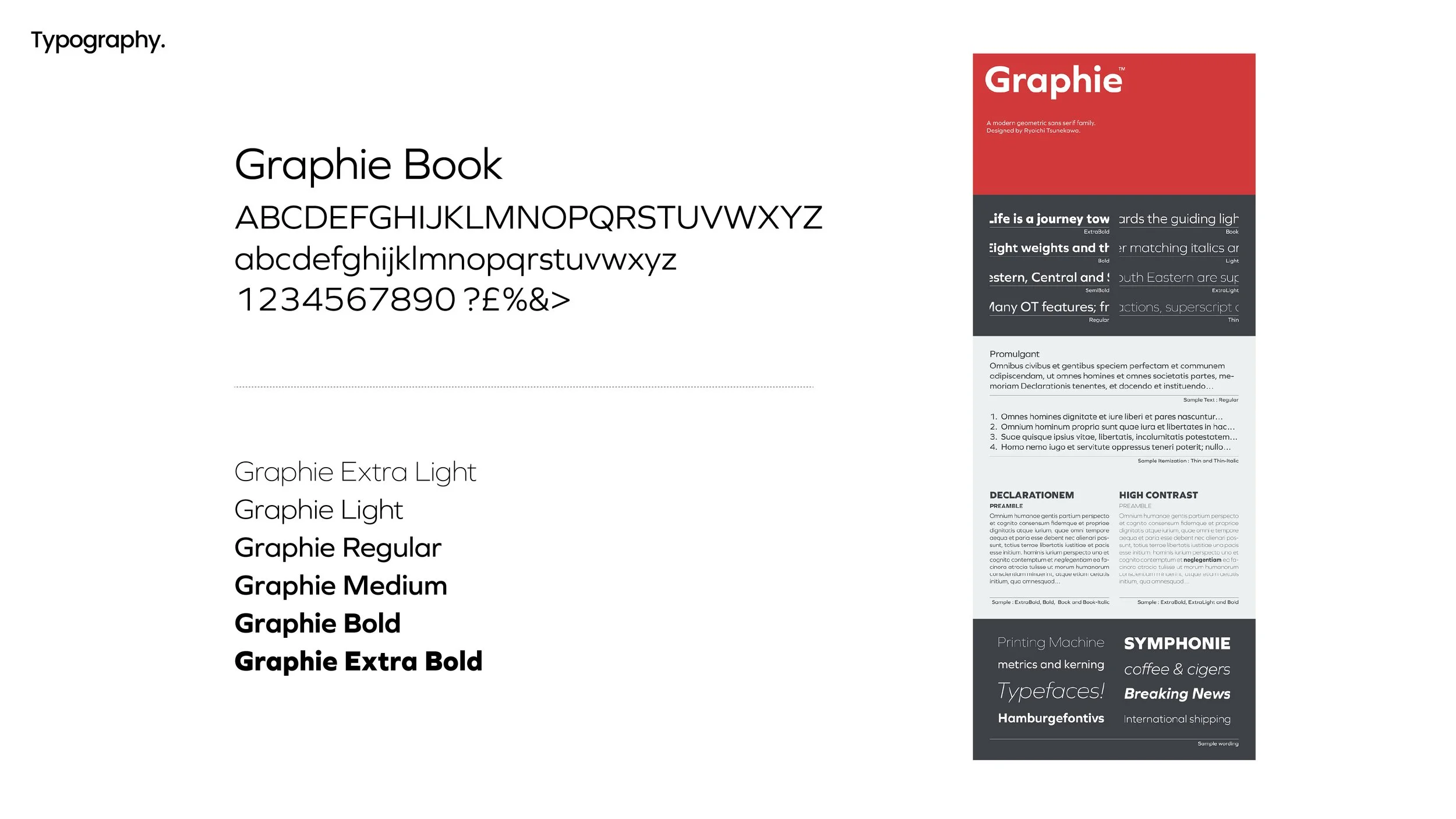
The old wordmark used a dated display face that had to sit on white to work at all. We set the name in six candidates, among them Manrope, Neue Haas Grotesk, DIN 2014, Articulat CF, Area Normal and Graphie, and tested each in title case and in wide letterspaced capitals. What we were looking for was a face that reads as institutional without turning cold, and that holds up small on an email signature as well as large on a cover.
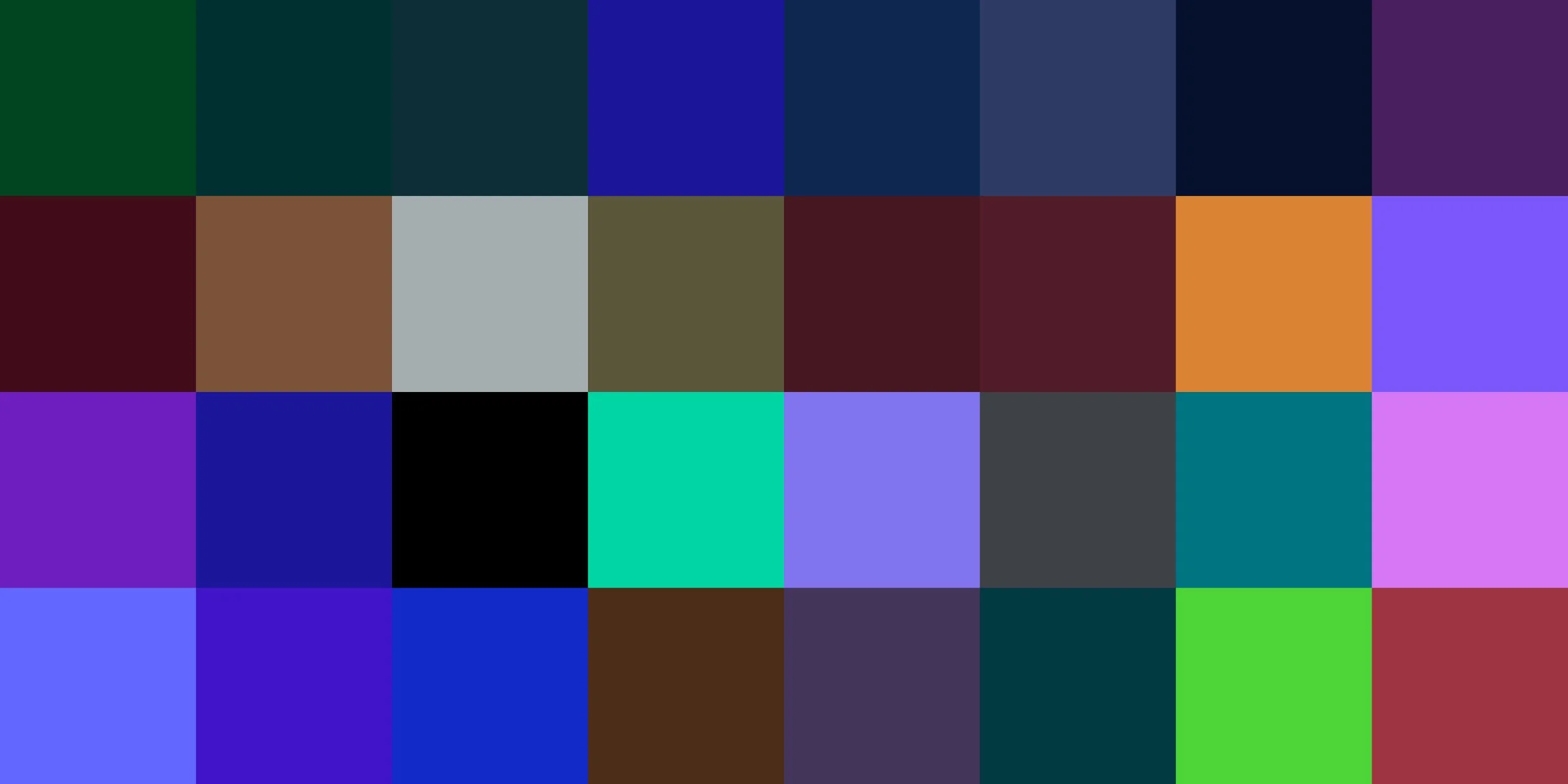
Moving away from a palette that played it safe.
The existing colours were a muted blue and a set of greys, chosen years earlier because they were simple and inexpensive rather than because they meant anything. The team told us plainly that it felt safe and bland. We put four directions forward, deep navy for trust, gunmetal grey for restraint, dark green for growth and deep burgundy for prestige, and tested each at full strength rather than as a tint, so the decision was made on how the colour behaves in use.

Every route, in every colourway.
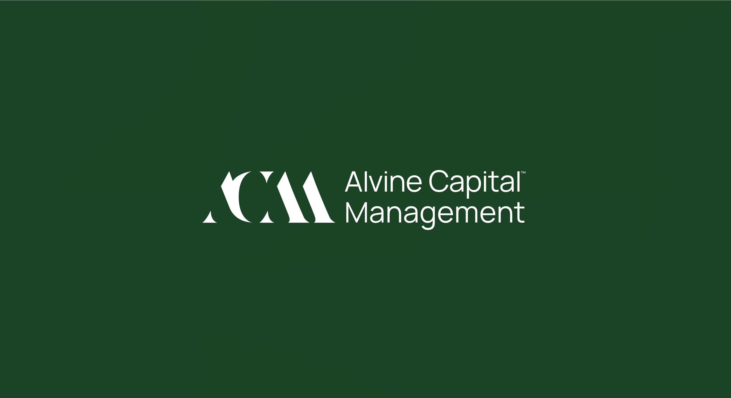
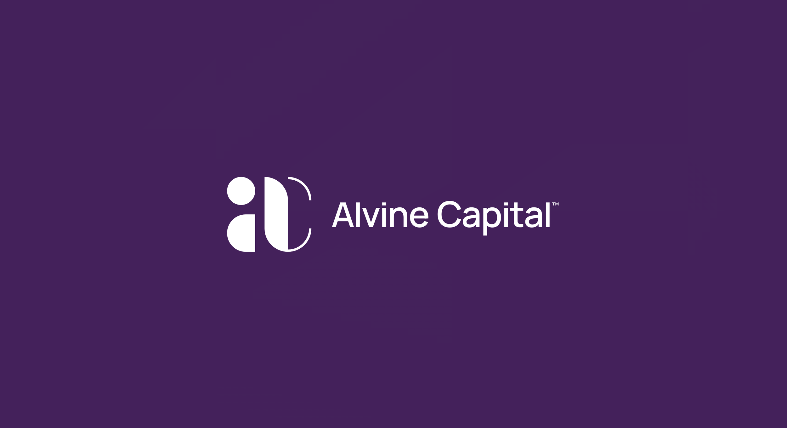
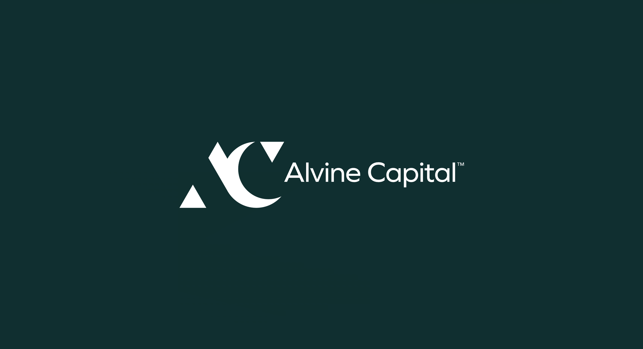
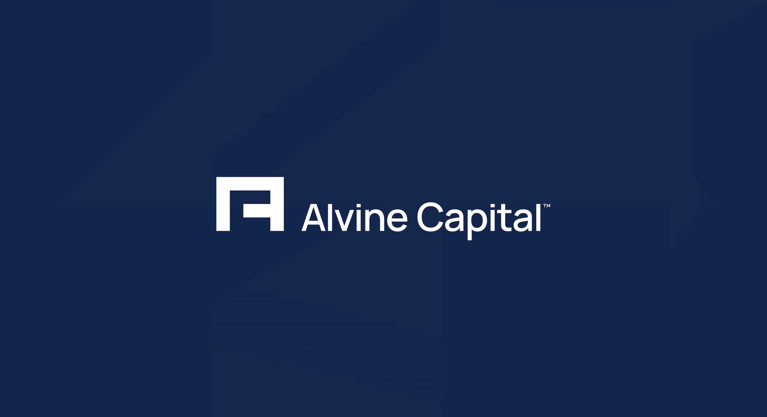
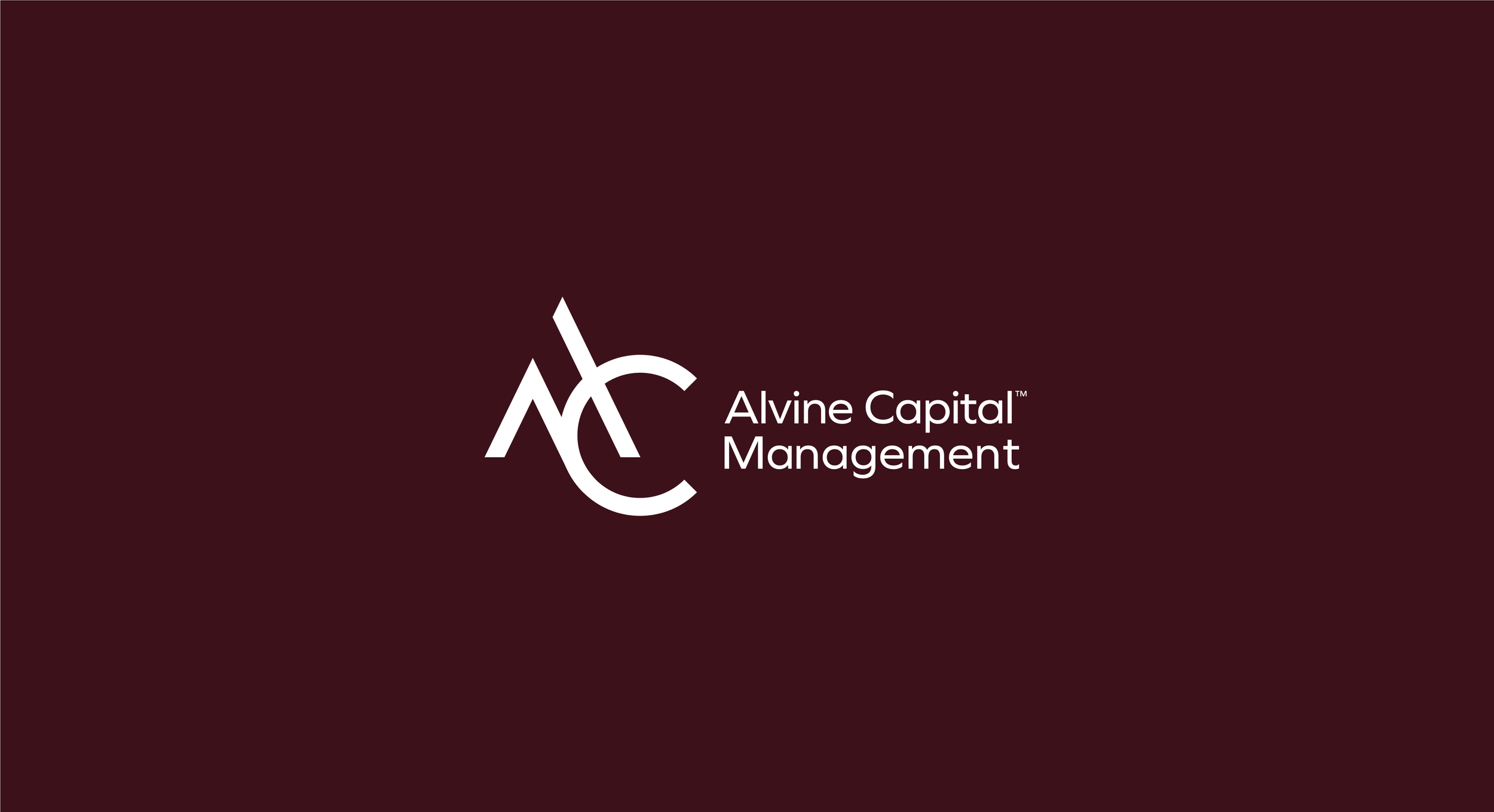
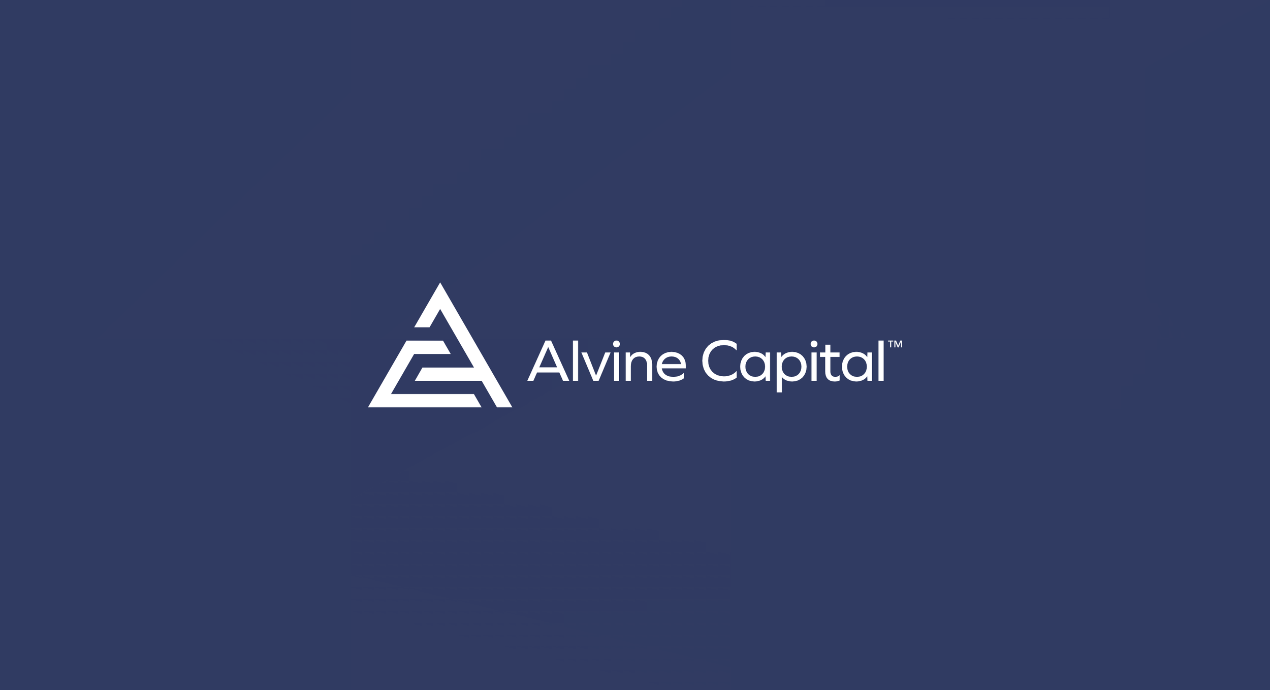
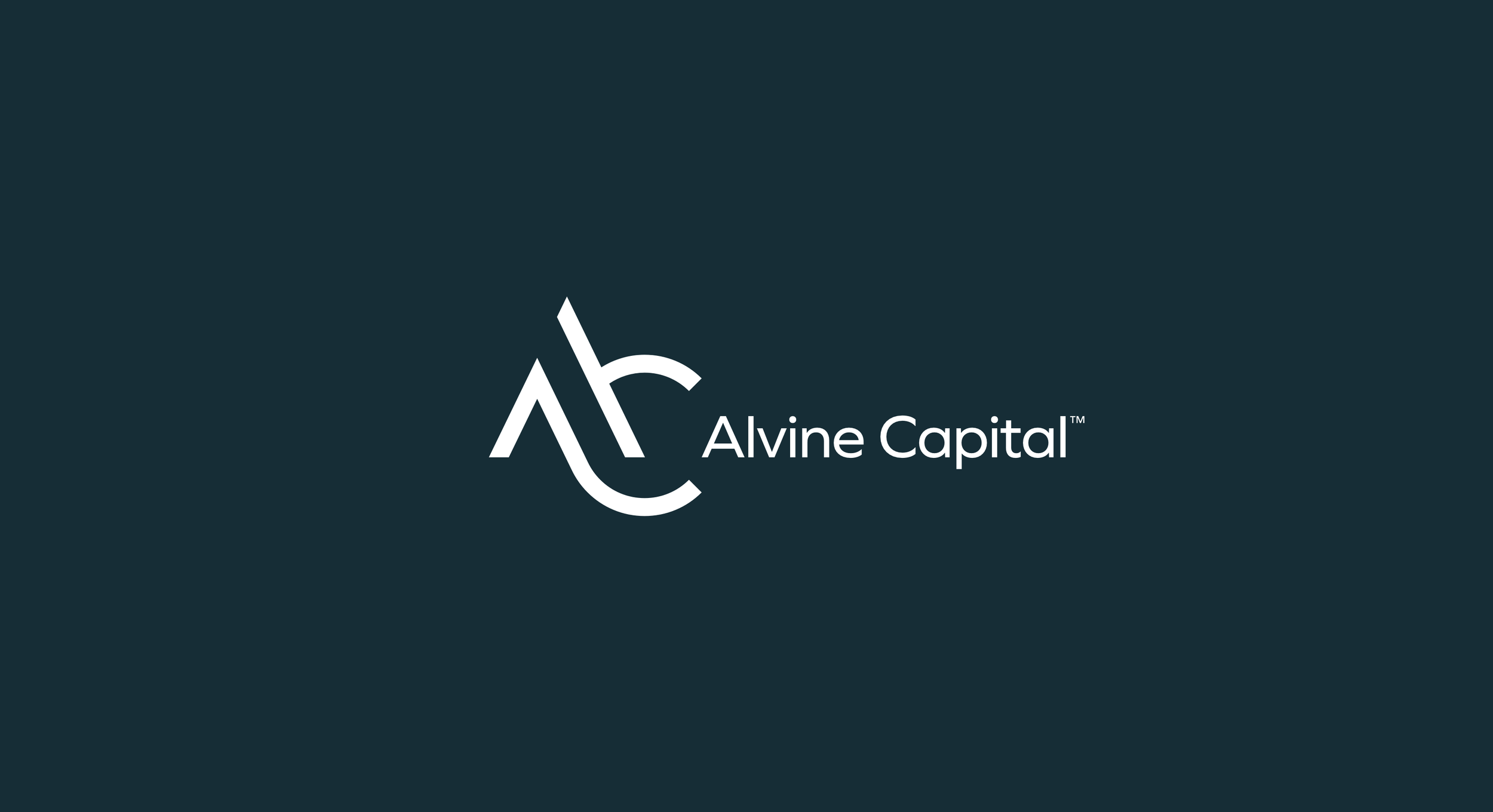
Rather than present three polished concepts and hope one landed, we showed every serious route across each of the four palettes. Some used the full name, some shortened to Alvine Capital, and several built an AC monogram in different ways. Seeing them together made the conversation concrete. The board could compare like with like, and the marks that were merely clever fell away quickly against the ones that still looked right at the twentieth viewing.

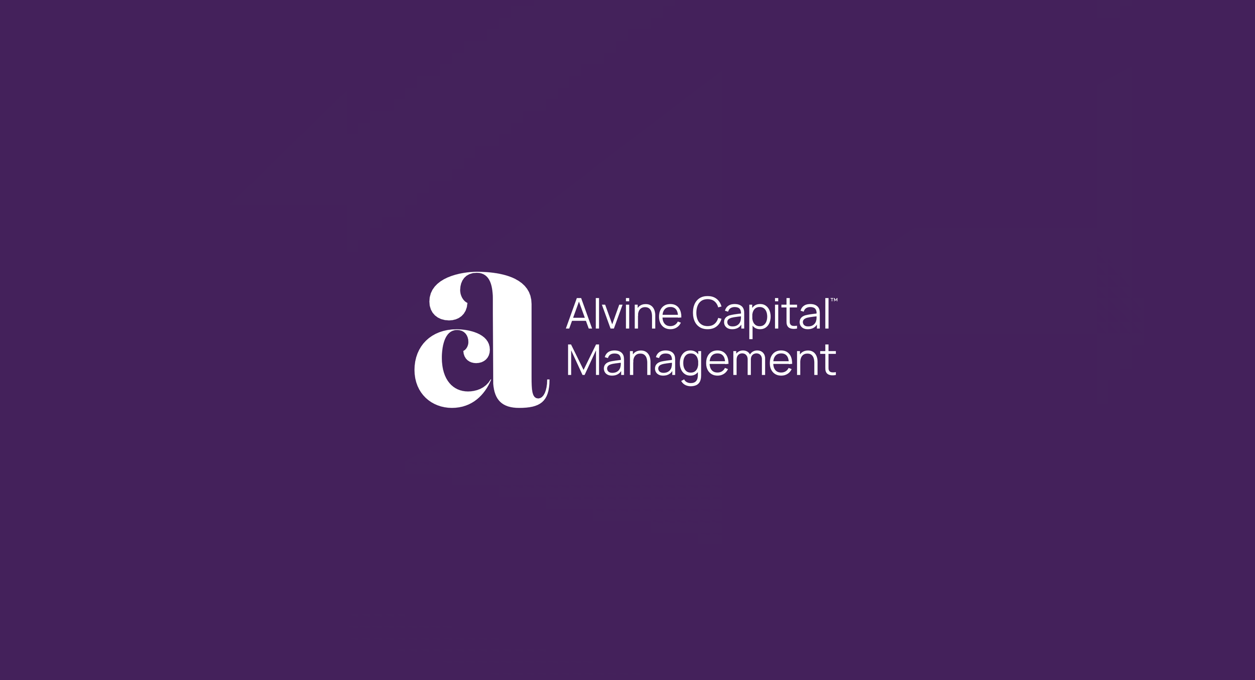
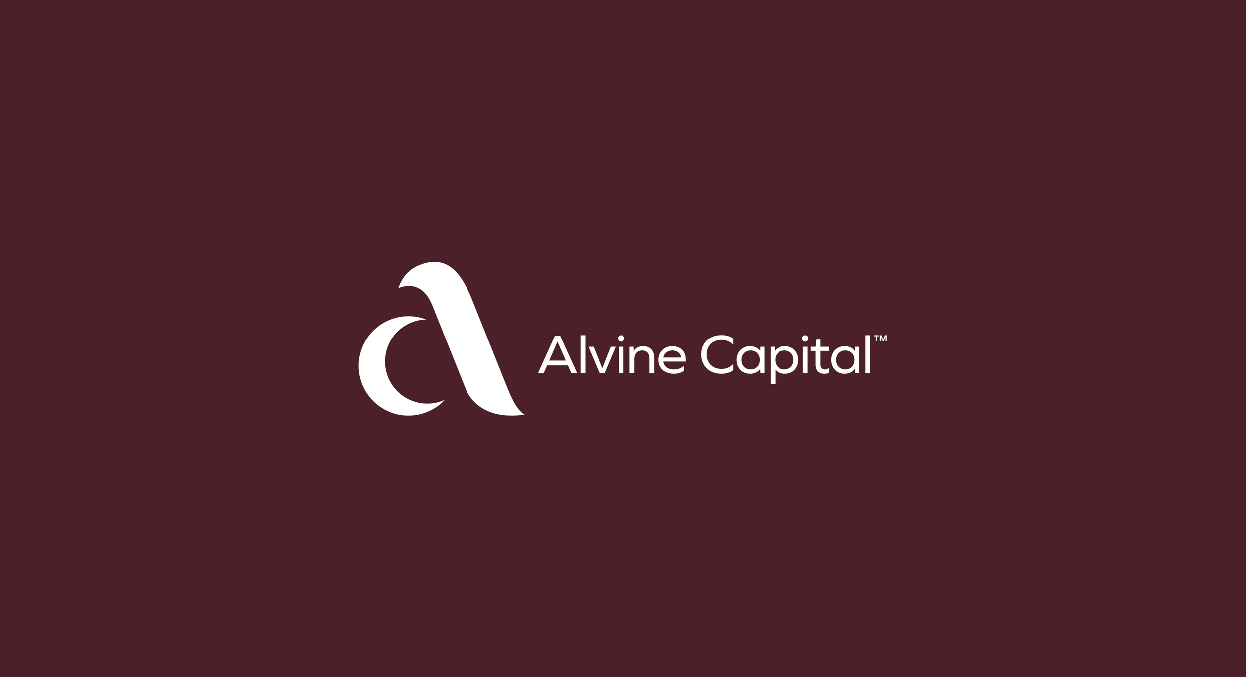
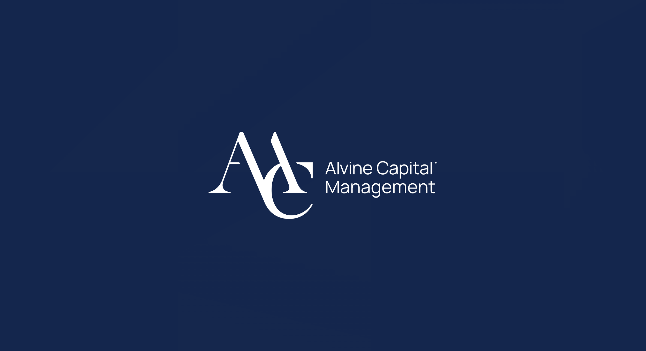
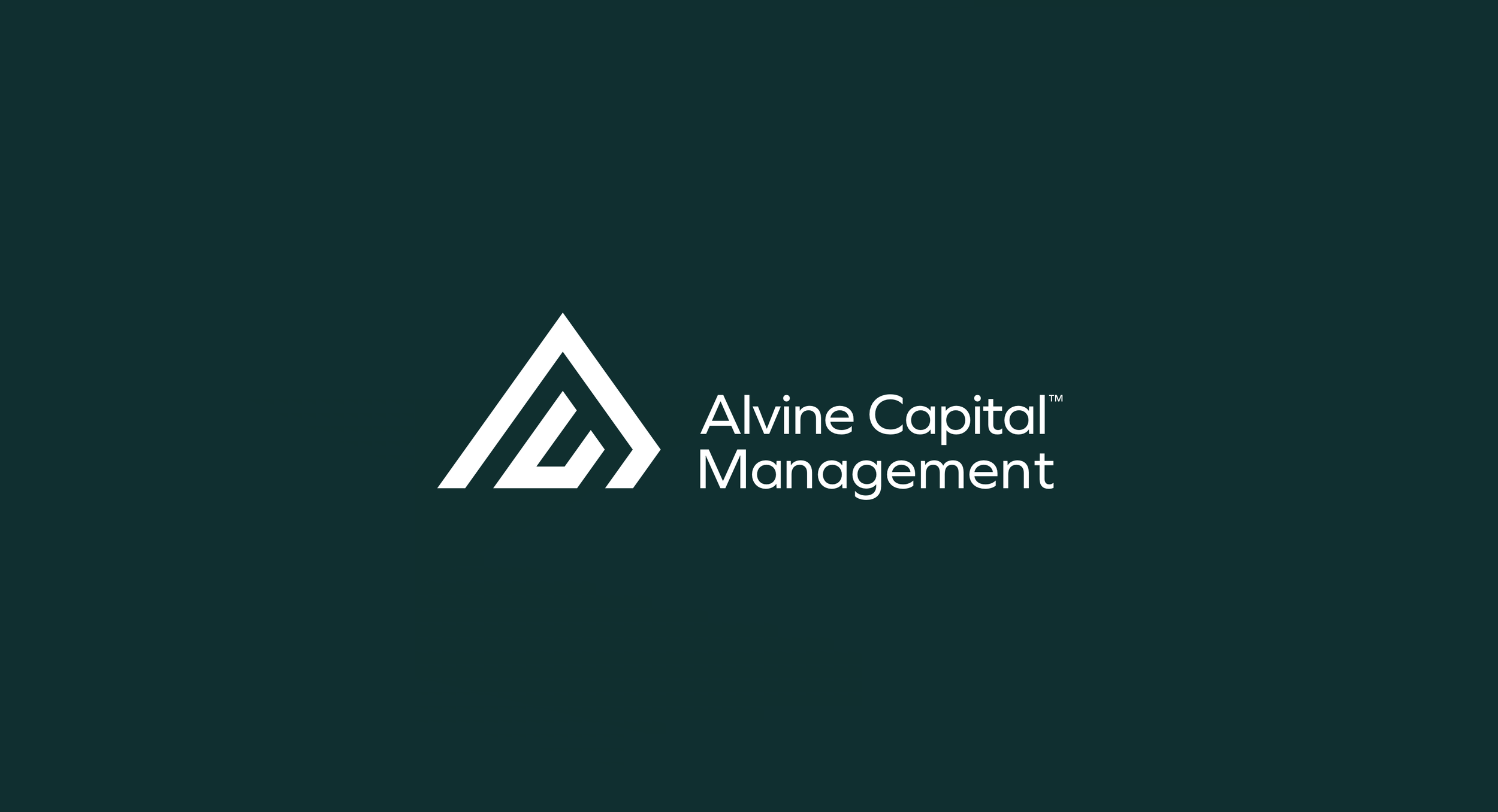
Refining the mark until it held in one colour.
With the direction agreed, the work moved to the detail. We tested every version in solid black and reversed out in white, because a mark that only works in its brand colour is a mark that will fail on an embossed folder, a signage panel or a single colour print run. The joint between the A and the C was drawn and redrawn, the weight balanced against the wordmark, and the lockup set so the monogram can stand alone when space is tight.
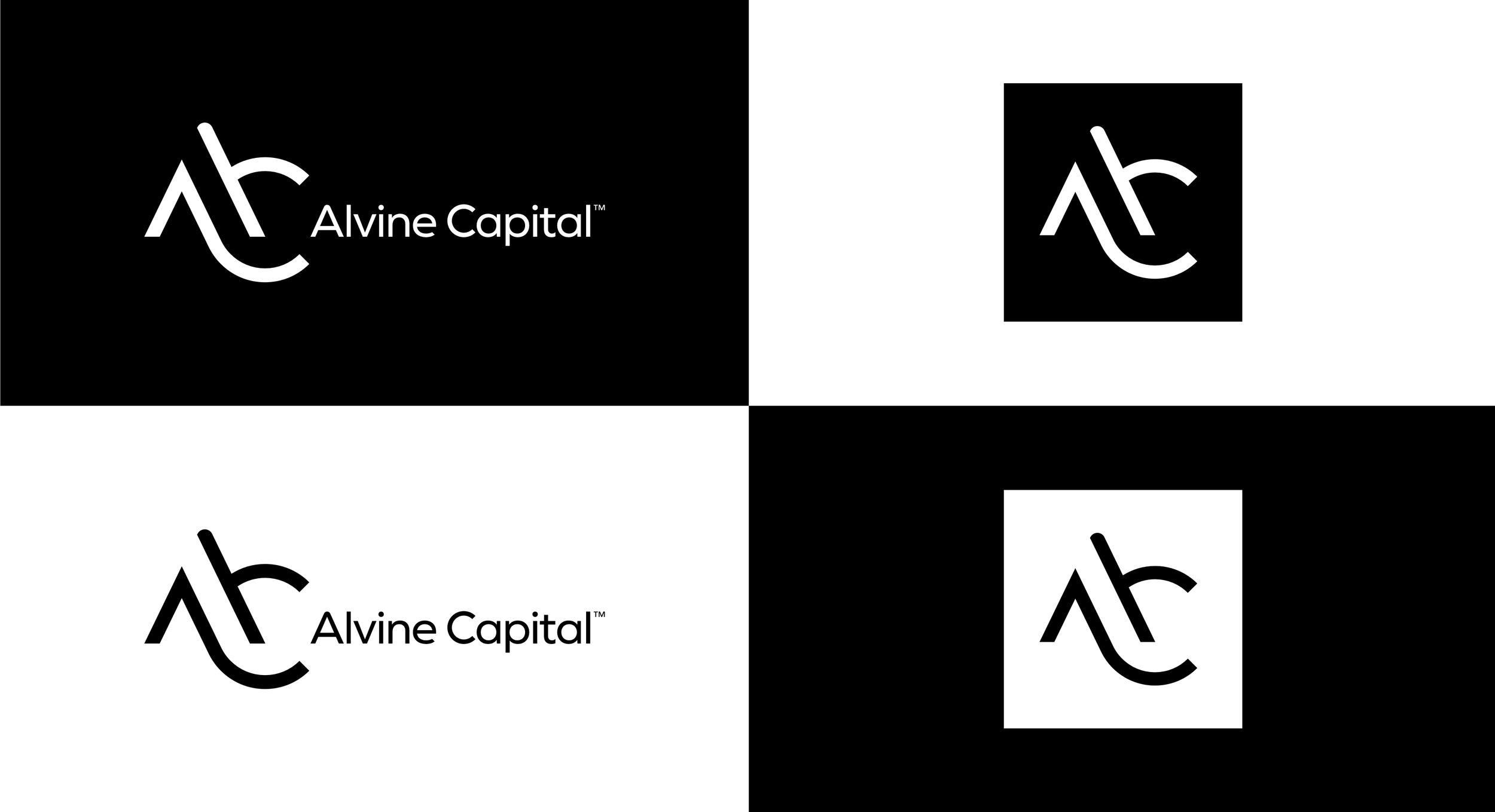
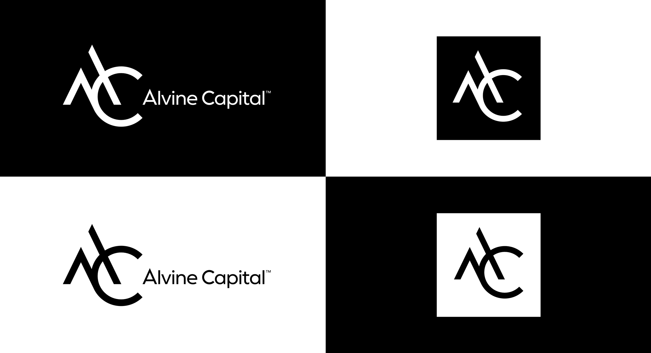
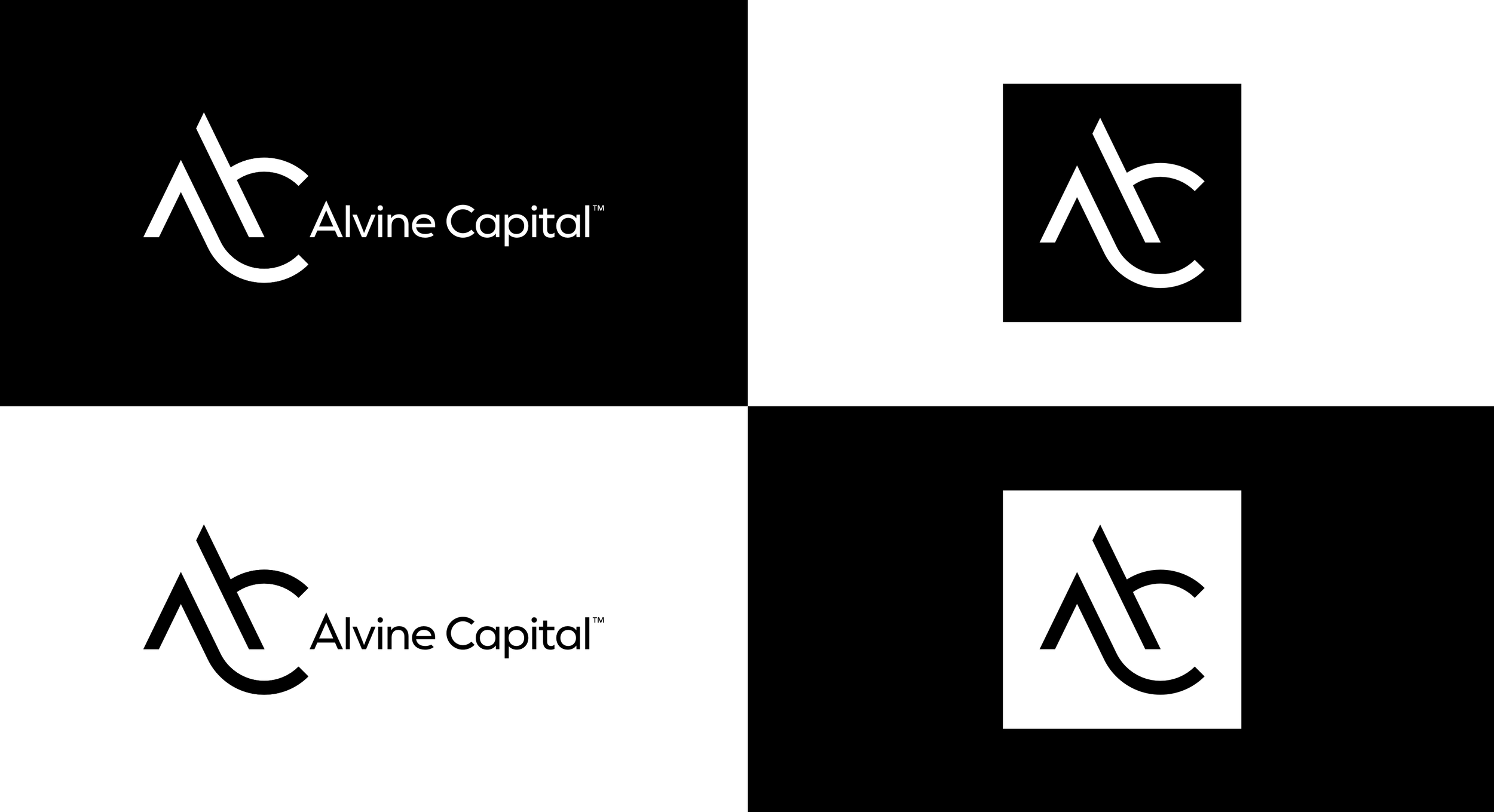
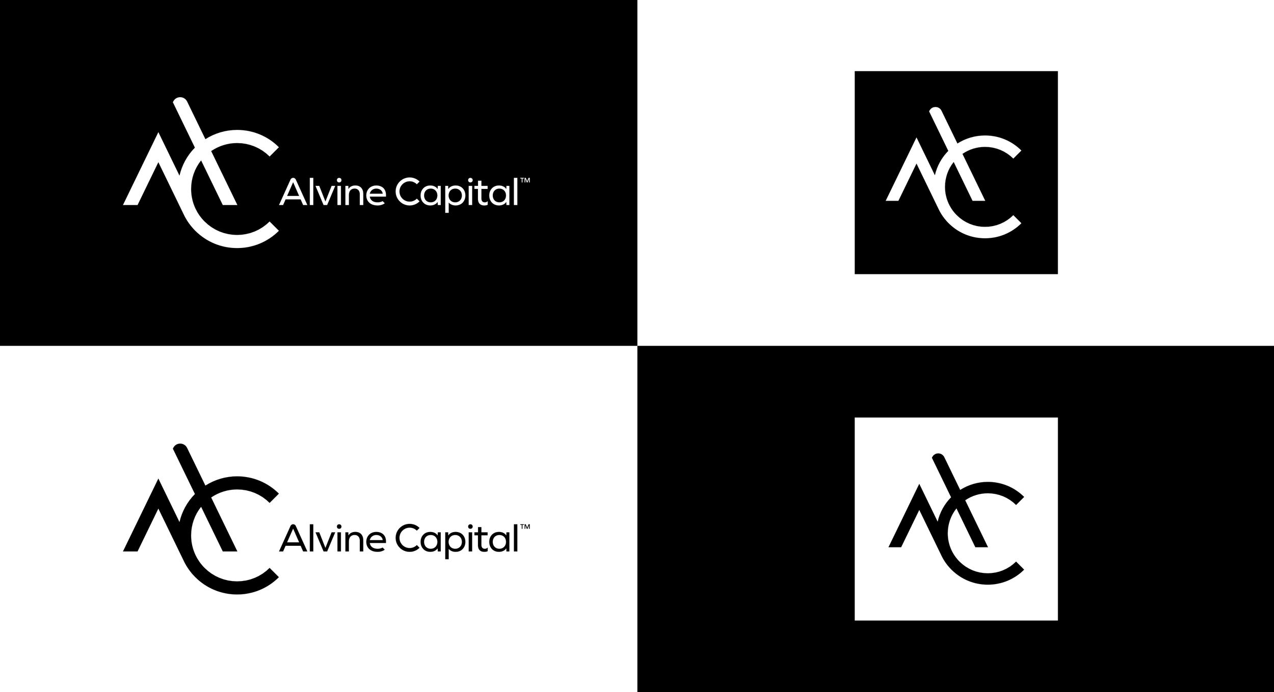
One mark, two readings.
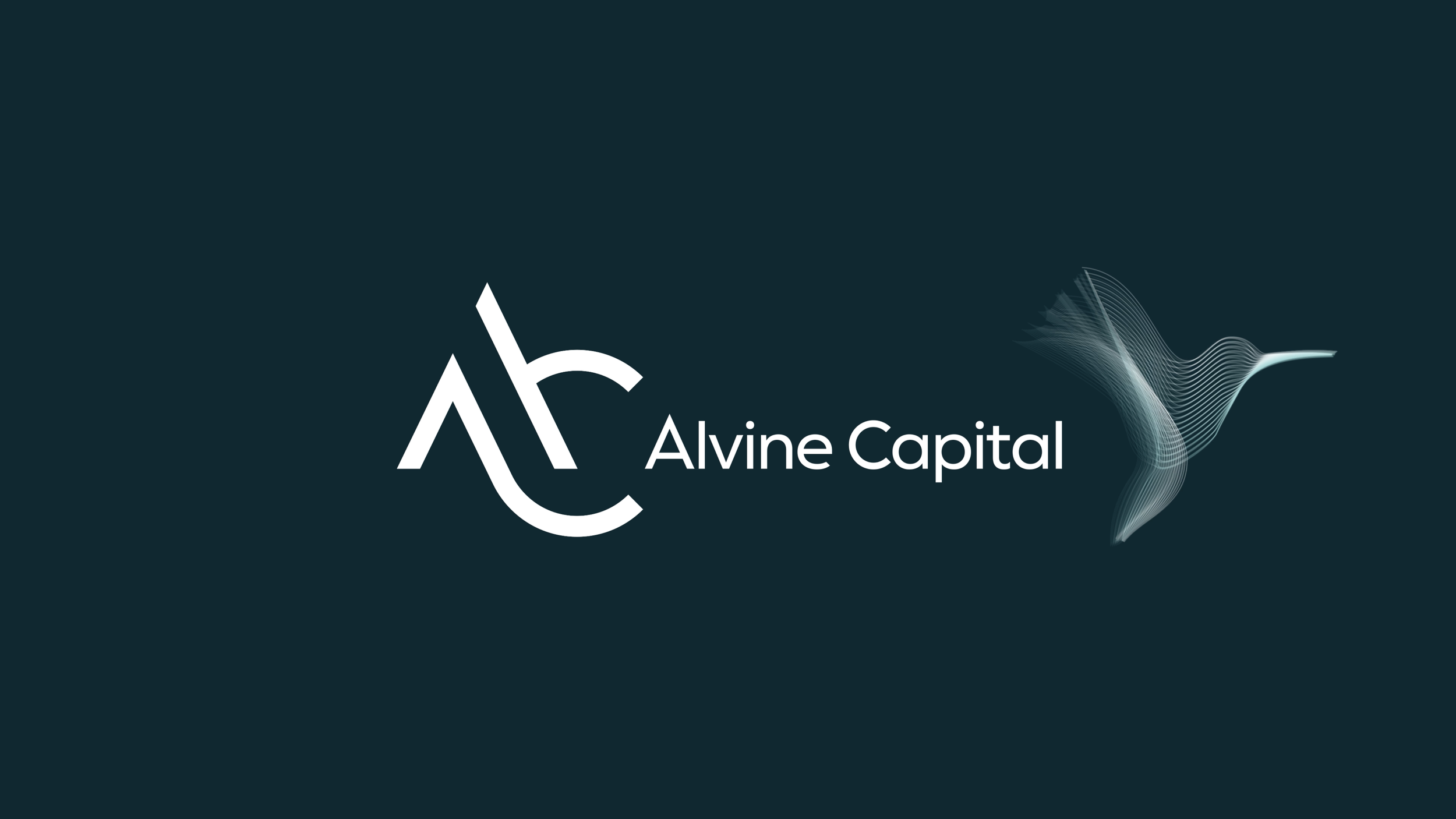
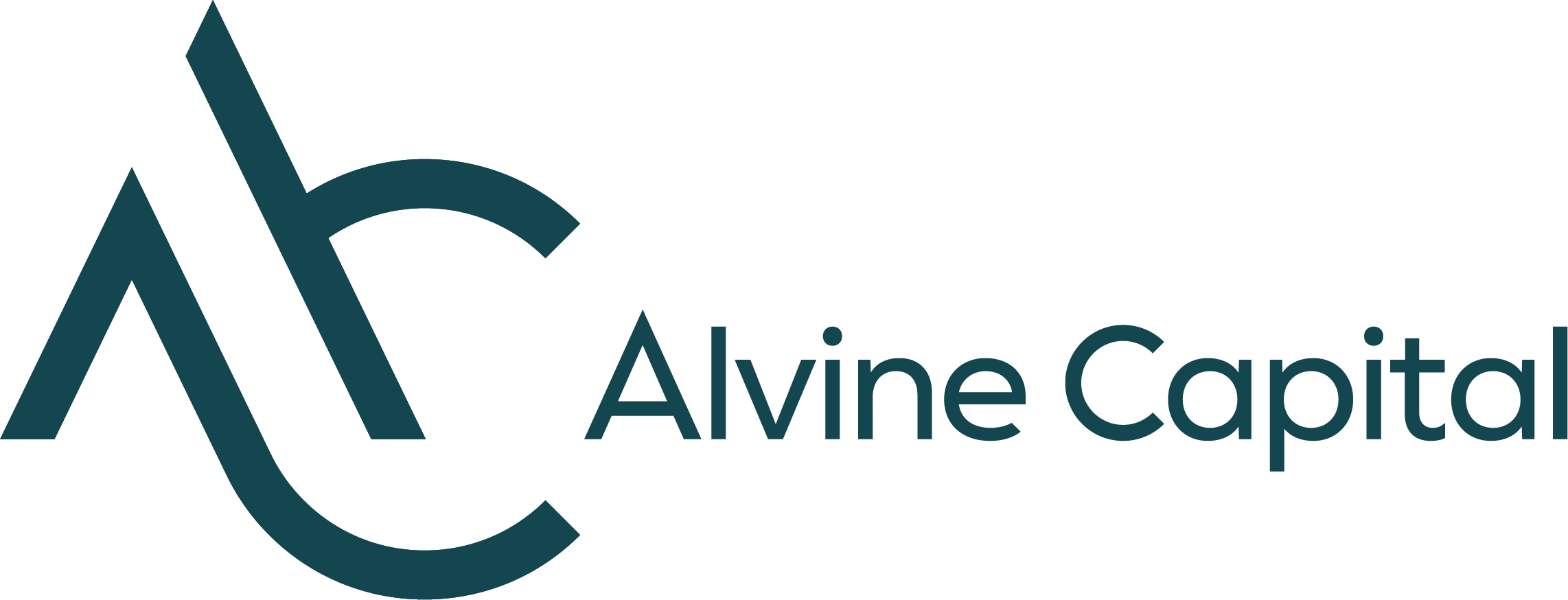
The finished monogram is an A and a C drawn as one continuous gesture. Read again, the ascender and the sweep beneath it suggest a bird in flight, which keeps a thread back to the original identity without repeating it. It works in a single colour, reverses cleanly, and holds its shape at the size of a favicon. The wordmark sits alongside in a modern grotesque, set quietly so the monogram does the talking.
Seven directions for the wider brand world.
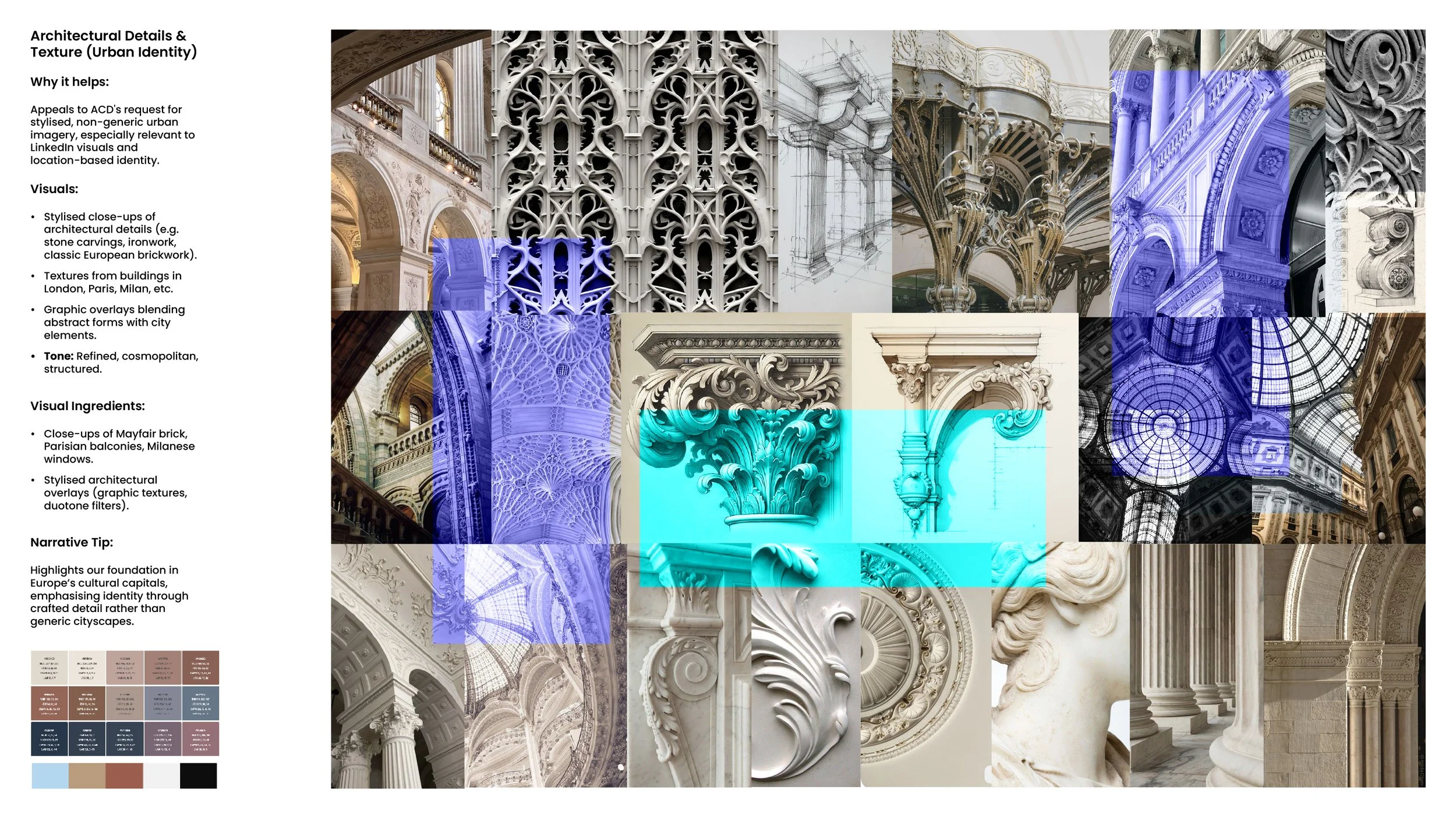
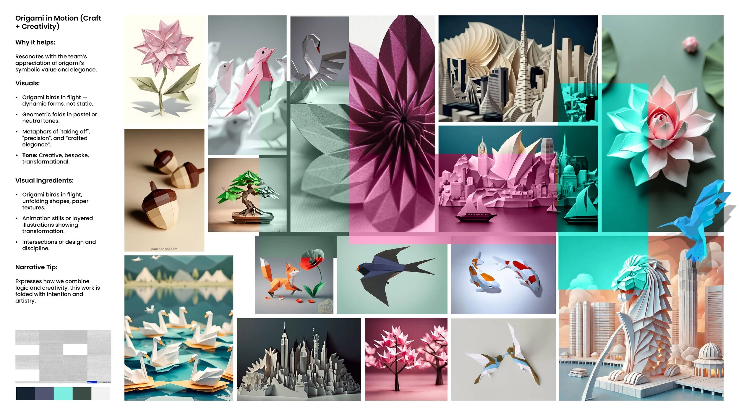
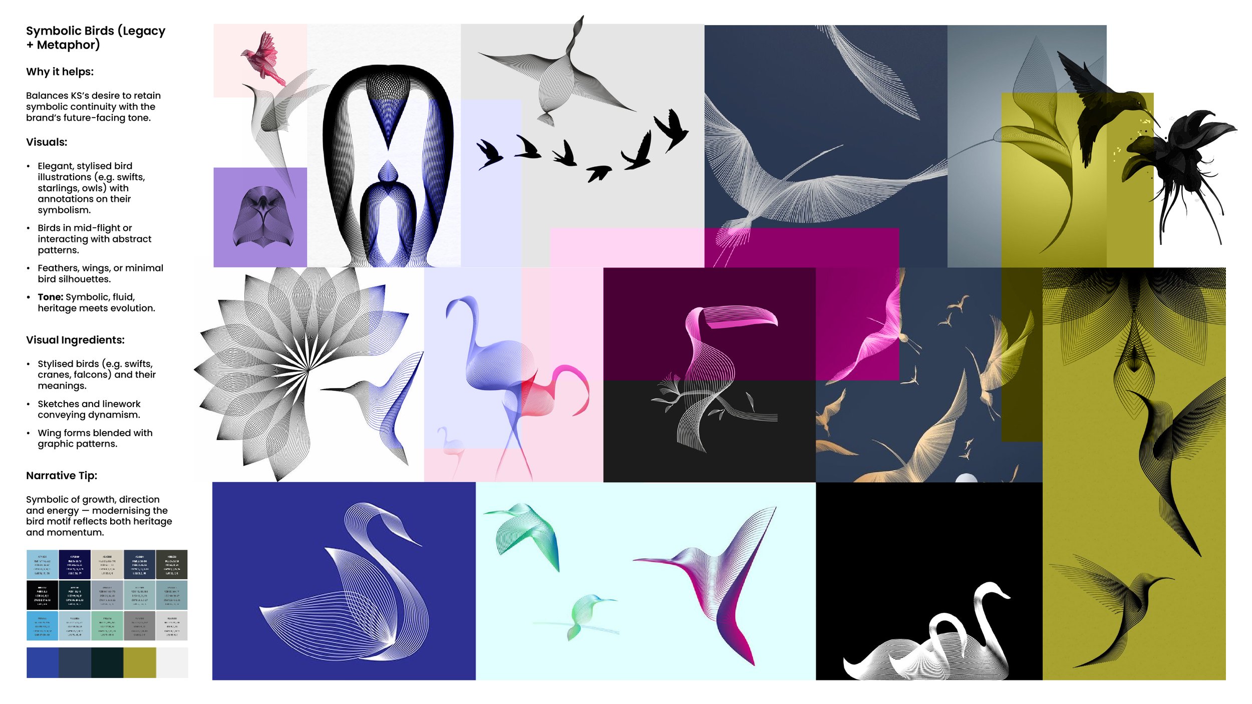
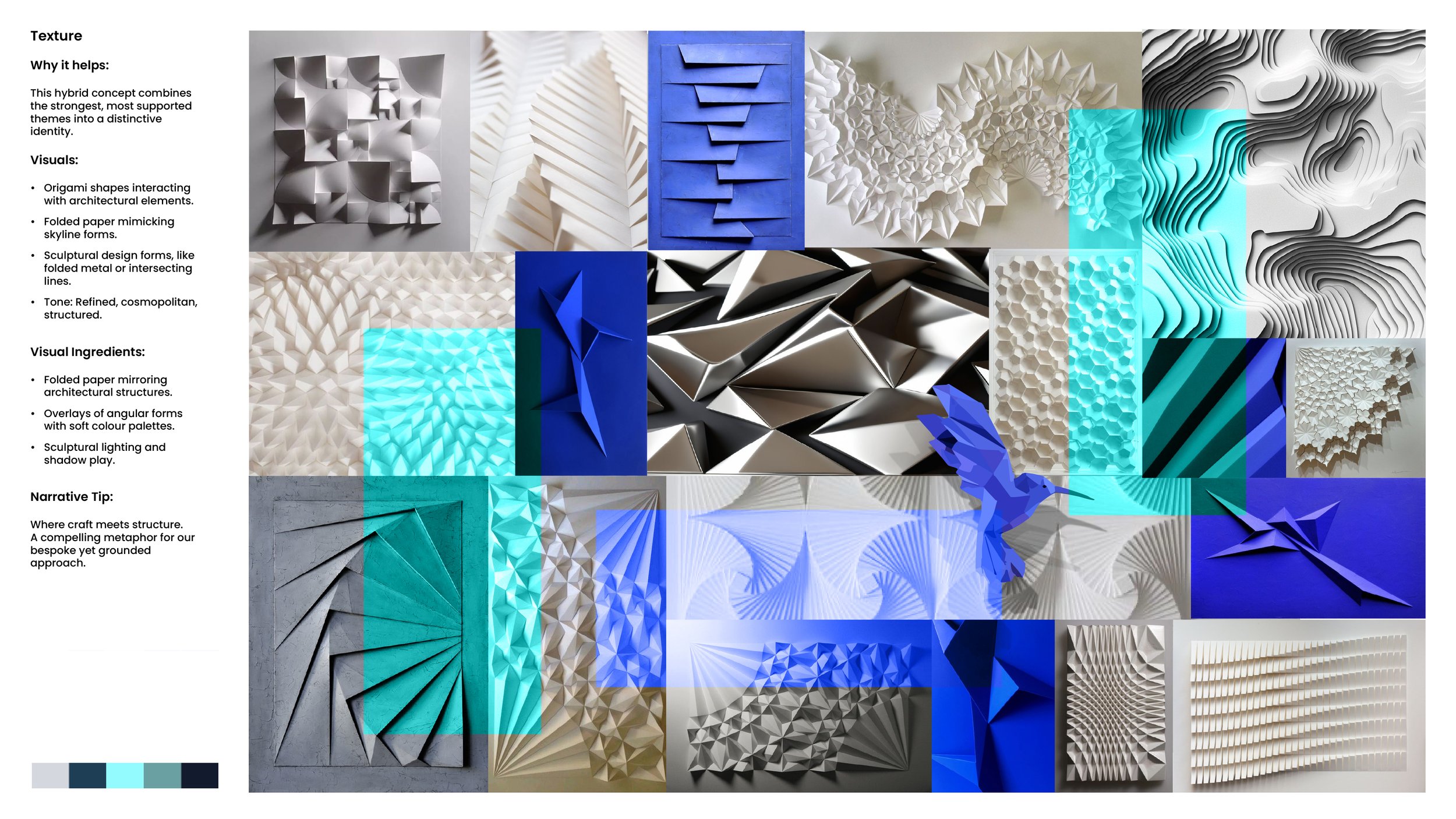
A logo is only the start. We built seven moodboards to decide how everything around it should look, each with a note on why it might suit the firm. They ranged from architectural detail drawn from Europe’s financial capitals, through symbolic birds and origami in motion, to abstract navigation instruments and organic growth. Each board carried a short narrative, so the client was choosing a story about the business rather than simply picking pictures they liked.
A cover system, not a one off cover.
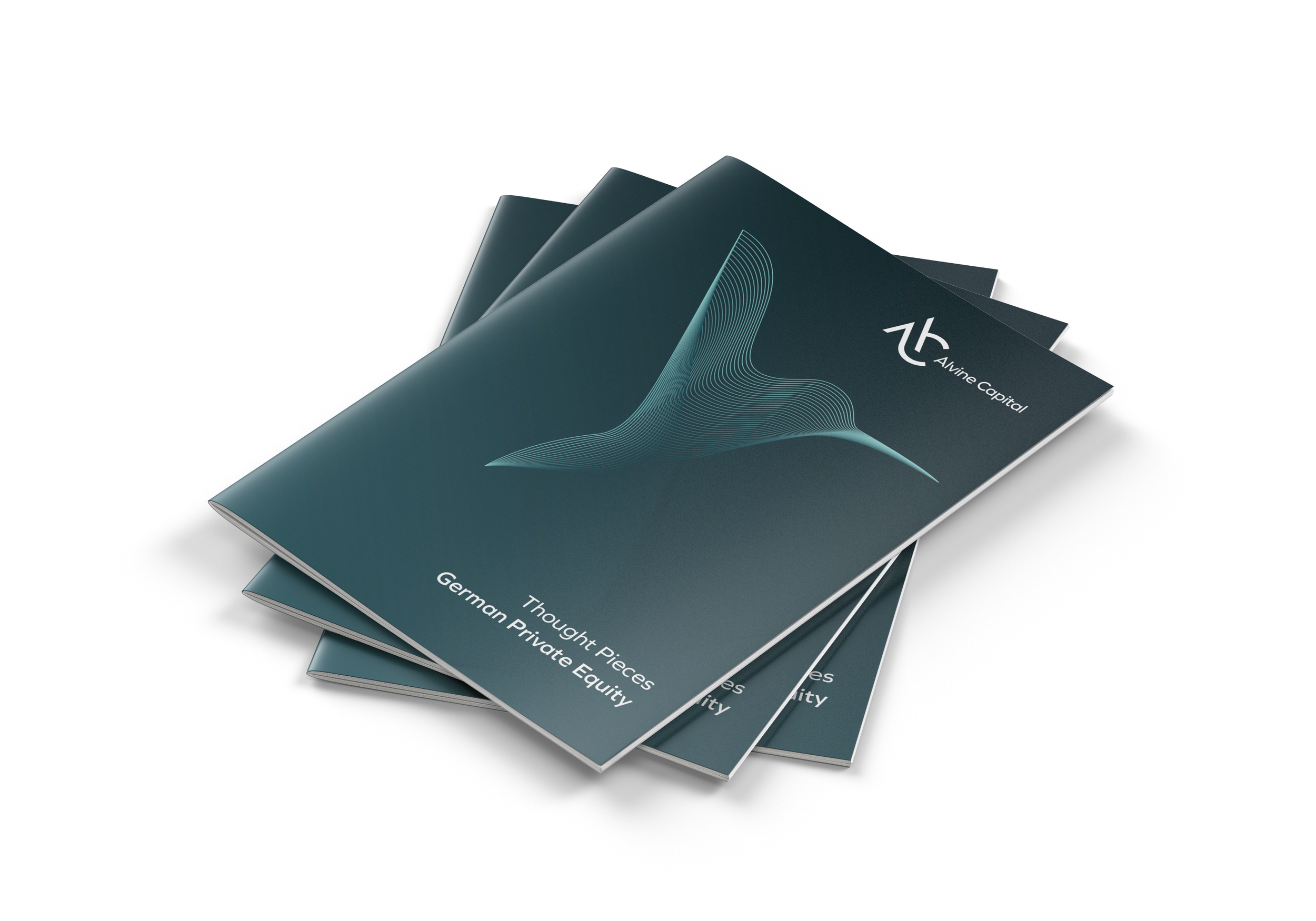
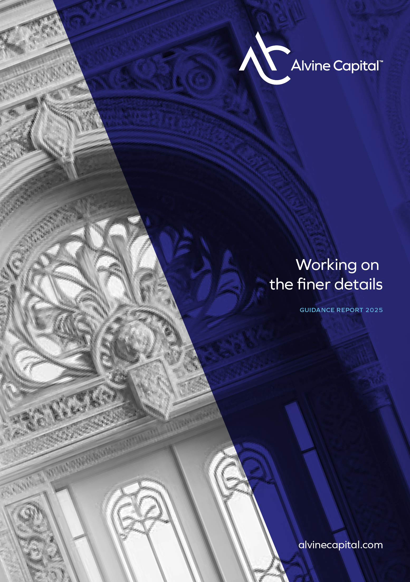
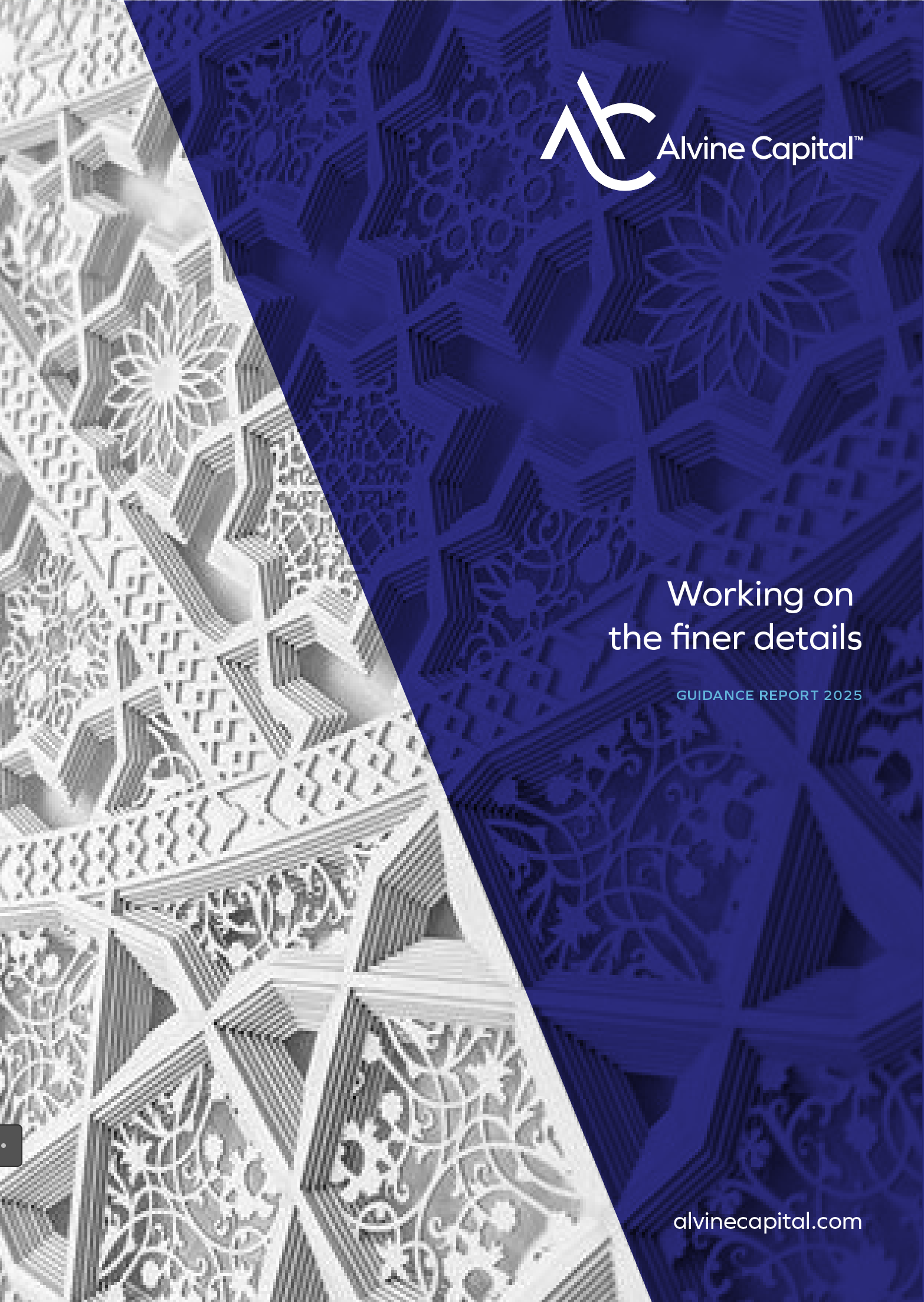
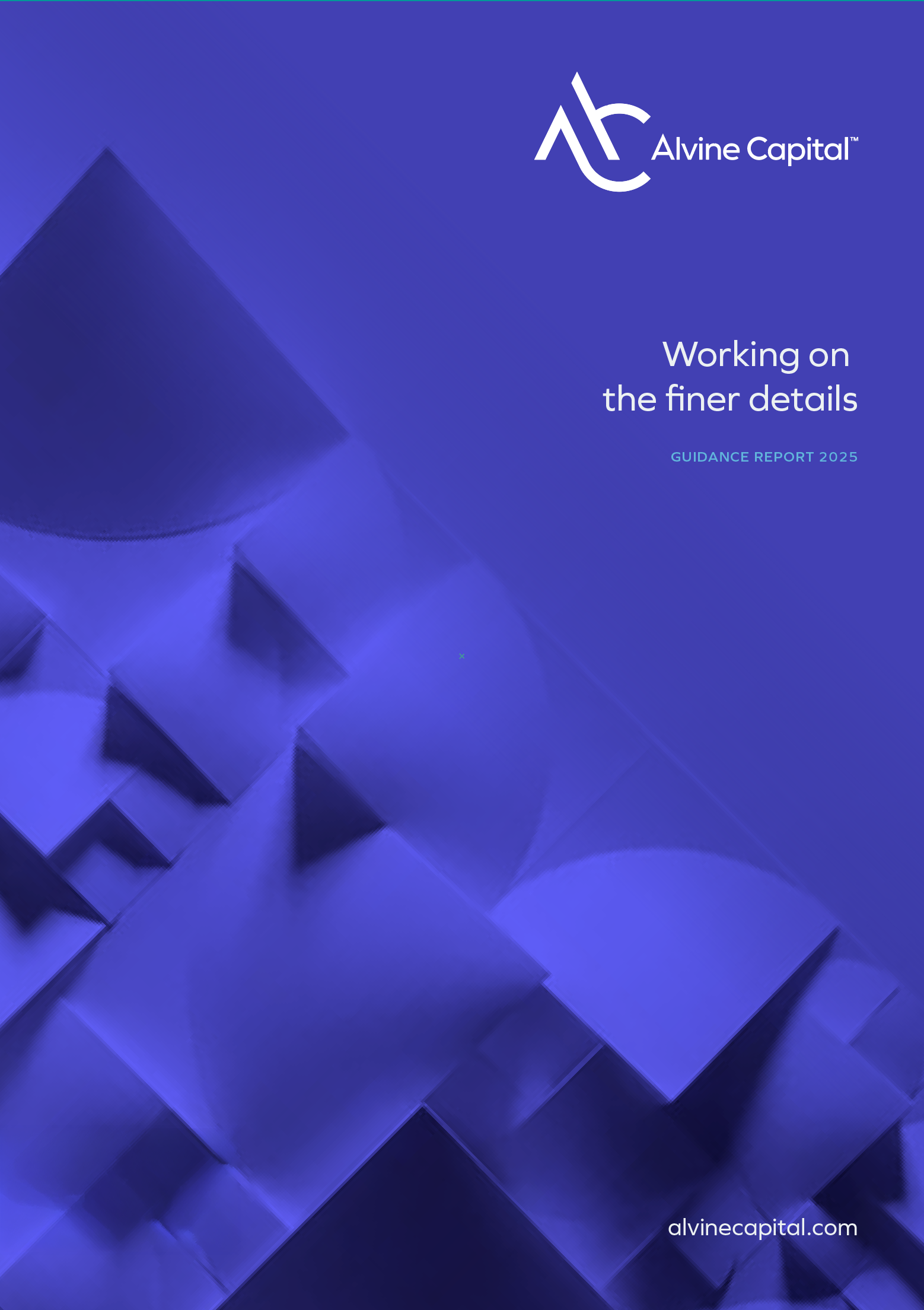
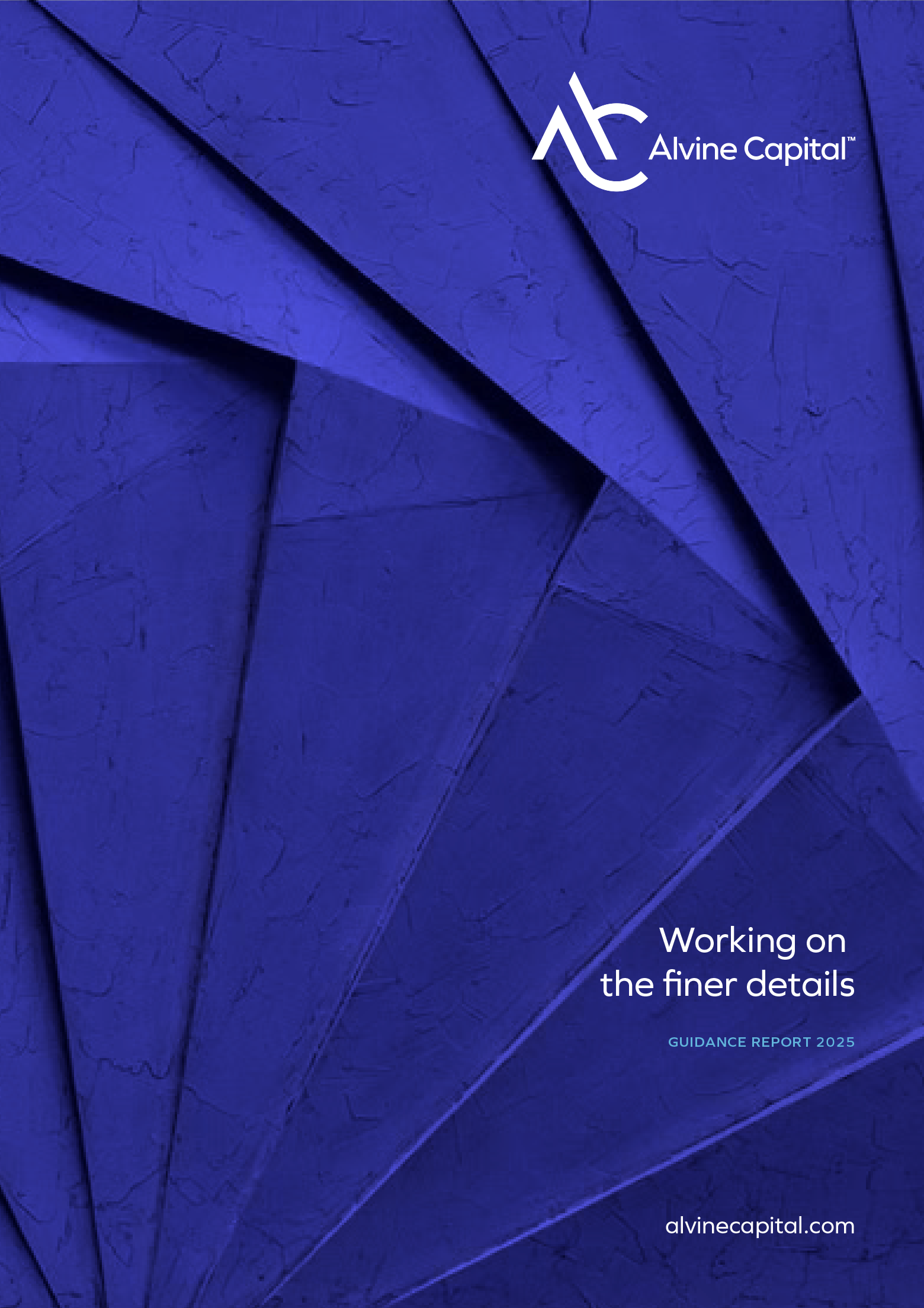
Alvine publish thought pieces several times a year, so the covers needed to be a system rather than a single design. We set an angled crop with the logo held in a consistent position, then let the imagery change underneath it: folded paper, carved stone, architectural pattern. The result is instantly recognisable as Alvine from across a room, while every issue still looks like its own piece of work. Anyone in the team can produce the next one without a designer.
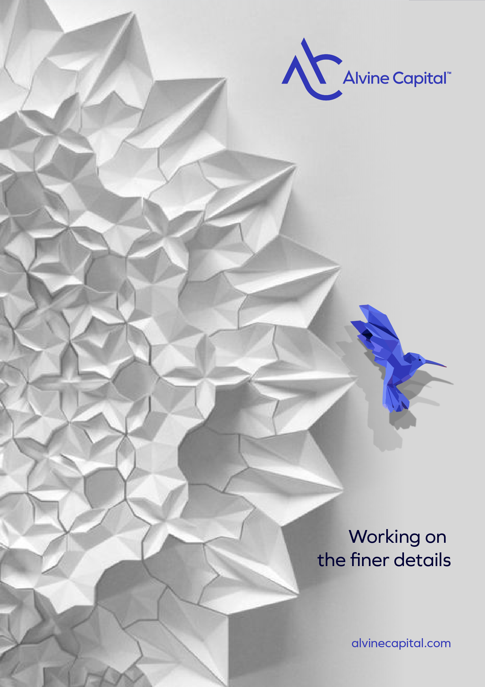
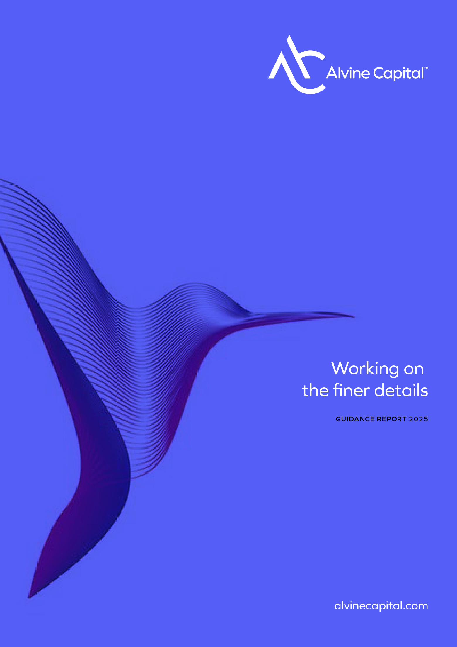

Keeping the bird, redrawing it entirely.
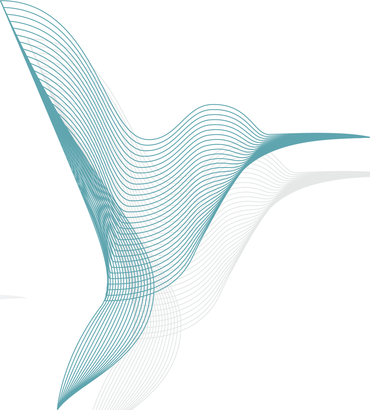
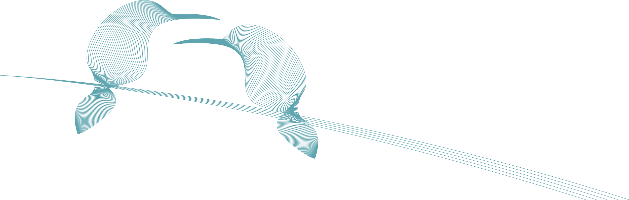
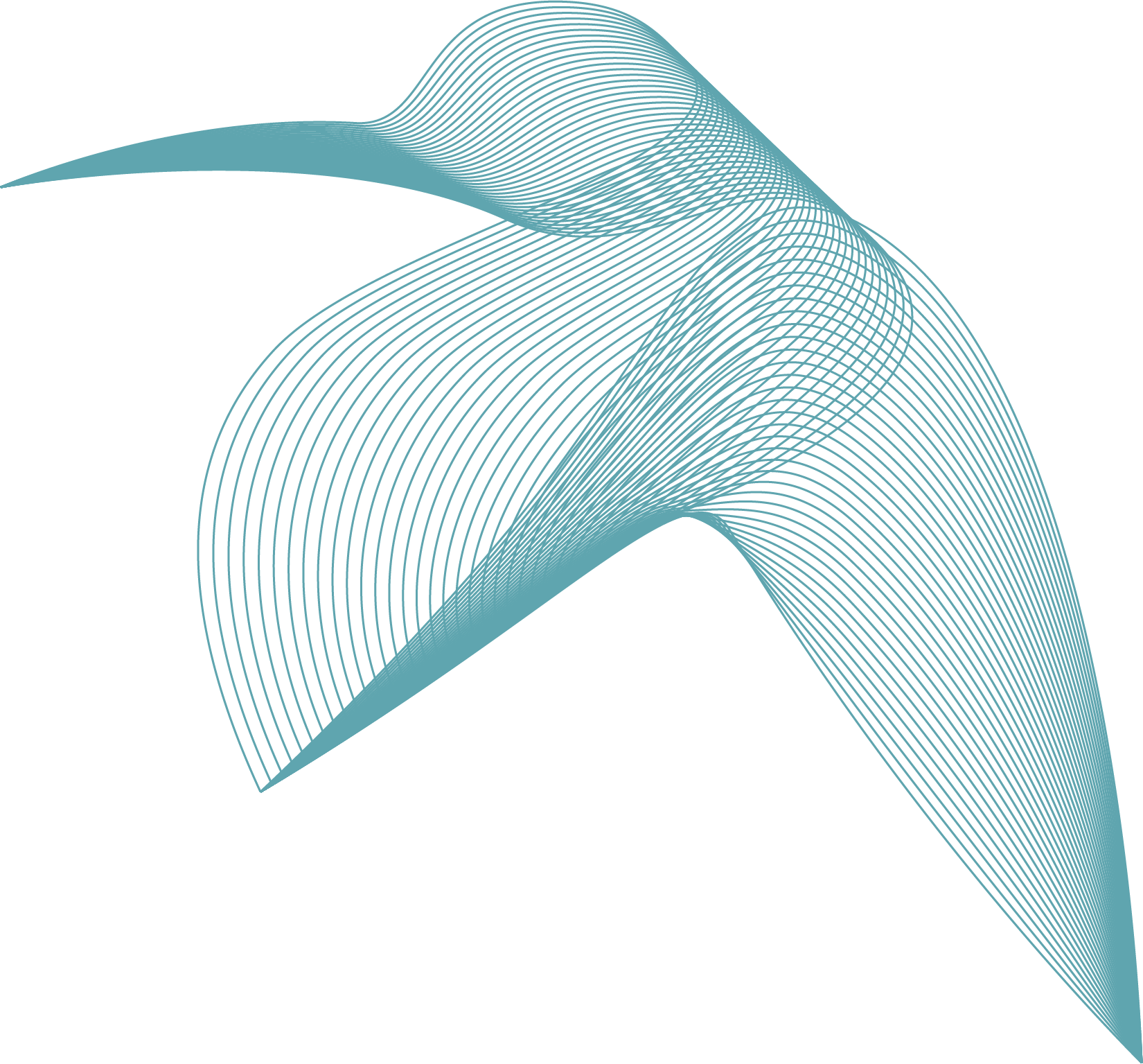
The original identity included a bird that had stopped doing its job. The instinct was to drop it, but twenty years of recognition is not worth throwing away lightly. So we rebuilt it instead. These birds are drawn as flowing line forms rather than illustrations, closer to a data visualisation than a mascot, which suits a firm whose work is about movement and precision. They give the brand something ownable beyond the logo, and they scale from a slide corner to a full page.
Testing the brand on screen before building it.
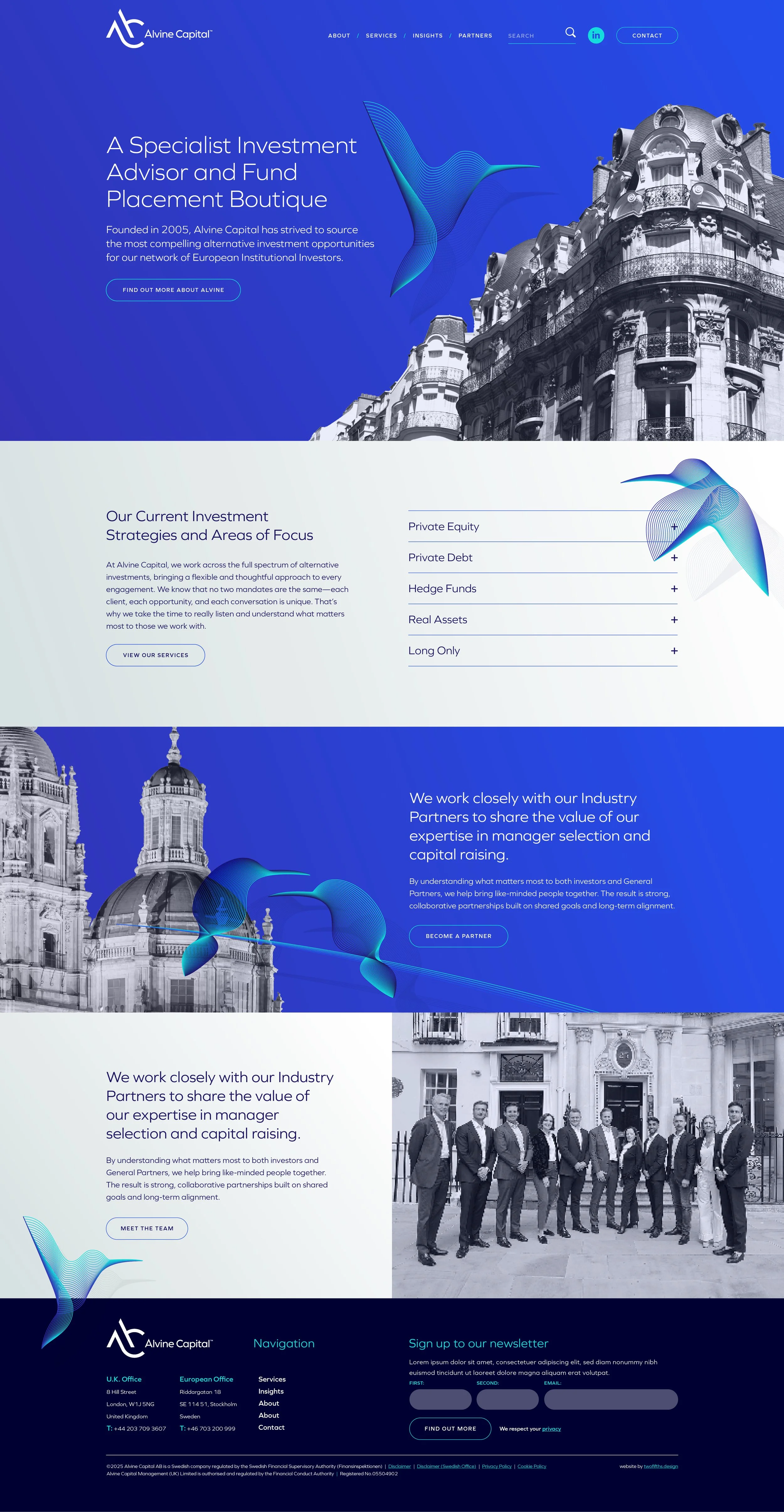
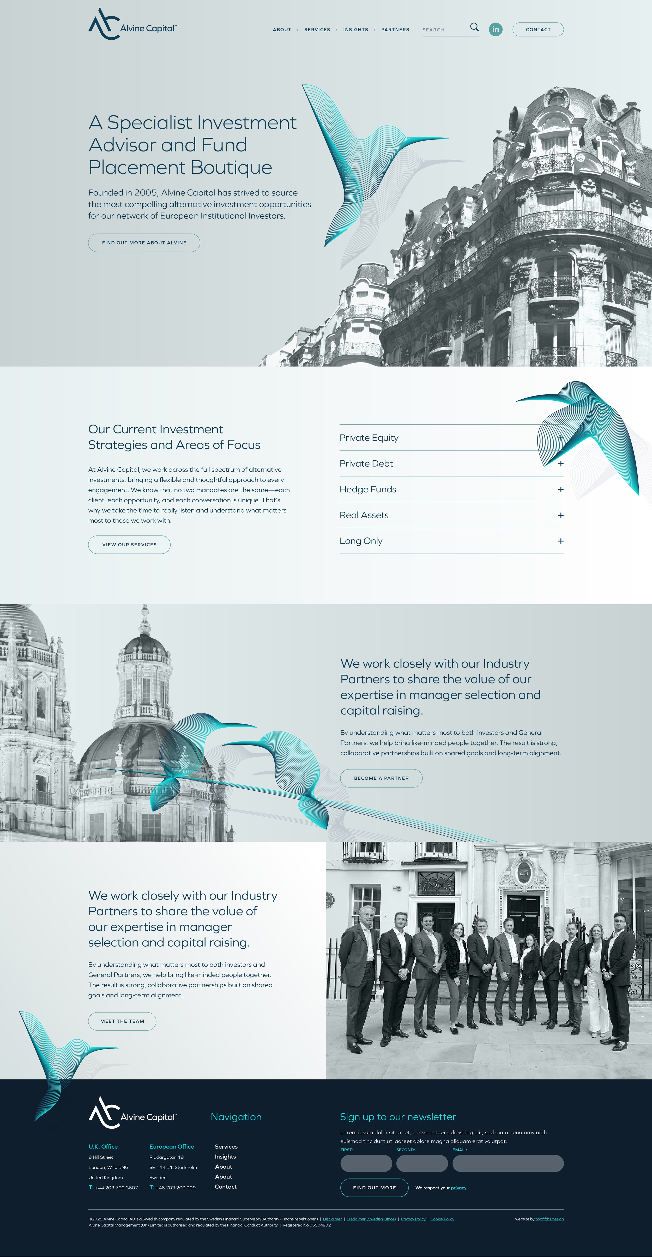
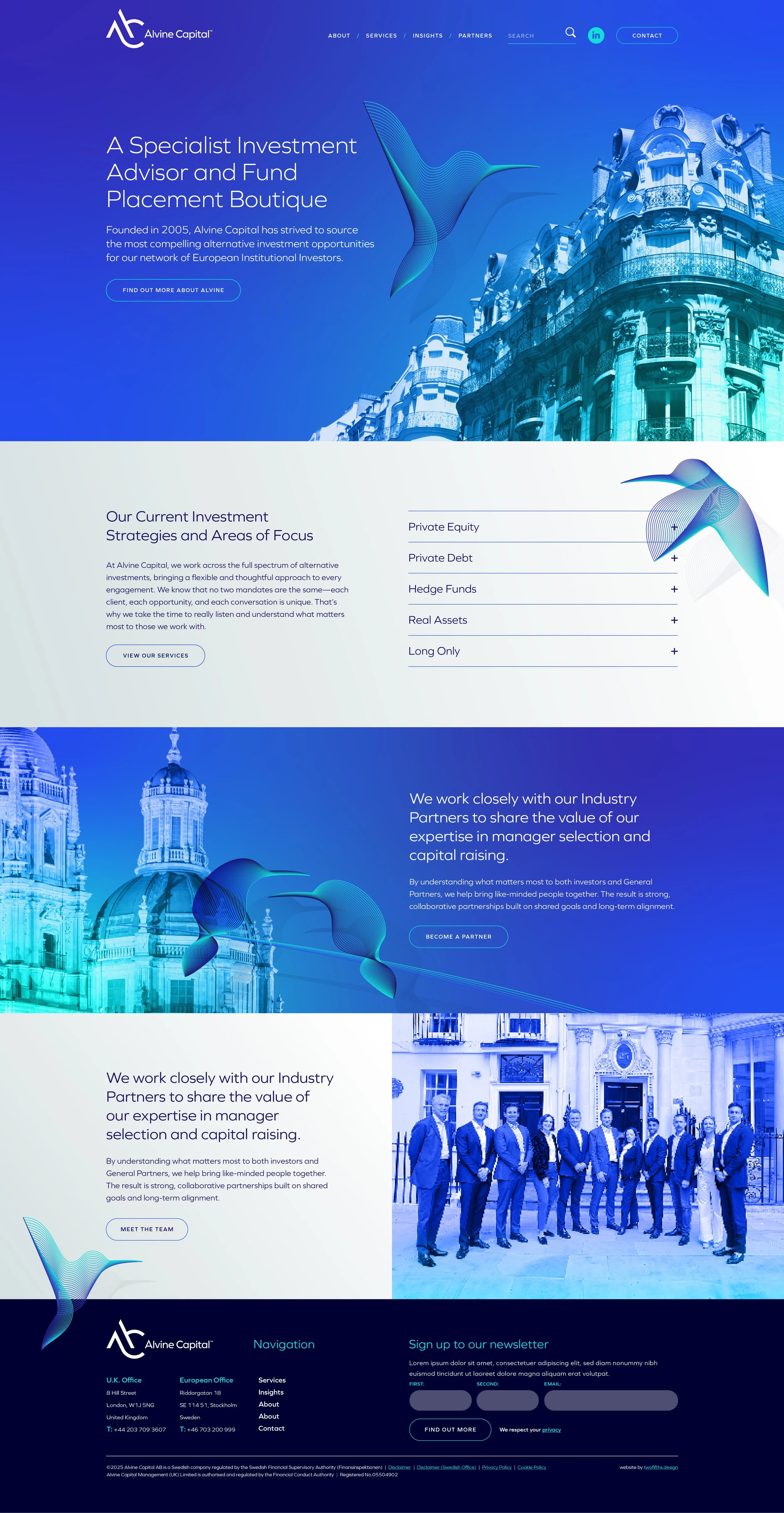
Before writing a line of code we showed the brand working as a website, in each of the shortlisted palettes. The same layout in deep blue, in near black and in teal makes the decision far easier than a swatch does, because the client can see how much colour the design actually carries. It also settled how the birds and the architectural imagery would sit together on screen, which is a harder question than it looks.
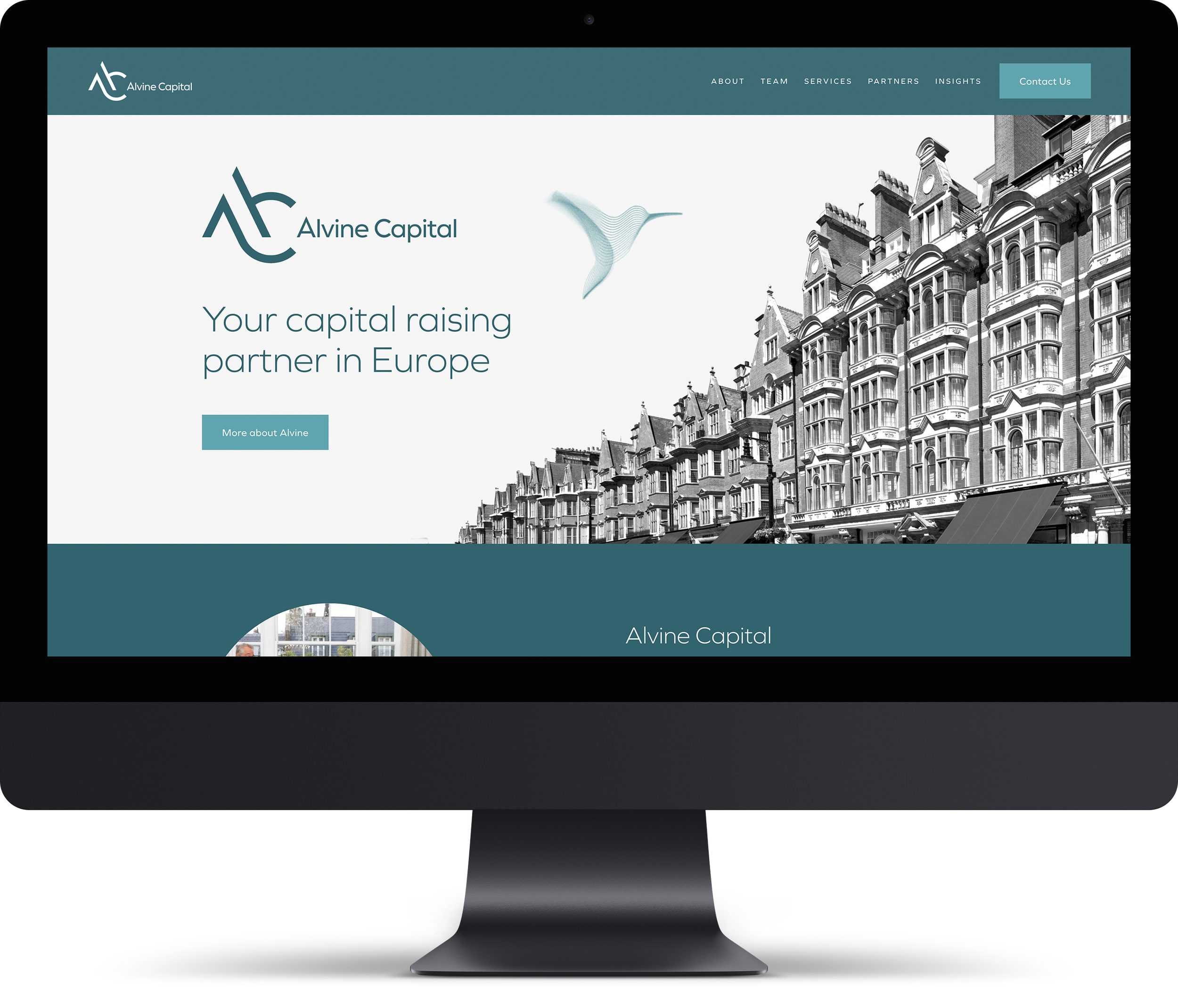
A website that looks like the firm it belongs to.
The new site was built on Squarespace 7.1, so the team can update it themselves without coming back to us for routine changes. The identity carries through in the detail: the monogram in the corner, a hummingbird holding the space beside the headline, and Mayfair architecture treated in monochrome so the teal reads as the only colour on the page. It states what Alvine does in seven words, which is more than most firms in this sector manage.
Visit: www.alvinecapital.com

Templates the team can post without us.
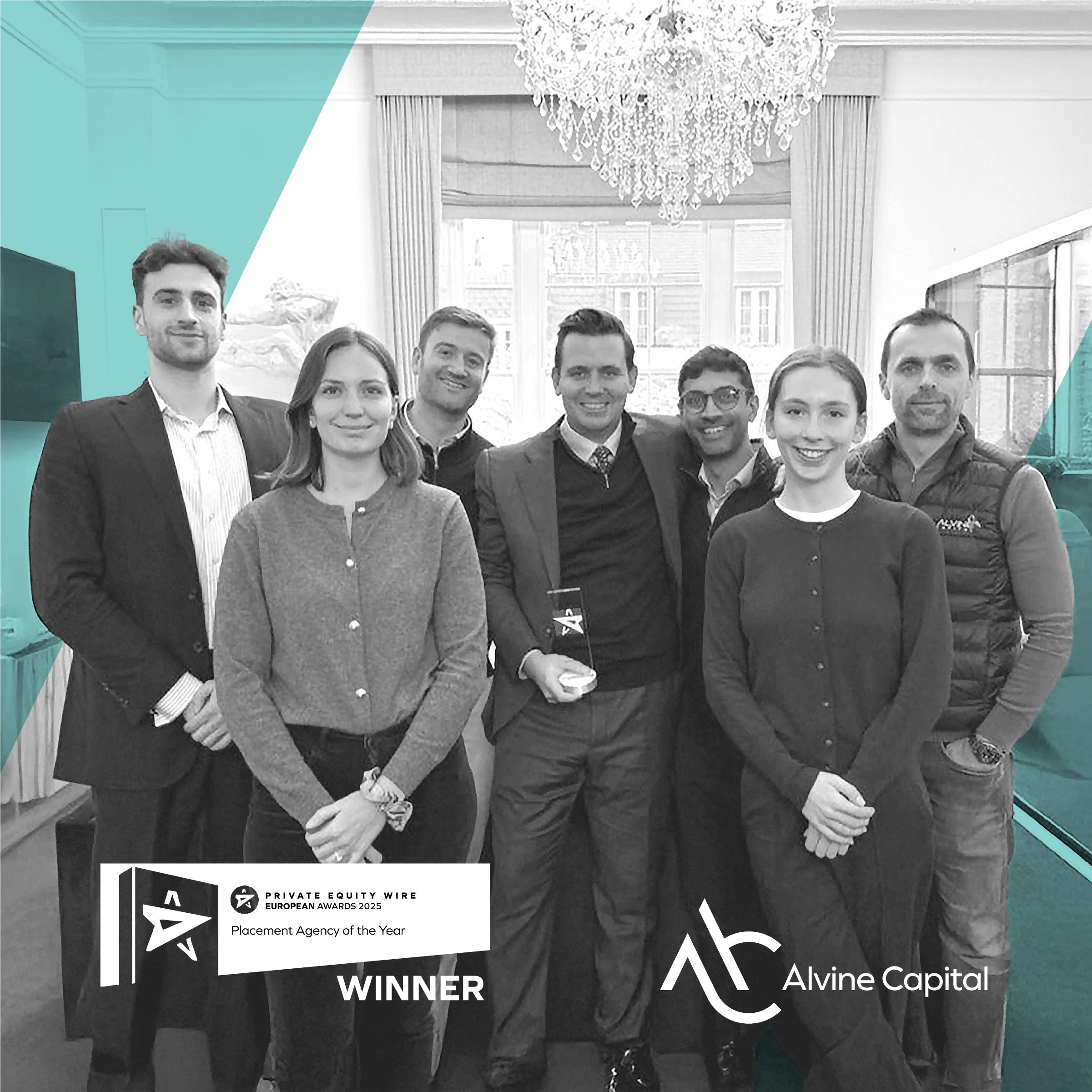
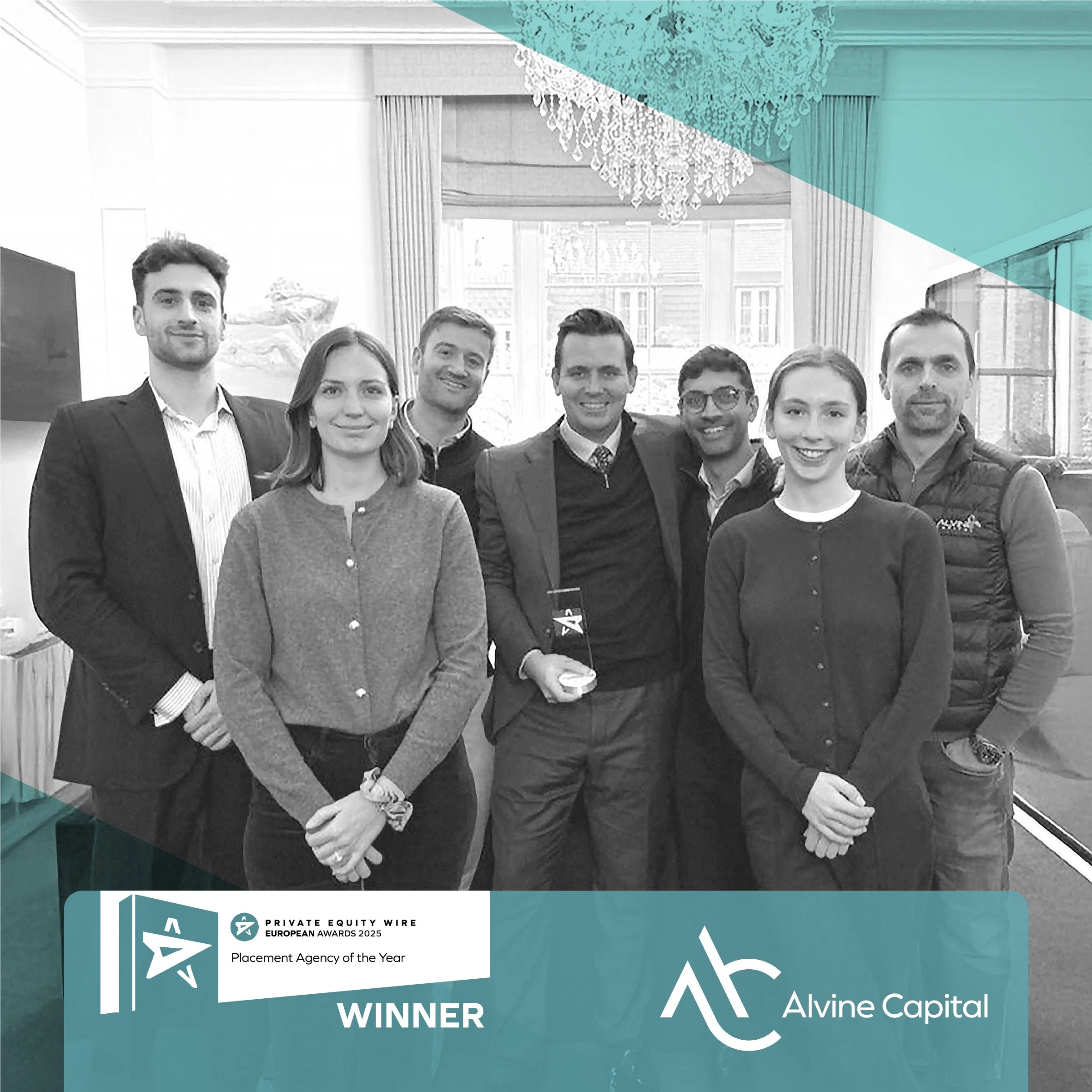
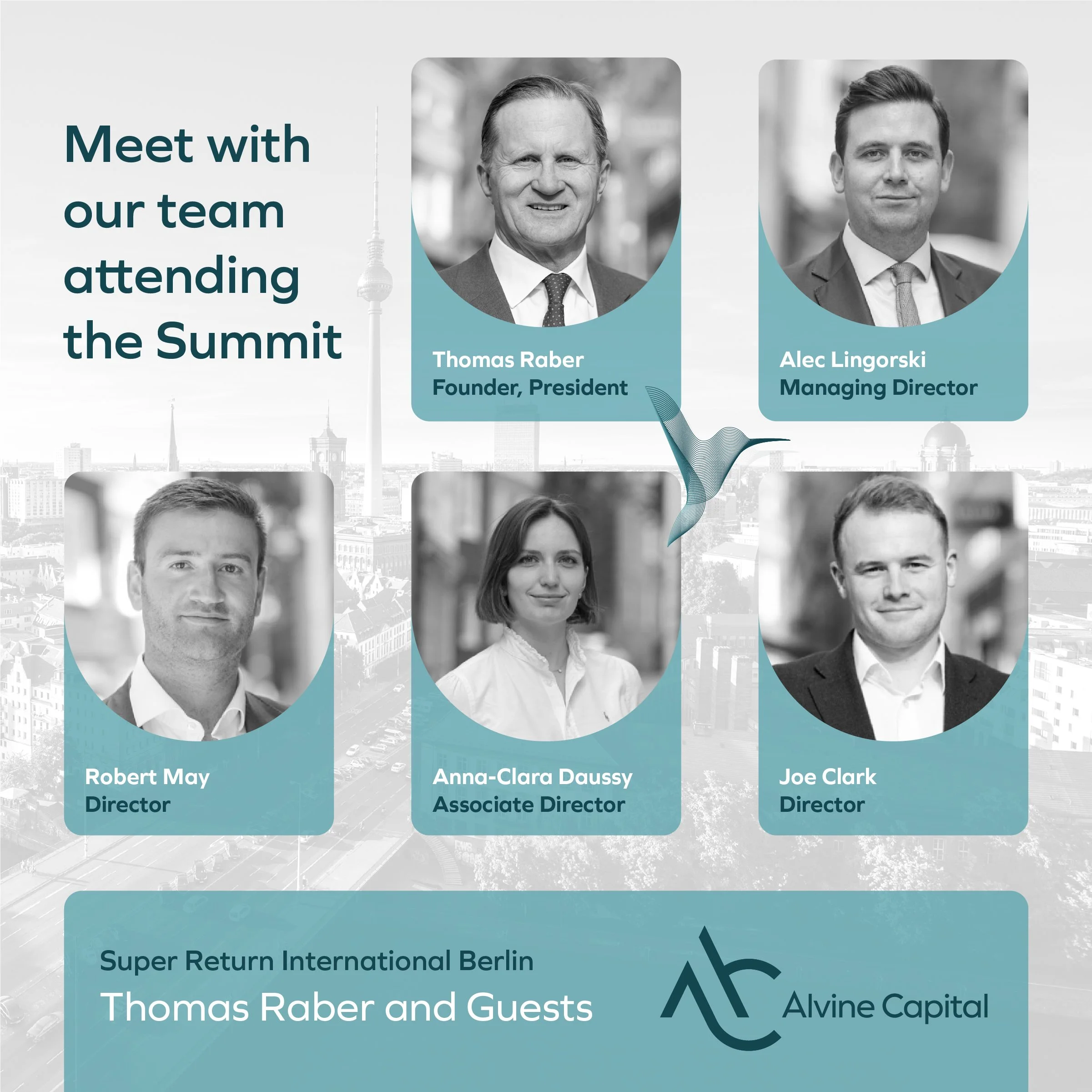
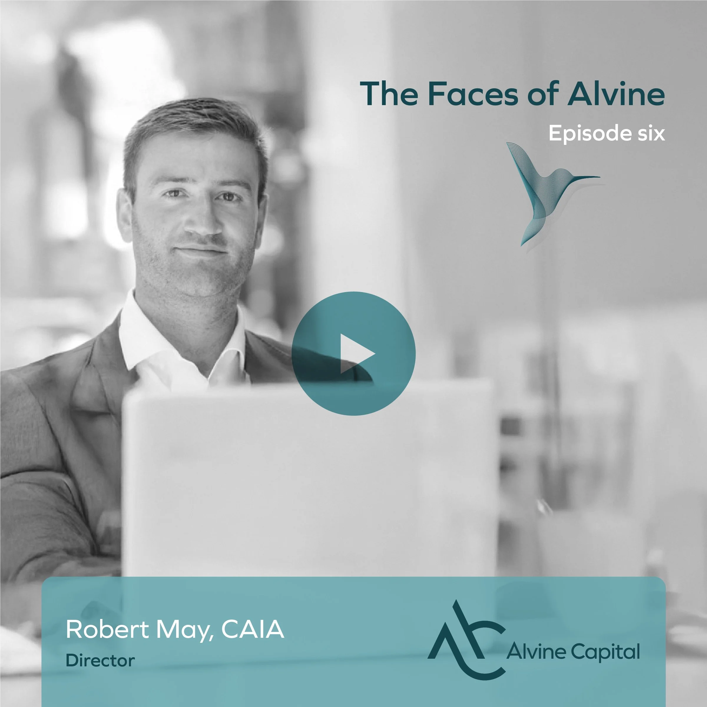
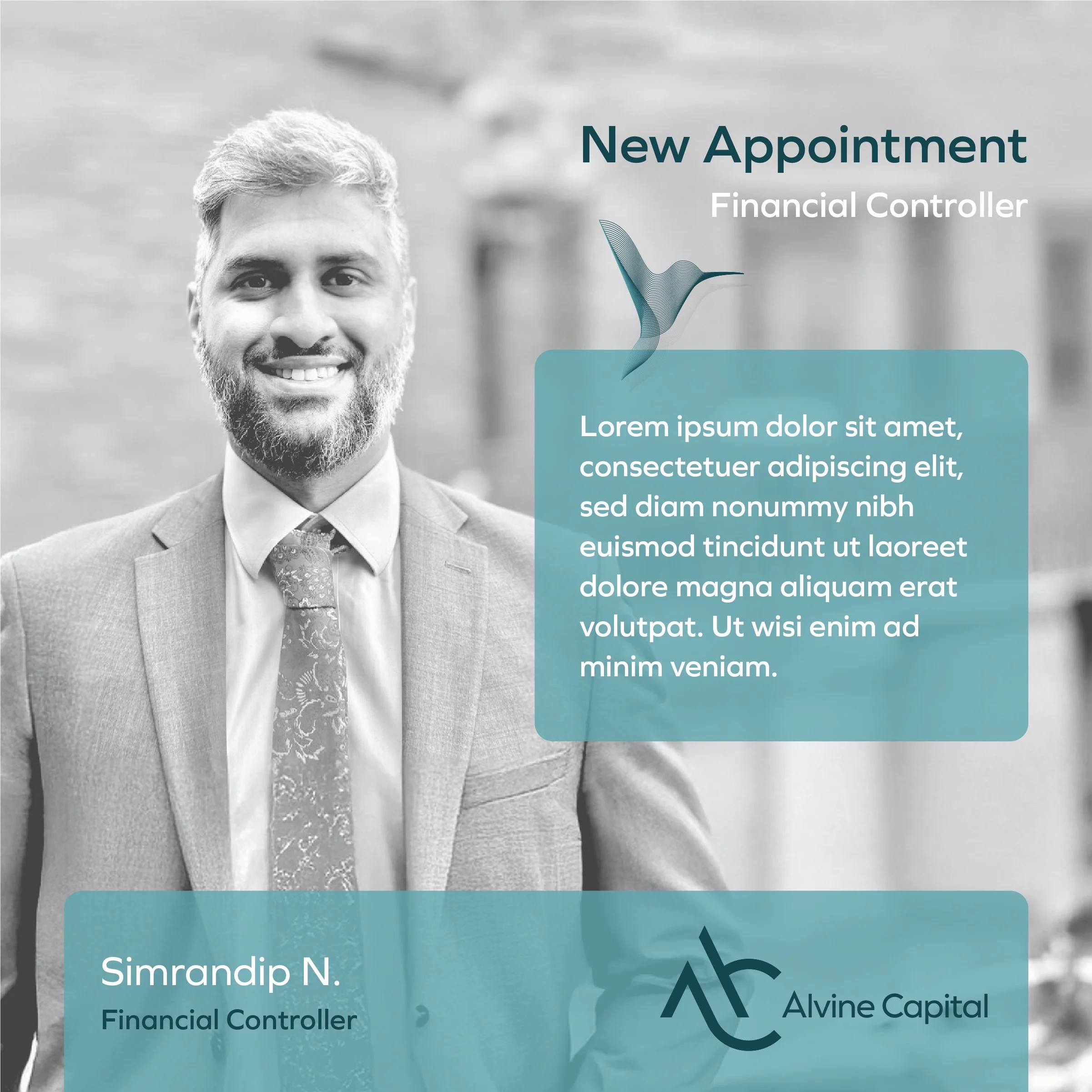
LinkedIn is where Alvine’s audience actually is, and posting there had to be quick. We built a set of templates covering the situations that come up: a new thought piece, the team travelling to meet investors, an award, a new appointment, a video interview. Each one holds the logo and the teal in a fixed position, with the angled crop from the report covers carried through, so a post looks like Alvine whether it is a map, a headshot or a document cover. Nobody needs to open a design file to publish.
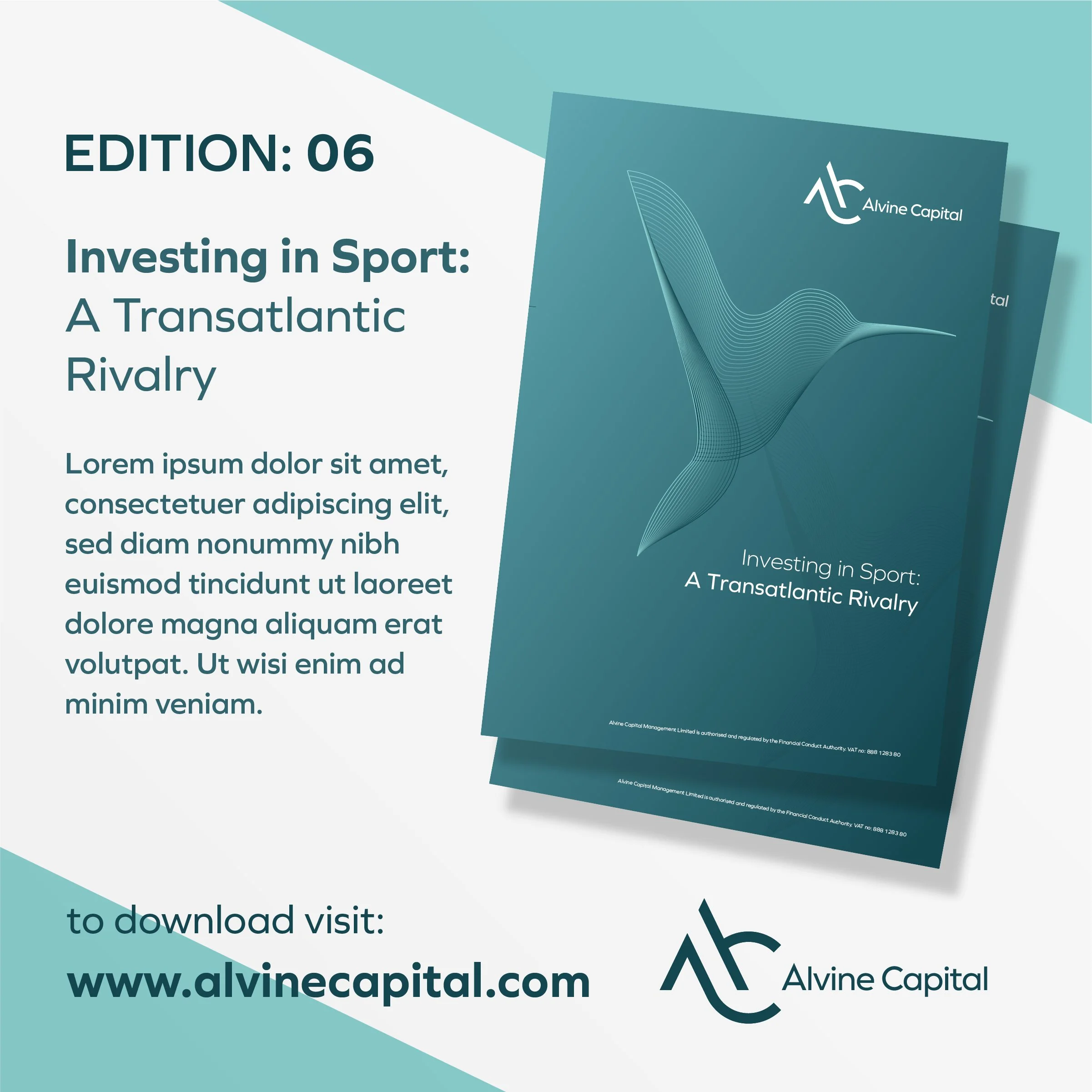
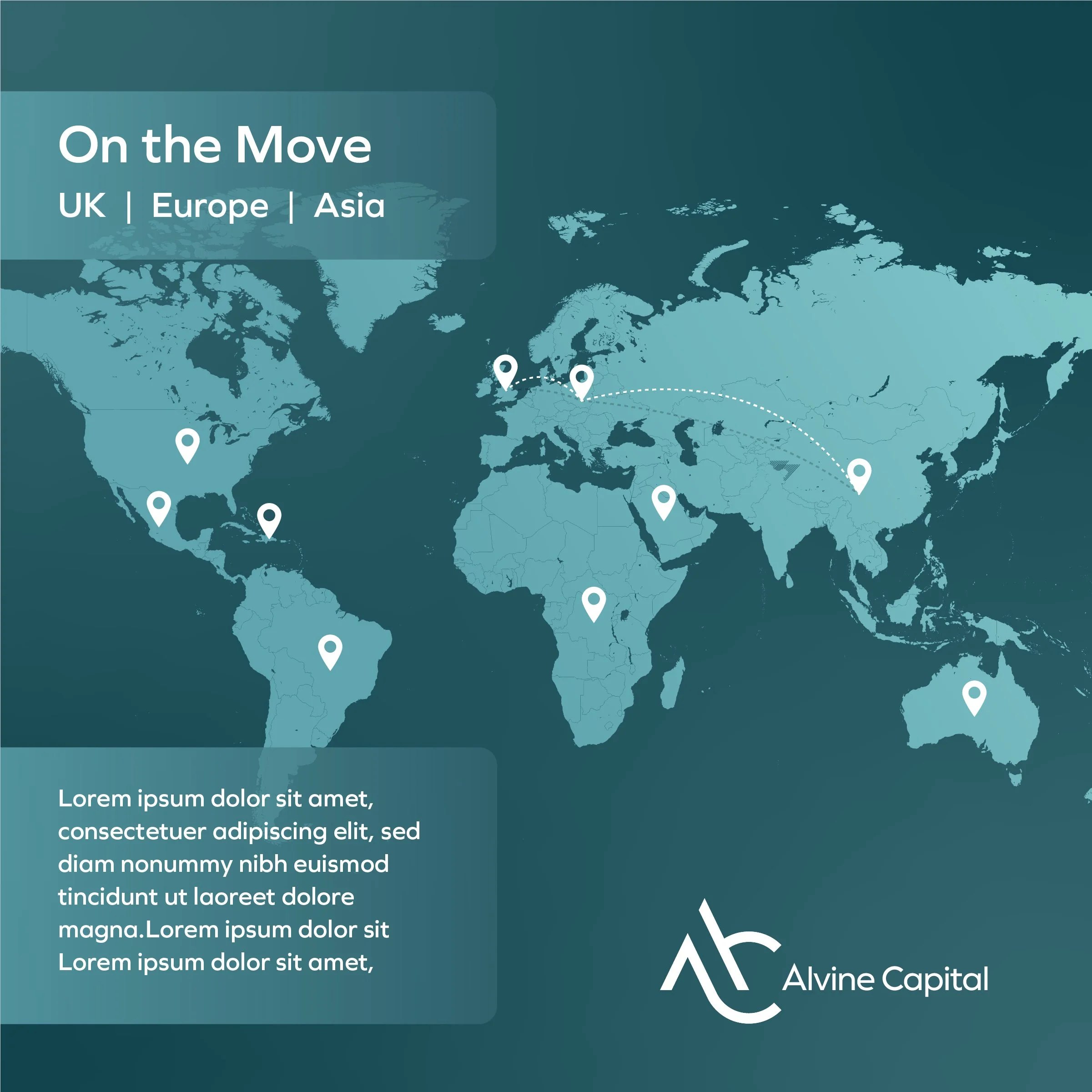
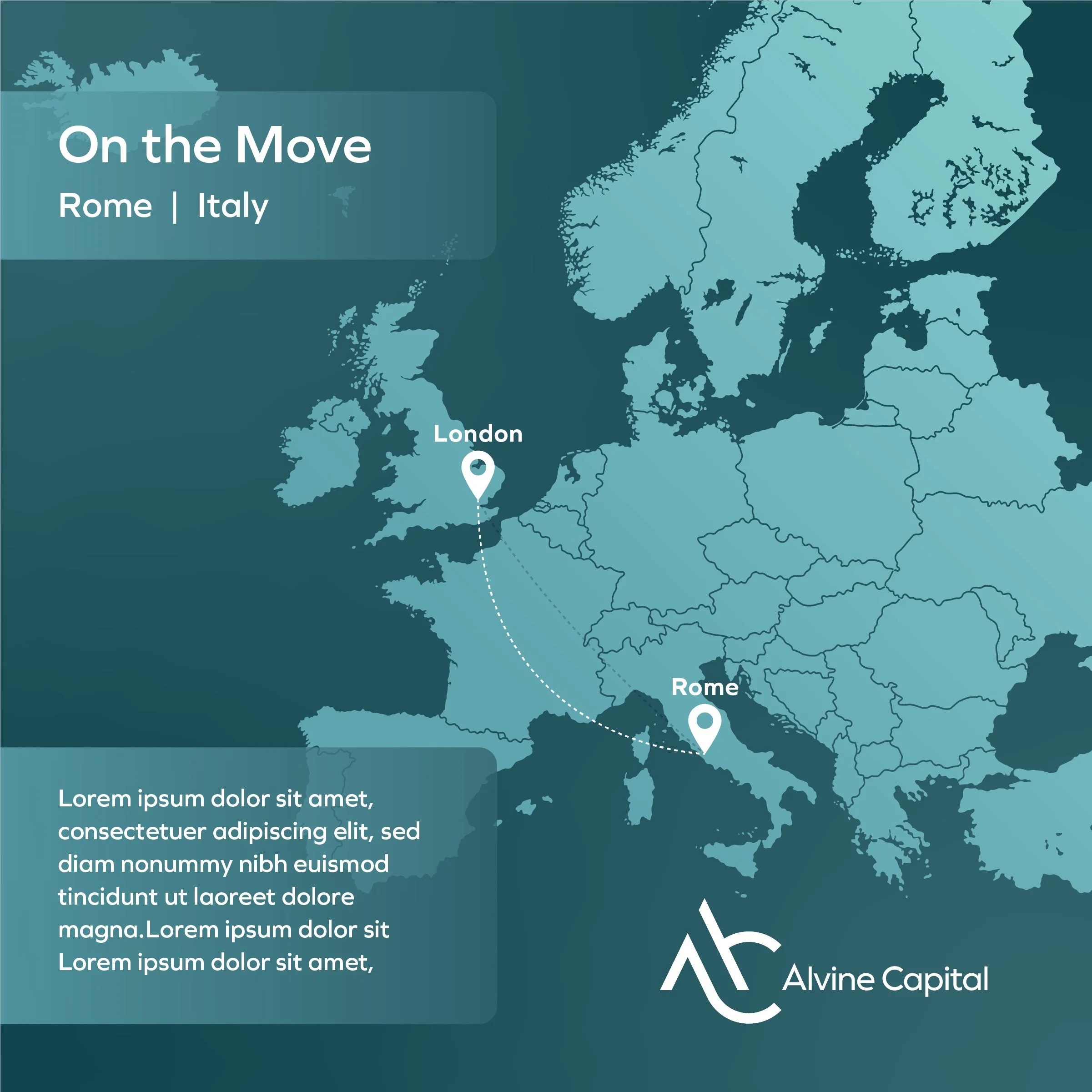
Everything the team needs to use it.
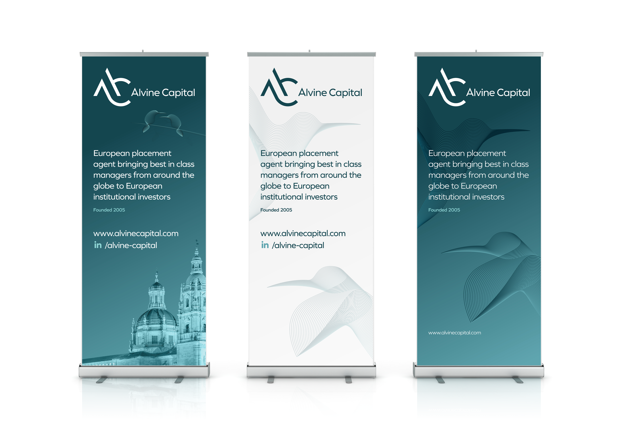
A brand only holds if the people using it have the right files to hand. Alvine were given roller banners for conferences, printed report covers, LinkedIn banners, email signatures and templates for PowerPoint, Word and Excel, all wrapped in brand guidelines covering logo use, colour, type and imagery. Twenty years on from the firm’s founding, the identity now matches the business, and the team have everything they need to keep it consistent.