
Young.Scot: a fast, mobile first platform shaped with young people
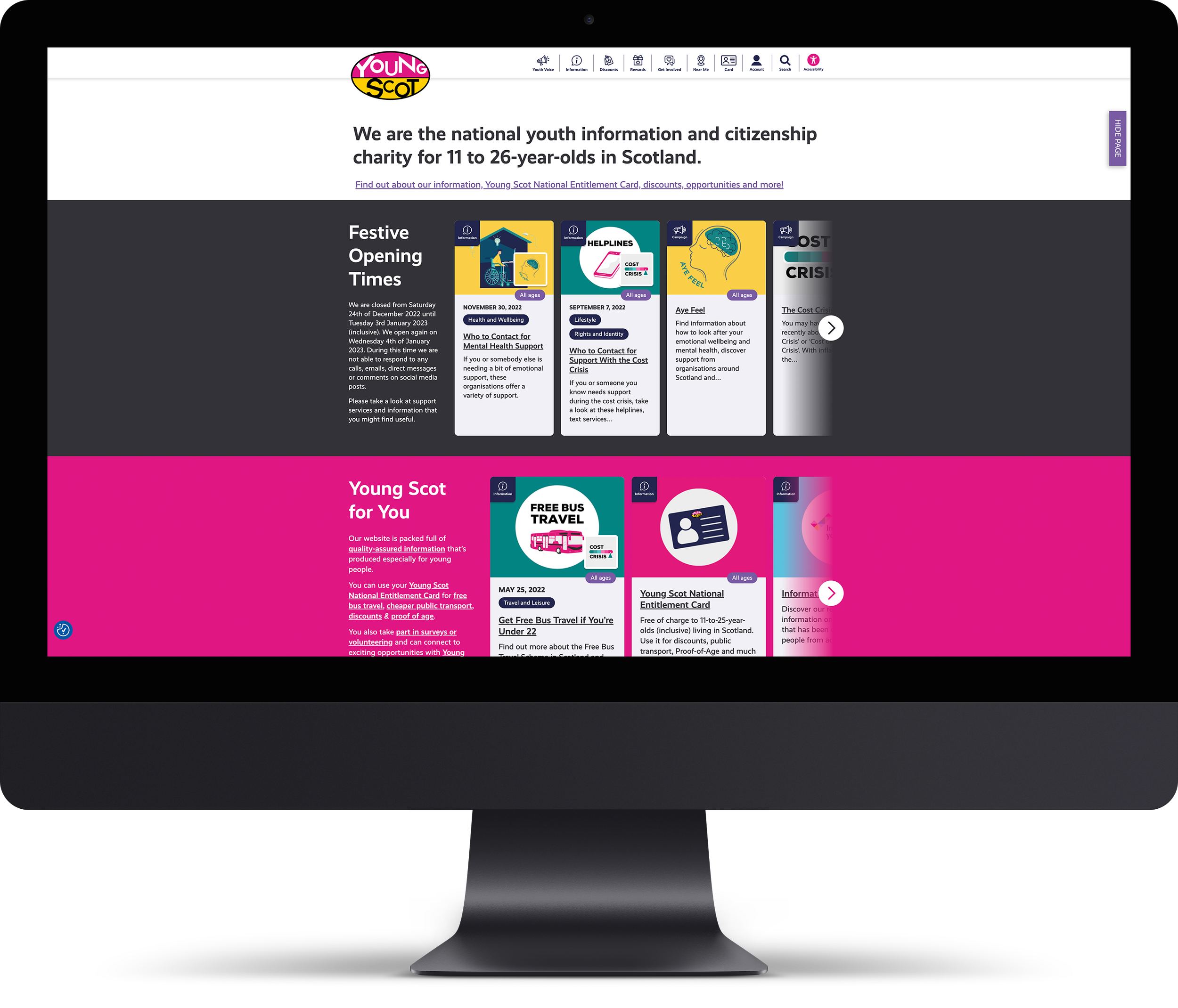
TwoFifths Design, a website design and development studio in Edinburgh, worked with Young Scot to design and build the new Young.Scot website. Young Scot is Scotland’s national youth information and citizenship charity for 11 to 26 year olds. The brief was a mobile first site that delivers what young people come for first: clear information, real discounts and easy ways to get involved.
The brief
Design for 13–23 as the primary cohort. Make paths to “get informed,” “get discounts,” and “earn rewards” obvious. Keep language plain. Remove friction on mobile. Balance safety with autonomy.
Co-design with Young Scot
We ran focused workshops with editorial, membership, and policy teams. We reviewed analytics, tested copy with young people, and mapped three core journeys: find trusted info fast, use card benefits, and join to earn points. The information architecture now mirrors those tasks in navigation and page templates.
Built for how young people browse
Discounts, upfront: travel and retail offers surface early, with local context and eligibility explained in-line.
Rewards, with clear actions: accounts collect points for surveys, volunteering, and learning, then trade points for rewards. Primary “earn” and “use” CTAs sit where momentum is highest.
Card integration: clear guidance around the National Entitlement Card appears at decision points, with eligibility and benefits in plain English.
Trust signals: information pages state youth involvement and fact-checking, reinforcing credibility.
Mobile-first patterns: thumb-zone layouts, single-tap actions, short forms, and media that loads fast on variable connections.
Content that builds agency
We shipped flexible blocks for explainers, step-by-steps, and “what to do next.” Editors can add polls, quizzes, and reward hooks without design drift. Information, benefits, and participation sit together in one system.
Performance, access, and safety
We optimised for Core Web Vitals, set WCAG-aligned defaults, simplified forms, and tuned copy for screen-reading and low-attention contexts. We biased to on-page clarity over PDFs and kept policy pages readable.
Outcomes
Shorter paths to discounts and rewards from the homepage.
Clearer signposting to reliable, fact-checked information.
Card guidance embedded at the right moment, not buried in FAQs.
Faster performance on mobile with measurable gains in engagement.
What’s next
We’re testing a “For You” feed that blends info, local discounts, and points opportunities. We’re exploring light personalisation by location and interests, tighter reward loops after quizzes, and ethical nudge patterns that keep control with the user.
Building a youth platform that must earn trust and daily use? Let’s make it fast, mobile-first, and conversion-ready.
See the full project: Young.Scot