
Alvine Capital Management: a brand identity built for the next twenty years
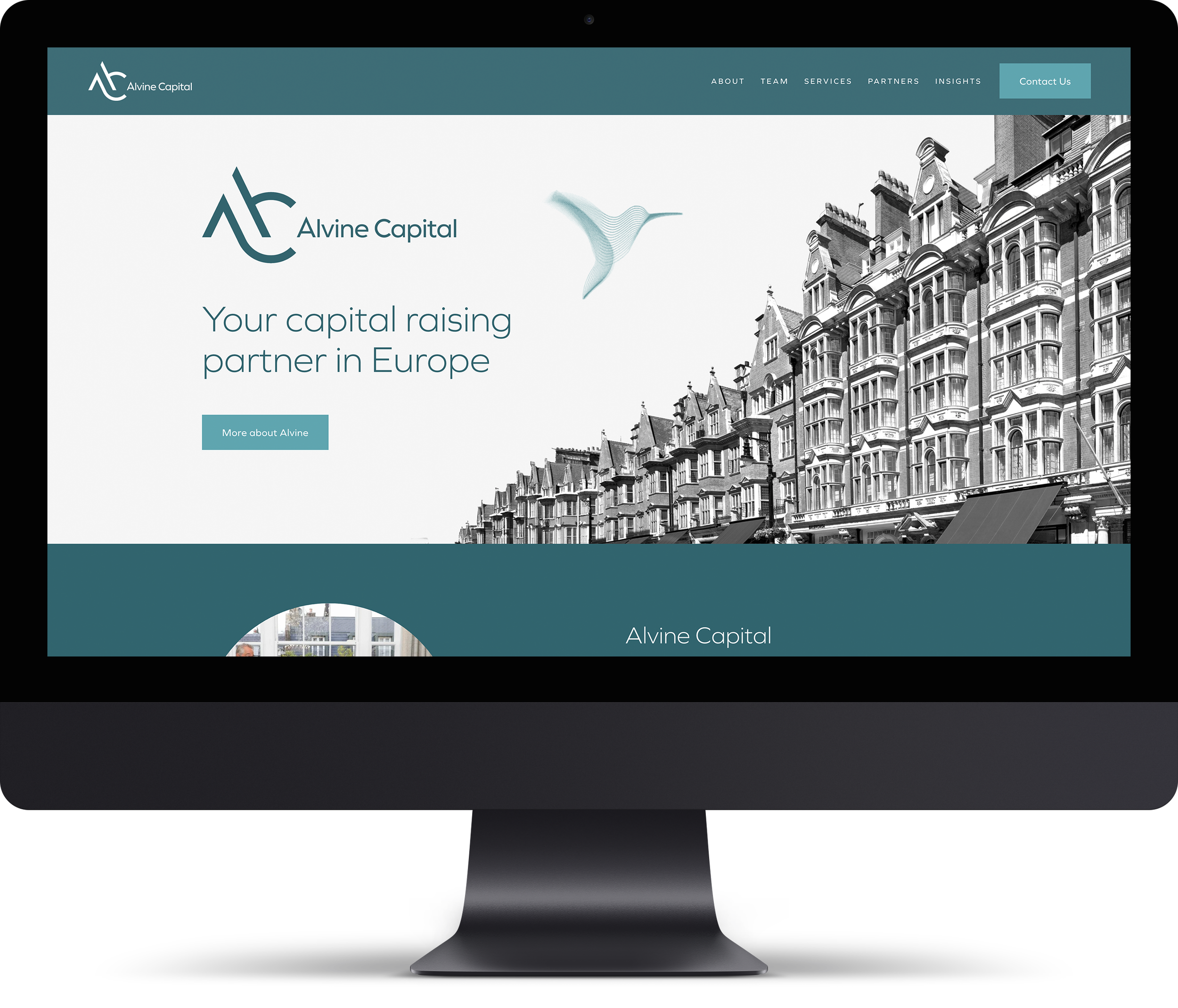
TwoFifths Design, a brand identity studio in Edinburgh, designed the new identity for Alvine Capital Management, the independent placement agency that connects European institutional investors with boutique fund managers. The firm works from London and Stockholm and was approaching its twentieth anniversary with an identity that no longer matched the business it had become.
The problem with the old mark
Alvine had grown from a bespoke advisory service into a firm partnering with best in class managers across the alternative asset classes. The logo had not moved with it. It was built quickly and cheaply years earlier, it needed a white background to work at all, and the bird at its centre had stopped meaning anything to the people using it.
The brief was direct. Modern with some tradition. High end. Professional, credible and on a par with competitors who have far larger marketing budgets. Nothing too clever, nothing that would date.
Research before drawing
The team named Chanel, Mercedes and Mulberry as brands they admired, so we started by studying how the luxury sector builds a monogram. Classic, modern and contemporary examples were collected to work out what gives a two letter mark authority, and where the line sits between confident and overworked.
We then put the full range of style directions in front of the client, from restrained and traditional to bold and graphic. Showing the extremes early is the quickest way to find the edges of what a board will accept.
Type and colour
Six typefaces were shortlisted and the name set in each, tested in title case and in wide letterspaced capitals. What mattered was finding a face that reads as institutional without turning cold, and that holds up small on an email signature as well as large on a report cover.
The old palette was a muted blue and a set of greys, chosen because they were simple rather than because they meant anything. We proposed four directions instead: deep navy for trust, gunmetal grey for restraint, dark green for growth and deep burgundy for prestige, each tested at full strength.
Keeping the bird, redrawing it entirely
The instinct was to drop the bird altogether. But twenty years of recognition is not worth discarding lightly, so we rebuilt it instead. The new birds are drawn as flowing line forms, closer to a data visualisation than an illustration, which suits a firm whose work is about movement and precision.
The finished monogram is an A and a C drawn as one continuous gesture. Read again, the ascender and the sweep beneath it suggest a bird in flight, keeping a thread back to the original identity without repeating it.
From logo to brand system
A logo on its own is not a brand. Seven moodboards set the direction for everything around it, ranging from architectural detail drawn from Europe's financial capitals to origami in motion and abstract navigation instruments. Each carried a short narrative, so the client was choosing a story about the business rather than picking pictures.
That system then had to work in practice. Report covers were designed as a repeatable format rather than a single layout, so the team can produce the next thought piece without a designer. The website was built on Squarespace 7.1 so Alvine can run it themselves. Roller banners, LinkedIn banners, email signatures and templates for PowerPoint, Word and Excel completed the set, all wrapped in brand guidelines.
The result
Twenty years on from the firm's founding, Alvine Capital has an identity that matches the business, works in a single colour, and can be applied by the team without coming back to us for every asset.
See the full project: Alvine Capital Management
Planning a rebrand that has to satisfy a board and outlast a trend? Let's talk about it.